Home>Interior Design>What Are The Colors For Quiet Luxury? 5 Colors You Should Consider
Interior Design
What Are The Colors For Quiet Luxury? 5 Colors You Should Consider
Modified: October 19, 2024
Discover the perfect colors for a serene and sophisticated interior design. Explore 5 luxurious color options that will add elegance and calmness to your space.
(Many of the links in this article redirect to a specific reviewed product. Your purchase of these products through affiliate links helps to generate commission for Storables.com, at no extra cost. Learn more)
Introduction
When it comes to interior design, color plays a vital role in setting the mood and atmosphere of a space. One particular trend that has been gaining popularity is the concept of “quiet luxury.” Quiet luxury embraces a sense of understated elegance and sophistication, creating a serene and tranquil ambiance in your home.
Choosing the right colors for a quiet luxury aesthetic requires careful consideration. The colors should evoke a sense of calmness and opulence while maintaining a soft and relaxing atmosphere. In this article, we will explore five colors that perfectly embody the essence of quiet luxury and discuss why you should consider incorporating them into your interior design palette.
Key Takeaways:
- Embrace quiet luxury in your home with soft ivory, subtle gray, pale blush, dusty blue, and muted olive. These colors create a serene, opulent ambiance, perfect for relaxation and sophistication.
- Incorporate natural materials, metallic accents, and warm lighting to enhance the quiet luxury aesthetic. Experiment with textures and colors to create a personalized haven of elegance and tranquility in your home.
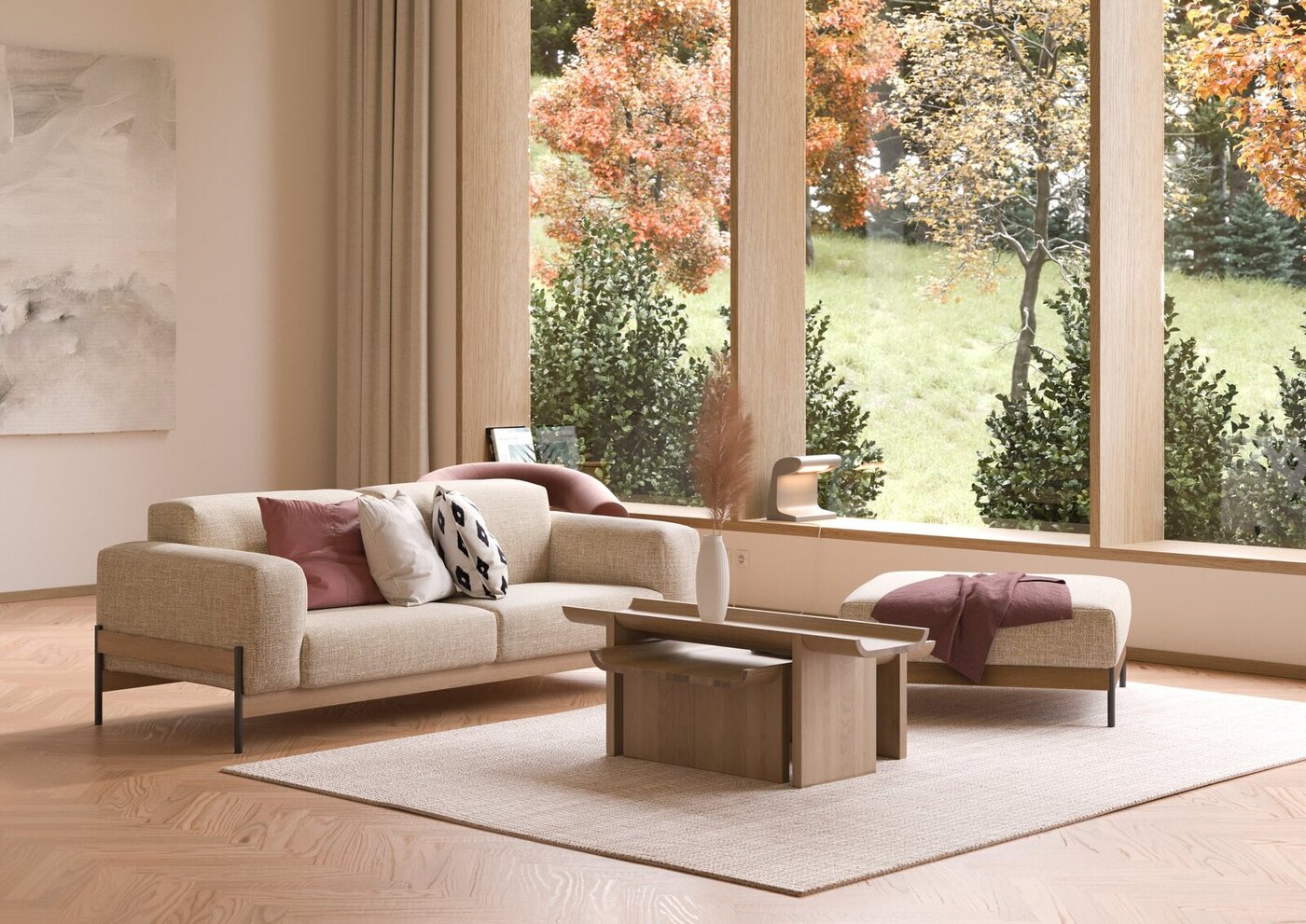
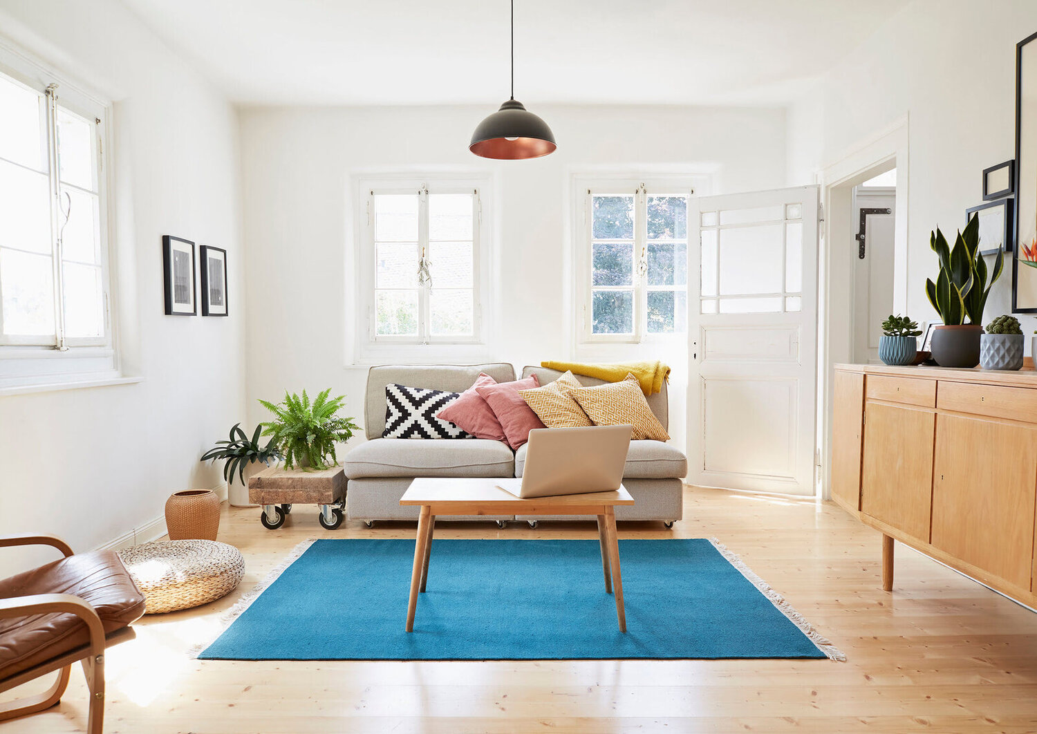
Soft Ivory: Elegance in Simplicity
Soft ivory is a versatile color that exudes an air of elegance and sophistication. This off-white shade is reminiscent of luxurious materials such as silk and cashmere, instantly elevating the aesthetic of any space. Its understated nature allows it to seamlessly blend with other colors, making it a perfect choice for a quiet luxury interior design.
Soft ivory walls create a serene backdrop that enhances the overall ambiance of a room. It provides a sense of calmness and tranquility, allowing other design elements to take center stage. Whether paired with rich, deep colors or lighter, neutral tones, soft ivory adds a touch of refinement and class to the space.
One of the benefits of using soft ivory in your interior design is its ability to create an illusion of spaciousness. The color reflects light, making the room appear larger and brighter. This makes it particularly well-suited for smaller rooms or spaces with limited natural light. Soft ivory also has a timeless quality, ensuring that your interior design will remain chic and elegant for years to come.
Incorporating soft ivory into your furniture and decor choices can further enhance the quiet luxury feel of your space. Opt for upholstered furniture in ivory hues, or select accent pieces such as throw pillows or curtains in this delicate shade. The combination of soft ivory with subtle textures or metallic accents creates an opulent yet understated look.
When choosing complementary colors for soft ivory, consider incorporating soft pastels or muted neutrals. Dusty rose, pale gray, or sage green can add depth and dimension to the overall design. Avoid using overly vibrant or bold colors, as they may disrupt the quiet ambiance you are aiming to create.
In summary, soft ivory is the epitome of elegance in simplicity. Its versatility, timeless appeal, and ability to create a serene backdrop make it a perfect choice for achieving a quiet luxury interior design aesthetic.
Subtle Gray: Understated Sophistication
Subtle gray is a color that exudes sophistication and refinement. With its understated nature, it serves as an excellent choice for creating a quiet luxury ambiance in your home. Gray tones can range from light and airy to deep and moody, offering endless possibilities for your interior design palette.
One of the advantages of using subtle gray is its ability to create a sense of calmness and tranquility. This color has a soothing effect on the eyes, making it ideal for bedrooms, living rooms, or any space where relaxation is a priority. The neutrality of gray also allows it to complement a wide range of other colors, making it a versatile option for any interior design style.
Subtle gray can be used as a primary color for walls or as an accent color for furniture and accessories. When paired with other neutral shades such as white or beige, it creates a clean and sophisticated look. Alternatively, combining gray with pops of color like blush pink or deep navy can add a touch of visual interest and depth to the space.
To enhance the quiet luxury feel, consider incorporating textured elements into your design. Fabrics such as velvet or suede in shades of gray can add a sense of opulence and depth. Layering different textures, such as a plush rug or a faux fur throw, can further enhance the overall aesthetic.
When choosing lighting fixtures and accessories, consider metallic finishes like brushed nickel or chrome. These finishes complement subtle gray beautifully, adding a touch of glamour and elegance to the space. Mirrors and reflective surfaces also work well in gray-toned rooms, as they help reflect light and create a sense of openness.
Overall, subtle gray brings a sense of understate sophistication to any room it is used in. Its versatility, calming effect, and ability to blend seamlessly with other colors make it an excellent choice for achieving a quiet luxury interior design aesthetic.
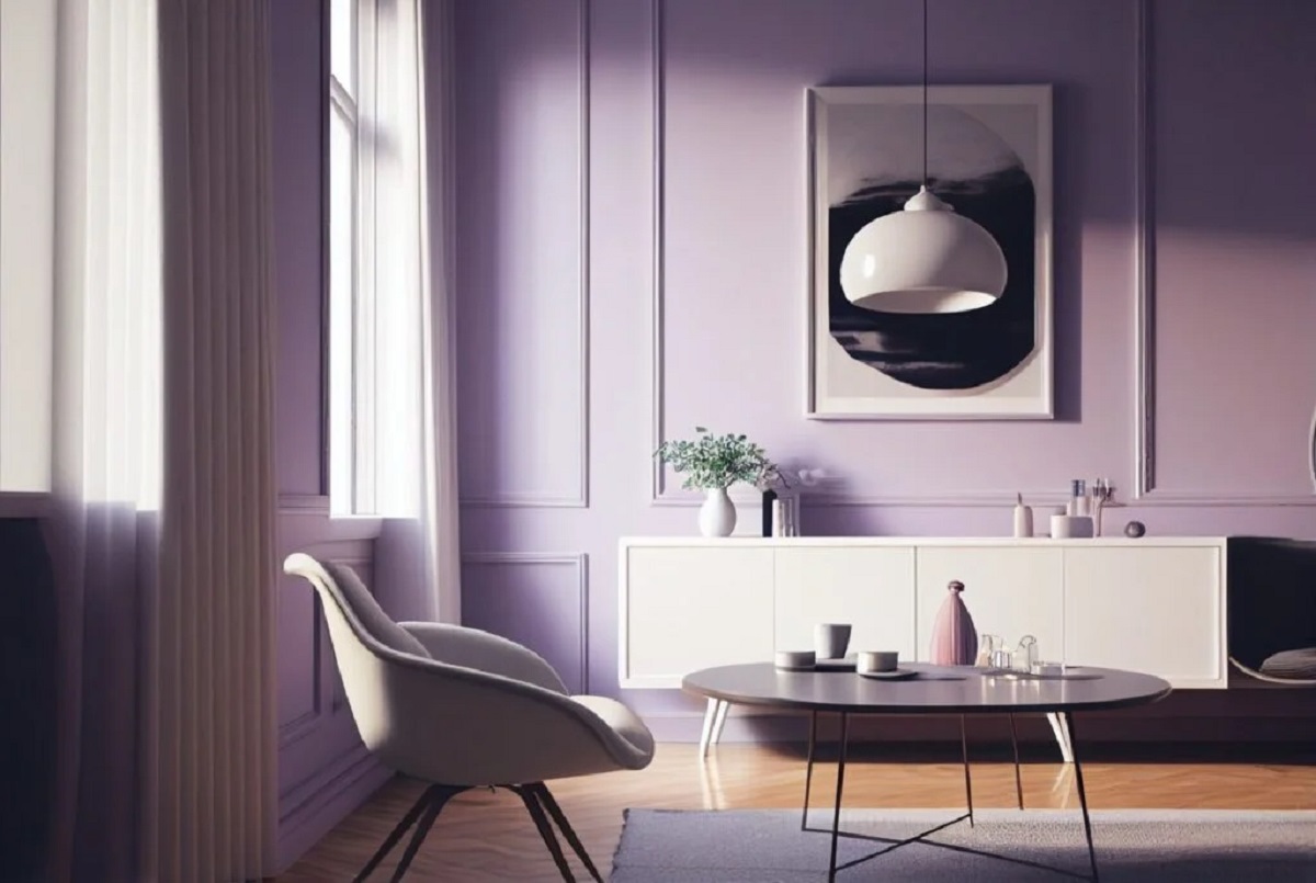
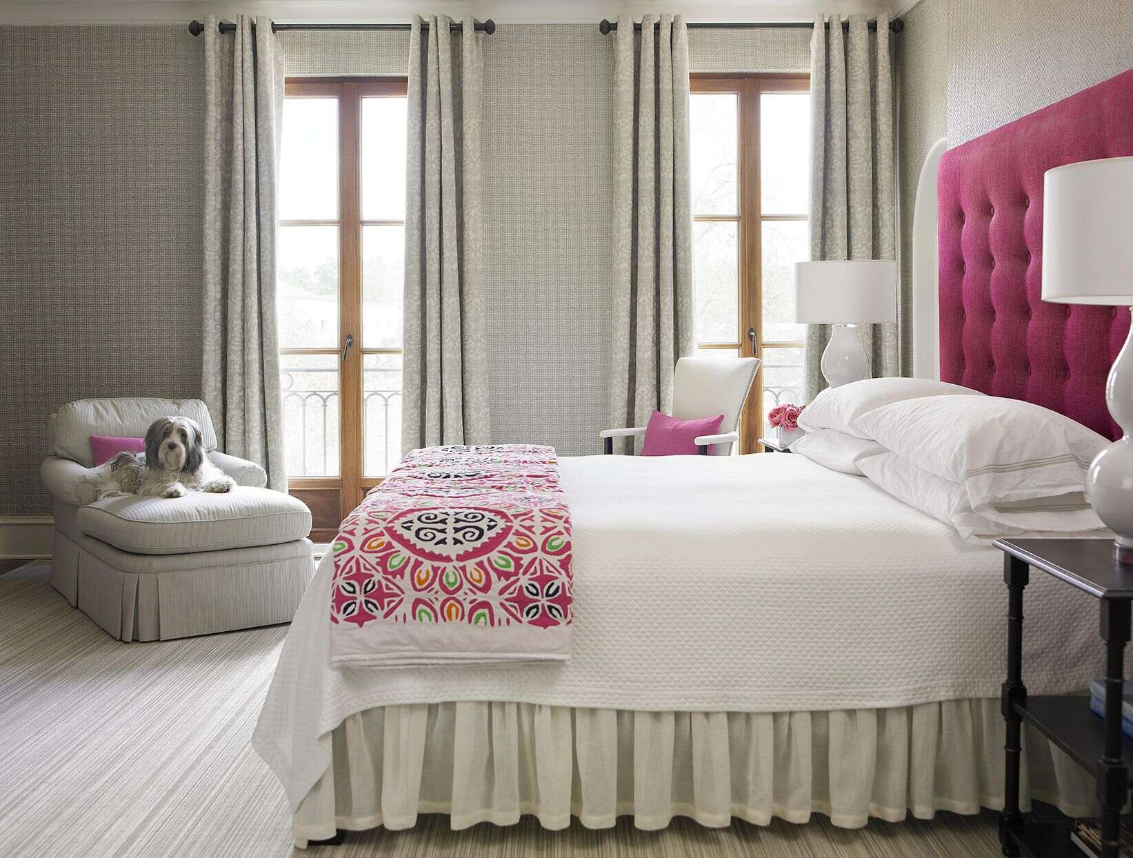
Pale Blush: Feminine Charm
Pale blush is a delicate and romantic color that adds a touch of feminine charm to any space. This soft shade of pink is perfect for creating a quiet luxury aesthetic that exudes elegance and sophistication. Its gentle and soothing nature makes it a popular choice for bedrooms, living rooms, and even bathrooms.
When used as the main color in your interior design, pale blush creates a sense of warmth and serenity. It has a calming effect that promotes relaxation and tranquility. This makes it an ideal choice for creating a cozy and inviting atmosphere in your home.
Pairing pale blush with other neutral shades, such as ivory or light gray, creates a harmonious and elegant color scheme. This combination allows the blush pink to stand out while maintaining a balanced and refined look. To add a touch of contrast, incorporate metallic accents like gold or brass, which will enhance the luxurious feel of the space.
To avoid an overly saccharine appearance, balance the femininity of pale blush with elements of texture and structure. Opt for furniture with clean lines and geometric shapes to create a modern and sophisticated look. Adding touches of natural materials like wood or marble can also help to ground the design and add a sense of organic elegance.
Incorporating pale blush through textiles and accessories can further enhance the feminine charm of the space. Consider using blush-colored curtains, throw pillows, or rugs to introduce subtle pops of color. Incorporating floral patterns or delicate fabrics in shades of blush can also create a romantic and luxurious ambiance.
When it comes to lighting, choose fixtures that cast a soft and warm glow. Chandeliers or pendant lights with tinted blush shades can create an intimate and dreamy atmosphere. Add scented candles or diffusers with floral or soft vanilla fragrances to complete the sensory experience of the space.
In summary, pale blush brings a sense of feminine charm and sophistication to your interior design. Its soft and romantic nature creates a quiet luxury aesthetic that is perfect for those seeking a delicate and elegant ambiance in their home.
When looking for colors that represent quiet luxury, consider soft and muted tones such as champagne, blush pink, dove gray, sage green, and dusty blue. These colors exude elegance and sophistication without being too bold or flashy.
Dusty Blue: Serene Tranquility
Dusty blue is a color that evokes a sense of calmness and serenity, making it an excellent choice for creating a quiet luxury ambiance in your home. This muted shade of blue brings a fresh and tranquil feel to any space, promoting a sense of relaxation and peace.
When used as the primary color in your interior design, dusty blue walls create a serene backdrop that sets the tone for a tranquil environment. The subtle hint of blue adds a touch of sophistication without overwhelming the space. This makes it an ideal choice for bedrooms, bathrooms, or any area in your home where you want to unwind and escape from the outside world.
Dusty blue pairs beautifully with other soft and neutral shades. Combining it with hues like ivory, beige, or pale gray creates a cohesive and harmonious color palette that exudes tranquility. You can also add depth and interest to the space by incorporating darker shades of blue, such as navy or indigo, as accent colors.
To enhance the quiet luxury feel, consider incorporating natural elements into your design. Wood accents in lighter tones, such as oak or birch, can bring warmth and create a sense of balance. Adding touches of greenery through plants or floral arrangements can also add a refreshing and natural touch to the space.
When it comes to furniture and textiles, opt for materials that provide both comfort and elegance. Soft upholstery in shades of blue can create a soothing and inviting atmosphere. Layering different textures, such as a chunky knit throw or a plush rug, adds depth and visual interest to the overall design.
In terms of accessories, choose pieces that complement the serene ambiance of the space. Decorative items in metallic finishes, such as silver or brushed nickel, can add a touch of luxury and sophistication. Keep the overall aesthetic minimalistic and clutter-free to maintain the sense of tranquility that dusty blue brings.
By incorporating dusty blue into your interior design, you can create a space that promotes a peaceful and serene atmosphere. Its subtle and calming nature makes it an excellent choice for achieving a quiet luxury aesthetic in your home.
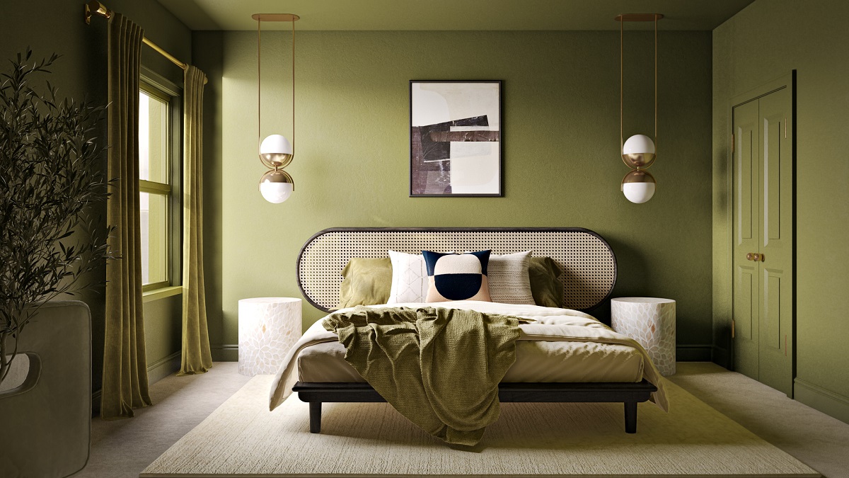
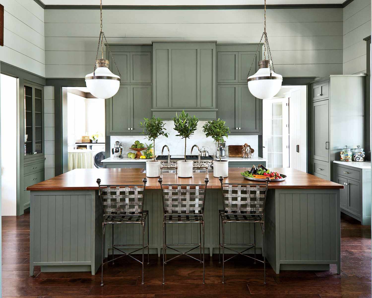
Muted Olive: Natural Opulence
Muted olive is a unique color that brings a sense of natural opulence to any space. This earthy and sophisticated hue blends elements of green and gray, creating a tranquil and luxurious ambiance. Muted olive is perfect for those who crave a quiet luxury aesthetic that is both refined and connected to nature.
Using muted olive as the main color in your interior design creates a sense of serenity and harmony. The understated nature of this color allows it to blend seamlessly with a variety of other tones, making it a versatile choice for different design styles. Whether paired with warm neutrals or contrasting shades, muted olive adds a touch of richness and depth to the space.
To enhance the natural opulence of muted olive, incorporate organic materials and textures into your design. Wooden furniture or accents in warm tones complement the earthy feel of the color. Textiles made from natural fibers, like linen or jute, bring a sense of texture and authenticity to the space.
When choosing complementary colors, consider soft and subtle shades that enhance the natural beauty of muted olive. Light beige, creamy ivory, or warm gray work well to create a harmonious and refined color palette. Accentuate the richness of muted olive by incorporating metallic accents, such as copper or gold, in lighting fixtures or decorative elements.
To add dimension and visual interest, incorporate patterns and prints that incorporate muted olive. Damask, floral, or leaf motifs can bring a touch of elegance and sophistication to the space. Balance the patterns with solid neutrals to maintain a quiet and luxurious ambiance.
In terms of lighting, opt for warm and ambient lighting options. Table lamps or wall sconces with soft, diffused lighting help create an intimate and cozy atmosphere. Adding candles or lanterns can also enhance the natural and opulent feel of the space.
Overall, muted olive brings a sense of natural opulence to your interior design. Its earthy tones and understated elegance create a quiet luxury aesthetic that is both timeless and connected to the beauty of nature.
Conclusion
Incorporating the right colors is key to achieving a quiet luxury aesthetic in your home. The colors discussed – soft ivory, subtle gray, pale blush, dusty blue, and muted olive – each offer their own unique qualities that contribute to a serene and opulent ambiance.
Soft ivory exudes elegance and simplicity, creating a timeless and spacious feel in any room. Subtle gray brings understated sophistication and a soothing atmosphere to your interior design. Pale blush adds a touch of feminine charm and creates a warm and inviting space.
Dusty blue introduces serenity and tranquility, setting the stage for a peaceful and relaxing environment. Muted olive brings natural opulence, connecting your space to the beauty of the outdoors while creating a sense of luxury.
When incorporating these colors, it’s important to consider their versatility and compatibility with other elements in your design. They can be used as primary colors or accents, and their harmonious combination with neutral shades and metallic finishes enhances the overall aesthetic.
In addition to color, texture and lighting play crucial roles in achieving a quiet luxury atmosphere. Incorporating natural materials, like wood and linen, and selecting warm and ambient lighting fixtures further enhance the opulence and tranquility of the space.
By carefully selecting and blending these colors, textures, and lighting options, you can create a quiet luxury interior design that is both visually stunning and emotionally soothing. Your home will become a haven of serenity and elegance, allowing you to unwind and experience the epitome of luxury within the comfort of your own space.
Remember, interior design is a reflection of personal style and taste, so feel free to experiment and customize these color palettes to suit your preferences. Let your creativity flow and enjoy the process of transforming your home into a haven of quiet luxury.
Frequently Asked Questions about What Are The Colors For Quiet Luxury? 5 Colors You Should Consider
Was this page helpful?
At Storables.com, we guarantee accurate and reliable information. Our content, validated by Expert Board Contributors, is crafted following stringent Editorial Policies. We're committed to providing you with well-researched, expert-backed insights for all your informational needs.
0 thoughts on “What Are The Colors For Quiet Luxury? 5 Colors You Should Consider”