Home>Interior Design>Couch Colors To Avoid: And What Designers Suggest Instead
Interior Design
Couch Colors To Avoid: And What Designers Suggest Instead
Modified: October 27, 2024
Looking for interior design inspiration? Discover which couch colors to avoid and get expert suggestions from designers for stunning alternatives.
(Many of the links in this article redirect to a specific reviewed product. Your purchase of these products through affiliate links helps to generate commission for Storables.com, at no extra cost. Learn more)
Introduction
When it comes to interior design, choosing the right colors is crucial for creating a cohesive and visually pleasing space. The colors you select for your furniture, particularly your couch, can set the tone for the entire room. While it’s important to express your personal style, some color choices may not be as timeless or versatile as others. In this article, we will explore the couch colors to avoid and what designers suggest instead.
Designers often advise against certain colors due to their potential to overwhelm a space, clash with other elements, or quickly become outdated. By understanding the limitations and drawbacks associated with these colors, you can make informed decisions that will stand the test of time while still reflecting your personal taste.
So, let’s dive in and explore the colors that designers recommend steering clear of when it comes to couches, along with their expert suggestions for alternative choices that will create a more visually appealing and harmonious living space.
Key Takeaways:
- Avoid overwhelming your space with bold and bright couch colors. Opt for timeless neutrals or muted versions of bold shades to create a harmonious and versatile living environment that can evolve with your design tastes over time.
- Choose alternative white shades and modern color options for your couch to ensure a stylish and practical living space. Embrace sophisticated jewel tones, refined primary colors, and warm neutrals with subtle undertones for a contemporary and timeless look.
Bold and Bright Colors – Reasons to avoid bold and bright colors – Alternative colors suggested by designers
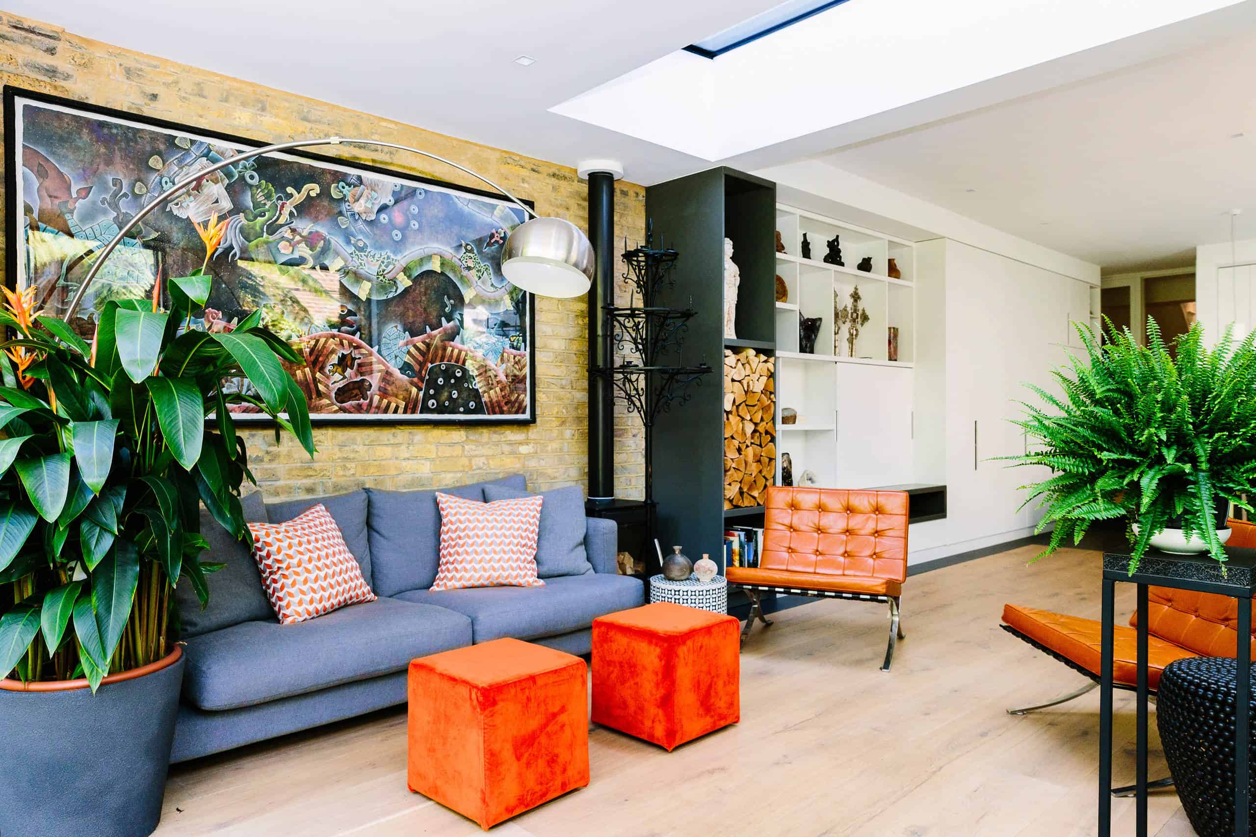
Bold and bright colors can add a pop of energy to a space, but they can also overwhelm the overall aesthetic if not used carefully. One of the main reasons to avoid these colors for your couch is their potential to become visually dominating. A vibrant couch can easily become the focal point of the room and may clash with other elements or make it difficult to change the overall color scheme without replacing the entire couch.
Designers often recommend opting for more neutral and versatile colors for your couch instead. Shades like beige, taupe, and gray are classic choices that can provide a timeless backdrop for the other elements in your room. These neutral hues can be easily complemented by accent pillows, rugs, and artwork, allowing you to inject color and personality into your space without overwhelming it.
If you still desire a pop of color, consider incorporating it through smaller accent pieces like throw pillows or blankets. This way, you can experiment with bolder shades without committing to a couch color that may eventually feel overwhelming or too difficult to style.
Another alternative designers suggest is opting for muted versions of bold colors. For example, rather than a bright red couch, consider a deeper burgundy or a dusty pink. These shades retain the uniqueness and vibrancy of the bold colors while providing a more sophisticated and versatile option for your couch.
Ultimately, the goal is to create a balanced and harmonious space. By choosing more neutral or muted colors for your couch, you create a foundation that allows you to incorporate other colors and elements more easily, ensuring a cohesive and stylish interior that can evolve with your design tastes over time.
Trendy Neutrals – Drawbacks of using trendy neutrals – Recommended alternatives by designers
Neutrals are a popular choice for couch colors as they offer a versatile canvas that can easily adapt to different styles. However, it’s important to be cautious when selecting trendy neutrals, as they may not withstand the test of time and can quickly make your couch look dated.
One of the drawbacks of using trendy neutrals is that they can become a passing fad. Just like fashion trends, interior design trends come and go, and what may be considered on-trend today may be outdated in a few years. Opting for a couch in a trendy neutral color can result in a space that feels tired and out of style sooner than you anticipated.
Instead, designers suggest choosing timeless neutrals that have proven to be enduring and versatile. Classic neutrals like ivory, beige, and charcoal gray are safe bets that can work well with a variety of design styles and color schemes. These colors have a timeless appeal and can easily be updated with accessories or accents to keep your space feeling fresh and current.
While it’s natural to want to incorporate current trends into your interior design, it’s important to do so in a way that can be easily changed or updated. Rather than investing in an entire couch in a trendy neutral, consider incorporating the trend through smaller elements like pillows or throws. This way, you can embrace the current aesthetic without the risk of your couch quickly falling out of fashion.
Ultimately, selecting neutrals that have stood the test of time will provide a more timeless and long-lasting aesthetic for your couch. This allows for greater flexibility when it comes to updating your space and ensures that your investment in a quality couch will continue to pay off for years to come.
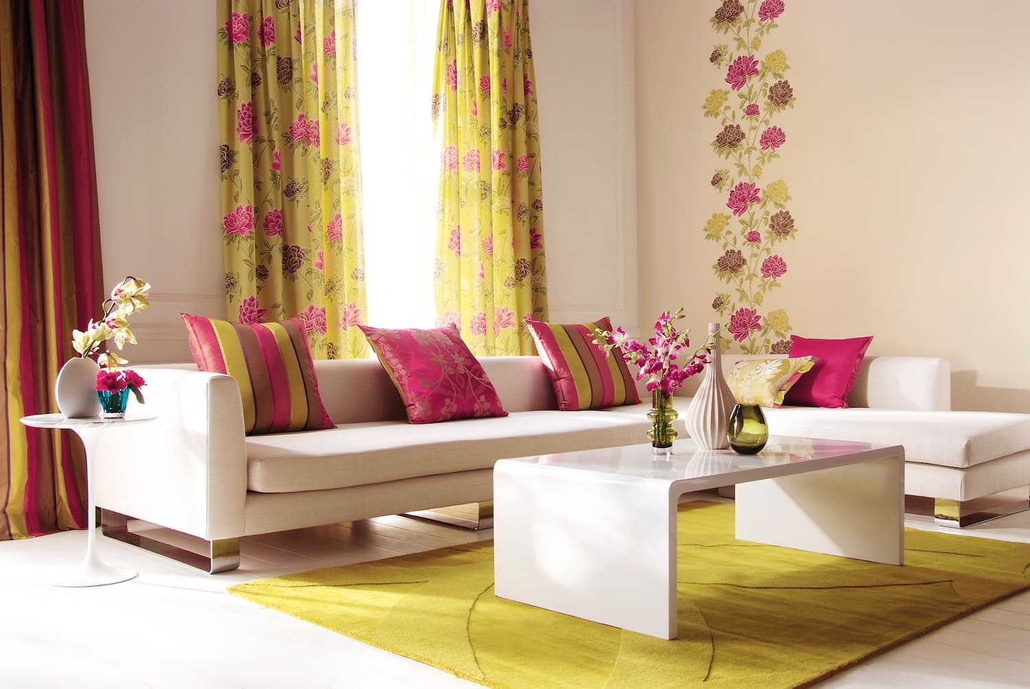
Overwhelming Patterns – Why overwhelming patterns should be avoided – Designers’ suggestions for patterns that work better
Patterns can add visual interest and personality to your couch, but it’s important to be cautious when choosing them. Overwhelming patterns can easily overpower a space and make it feel busy or chaotic. It’s crucial to strike a balance between boldness and harmony in order to create a visually appealing and comfortable living environment.
One of the main reasons to avoid overwhelming patterns on your couch is their potential to clash with other elements in the room. If your couch has a loud and dominant pattern, it can make it challenging to incorporate other patterns or textures in the space without creating visual overload. Additionally, patterns that are too bold or busy may not age well, and you may quickly tire of them.
Designers suggest opting for more subtle and versatile patterns that can enhance the overall aesthetic without overwhelming the space. Geometric patterns, such as herringbone or chevron, can add a touch of modern sophistication without being visually overpowering. These patterns can provide a sense of movement and interest without stealing the spotlight from other design elements in the room.
If you prefer a more organic and nature-inspired look, consider opting for botanical or floral patterns with a softer color palette. These patterns can bring a sense of tranquility and freshness to your space without dominating the overall aesthetic. By choosing patterns that are more muted and understated, you allow the couch to blend seamlessly with the surrounding decor, creating a cohesive and visually pleasing atmosphere.
Remember, less is often more when it comes to patterns on your couch. The goal is to create a balanced and harmonious space that reflects your personal style without overwhelming the senses. By selecting patterns that are visually appealing yet not overpowering, you can achieve a timeless and inviting look that will stand the test of time.
Avoid couch colors that are too trendy or bold, as they may quickly go out of style. Designers suggest opting for neutral tones like beige, gray, or navy, which are timeless and versatile.
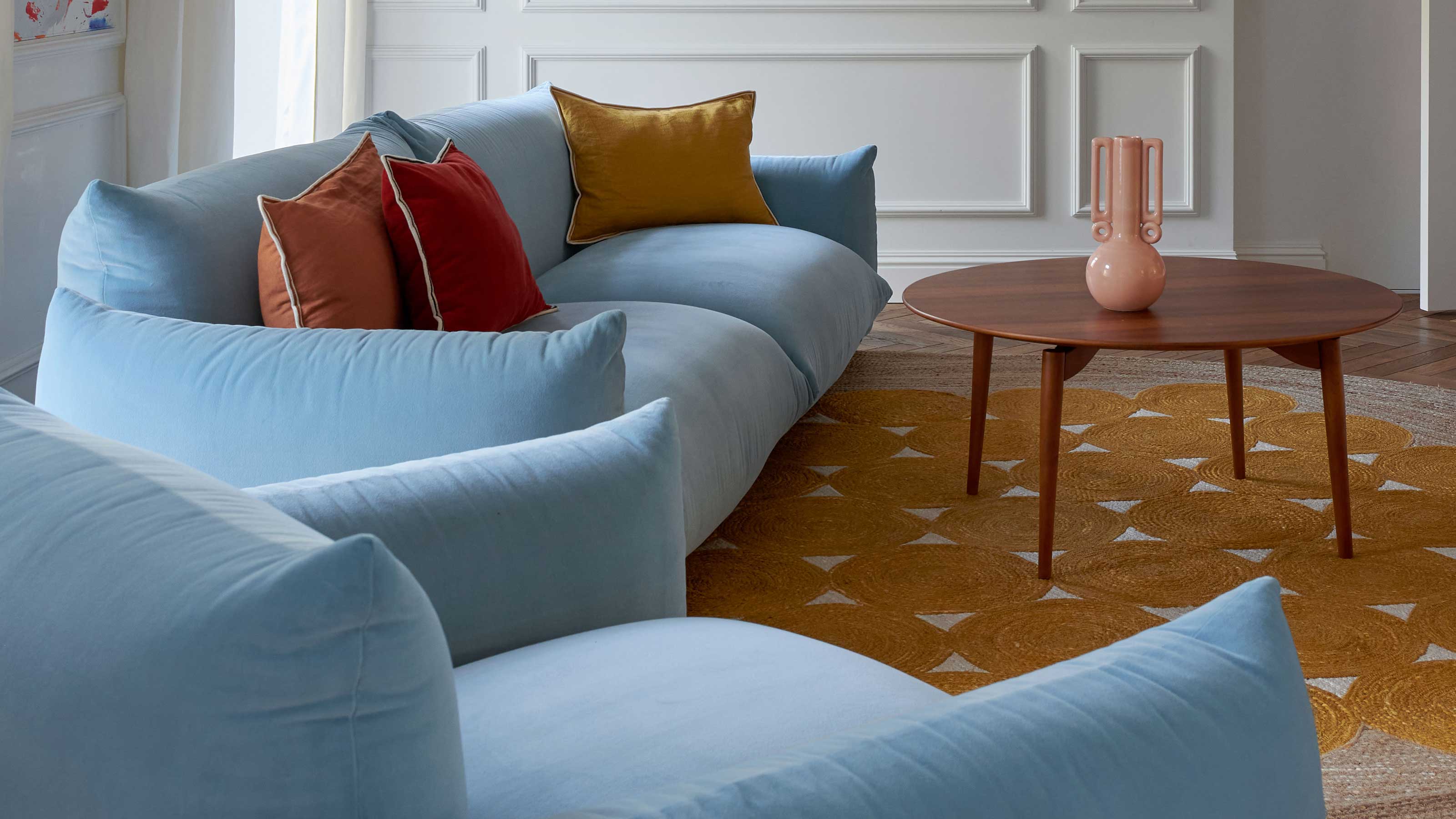
Muted and Monotonous Tones – Issues with muted and monotonous colors – Designer-recommended alternatives to create visual interest
Muted and monotonous tones can create a calm and serene atmosphere, but they can also make a space feel dull and uninspiring. It’s important to strike a balance between creating a soothing environment and infusing visual interest into your space.
One of the issues with using muted and monotonous colors for your couch is the potential for a lack of visual impact. While these tones may create a peaceful ambiance, they can also make your couch blend into the background, resulting in a lack of focal point or statement piece in the room.
To overcome this, designers recommend incorporating contrasting or complementary colors that can create visual interest and bring life to the space. Introducing accent pillows or throws in vibrant hues can add a pop of color and create a focal point around the couch. This not only adds visual interest but also allows you to update the space easily by changing the accessories, rather than investing in a completely new couch.
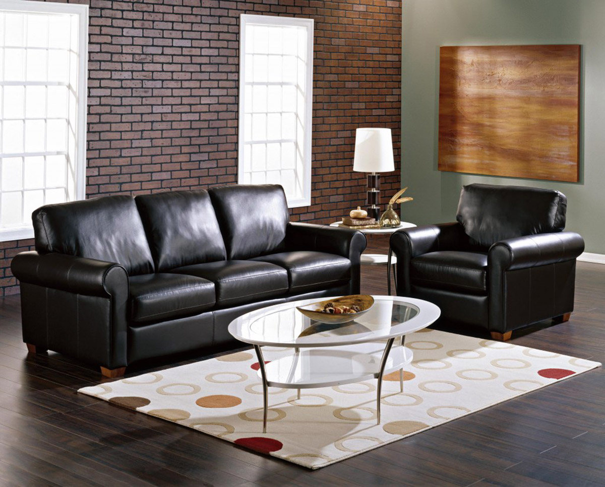
Another alternative is to choose a couch in a neutral tone but with textured upholstery. Fabrics with interesting weaves, subtle patterns, or different finishes can add depth and dimension to your couch, making it visually intriguing without relying solely on color. This can be achieved with materials like velvet, linen, or even leather, which can bring richness and texture to the overall look of the couch.
Furthermore, adding decorative elements like contrast piping or stitching can enhance the overall visual appeal of your couch. These small details can create a sense of craftsmanship and elevate the design while still maintaining a muted and soothing color palette.
The key is to find a balance between muted tones and pops of color or texture. By incorporating these elements strategically, you can create a visually interesting and cohesive space that is both calming and visually captivating.
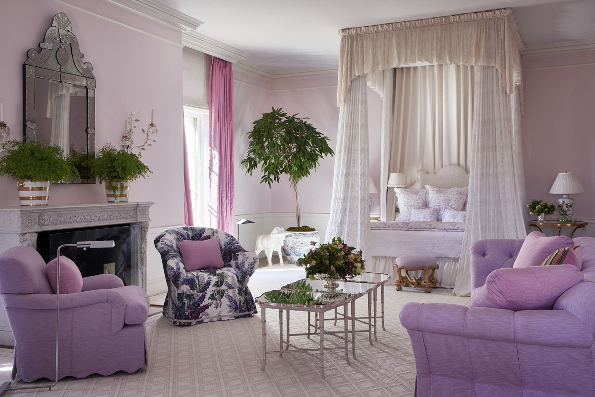
Unflattering Whites – Reasons to reconsider using pure white – Designers’ suggestions for alternative white shades
While white may be a popular choice for its clean and timeless appeal, pure white can sometimes be unflattering and impractical for a couch. There are a few reasons to reconsider using pure white as the color for your couch and alternatives that designers suggest to achieve a similar aesthetic.
One of the main reasons to reconsider pure white is its susceptibility to stains and dirt. A white couch may require constant maintenance and cleaning, making it impractical for those with children or pets, or even for everyday use. Additionally, pure white can also show signs of wear and tear more easily, potentially leading to the couch looking worn and less appealing over time.
Designers often recommend opting for alternative shades of white that are slightly warmer or have subtle undertones. These alternative white shades can still provide a clean and bright appearance while offering a more forgiving and practical option. Off-white or ivory are popular alternatives that provide a softer and more welcoming look, making them more suitable for everyday living.
Another option is to consider a white with a hint of gray or beige. These shades, often referred to as “greige,” offer the best of both worlds by maintaining the crispness and versatility of white while introducing a touch of warmth and depth. Greige shades can create a cozy and inviting atmosphere while still maintaining a fresh and modern look.
Furthermore, selecting a white with a textured fabric can add interest and visual appeal to your couch. Fabrics like linen or boucle can introduce subtle variations in color and texture, giving the couch a luxurious and sophisticated aesthetic.
Ultimately, the goal is to find a white shade that suits your lifestyle and design preferences while also being practical and forgiving in terms of maintenance. By opting for alternative white shades, you can achieve a clean and timeless look without the drawbacks associated with pure white.
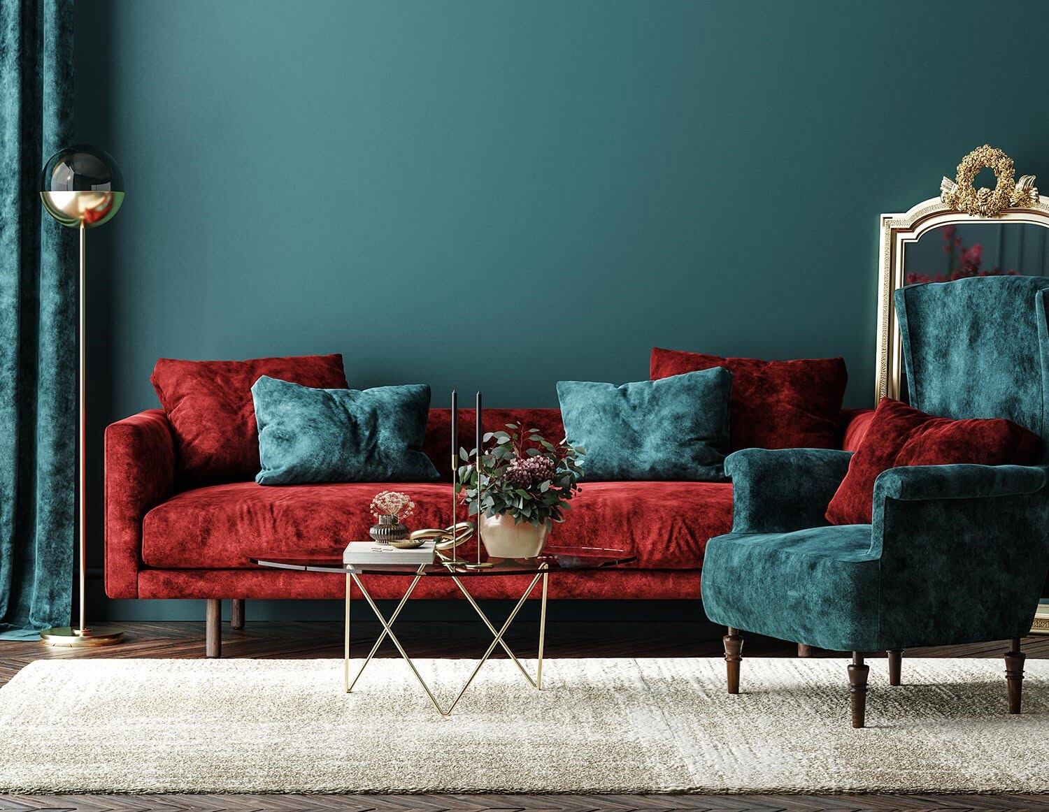
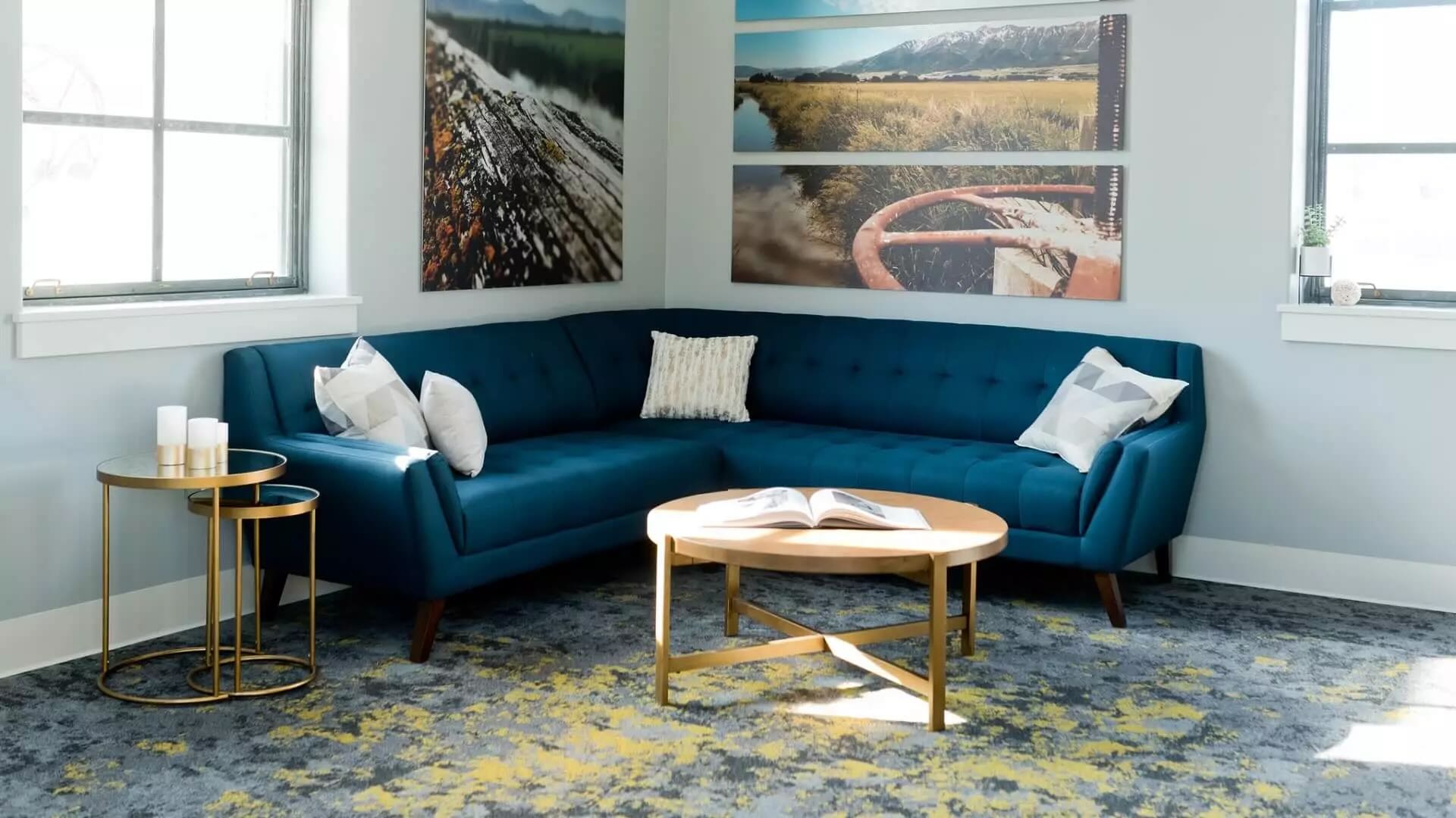
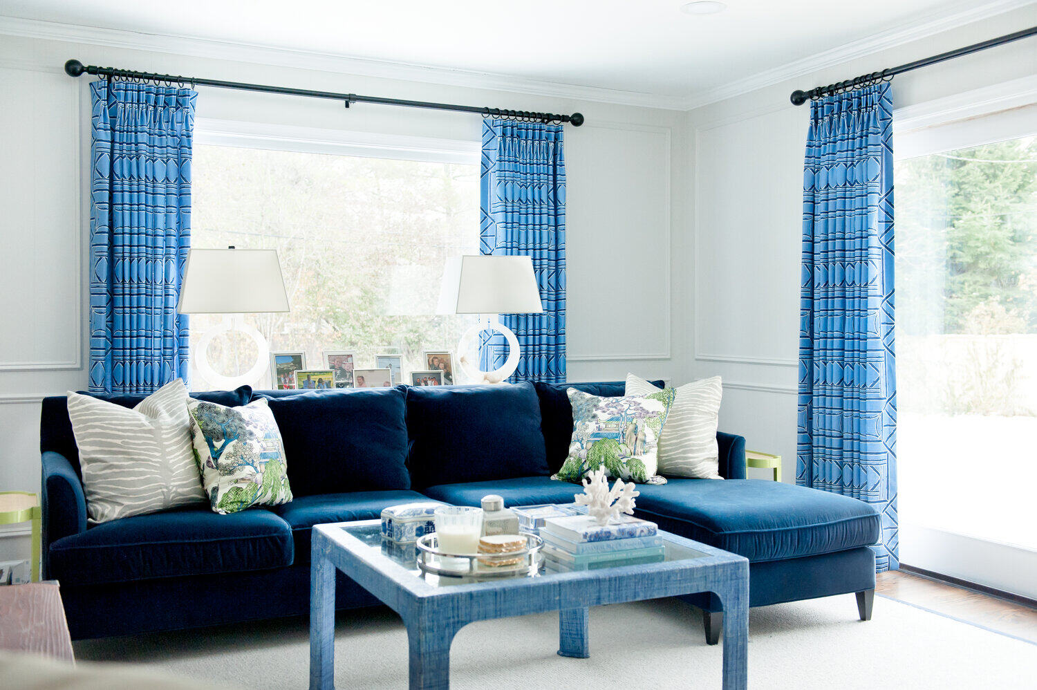
Dated and Distasteful Options – Outdated color choices to steer clear of – Modern and more appealing options suggested by designers
When choosing a color for your couch, it’s important to avoid options that can quickly become dated or fall out of style. Keeping up with modern trends and design aesthetics can ensure that your space feels fresh and appealing. Let’s explore some outdated color choices that designers recommend steering clear of and discover the modern and more appealing alternatives they suggest.
One color choice to avoid is the infamous avocado green or harvest gold. These hues were popular in the 1970s but are now considered retro and outdated. Opting for these colors can create a nostalgic feel, but they may not align with a contemporary and timeless design. Designers suggest ditching these retro colors and instead embracing more sophisticated and versatile options.
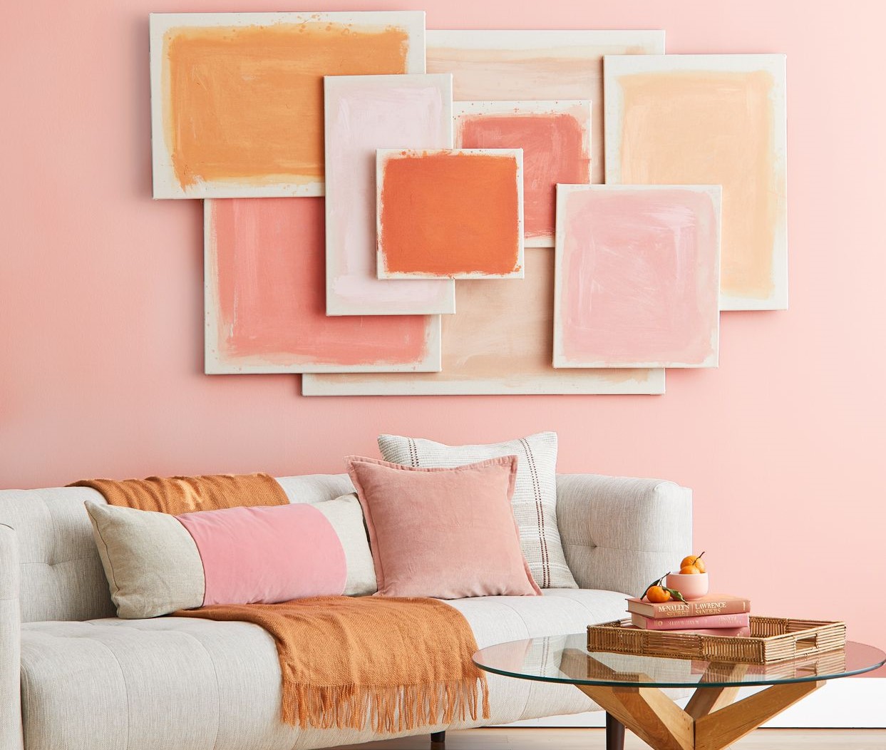
To infuse a modern touch into your space, consider selecting a couch in a deep jewel tone, such as emerald green or sapphire blue. These rich colors bring depth and elegance to your room while still providing a vibrant and luxurious feel. Alternatively, consider a neutral color with a twist, like a warm gray or a muted blush tone. These options offer a more timeless and chic look that won’t go out of style.
Another outdated color to avoid is the overly bright and loud shades of primary colors. While these colors can be appealing to children, they can quickly dominate a space and make it feel juvenile or unrefined. Instead, opt for more refined and mature versions of primary colors. For example, choose a deep navy blue rather than a bright royal blue or a rich burgundy instead of a vibrant red. These sophisticated variations offer a modern and stylish look while still maintaining the essence of the primary colors.
Furthermore, beige and tan tones that lack depth and character are also considered outdated choices. Instead, designers recommend opting for warm neutrals with subtle undertones, such as greige or taupe. These colors provide a sense of depth and sophistication, adding a contemporary and inviting feel to your space.
By avoiding dated color choices and embracing modern alternatives, you can create a home that reflects your personal style while still staying on-trend. Keeping your couch color palette fresh and appealing will ensure that your space remains visually engaging and appealing for years to come.
Conclusion
Choosing the right color for your couch is a key decision in interior design. It sets the tone for the entire room and can greatly impact the overall aesthetic and ambiance. By understanding the couch colors to avoid and the alternative options suggested by designers, you can create a space that is visually appealing, timeless, and reflective of your personal style.
Avoiding bold and bright colors is recommended to prevent overwhelming the space and potentially clashing with other elements. Instead, opt for neutral or muted shades that provide a versatile backdrop and allow for easy incorporation of accent colors through accessories.
Trendy neutrals may quickly date your couch, so it’s advisable to choose timeless neutrals that have proven to withstand changing design trends. This way, you can achieve a classic and enduring look that can be easily updated with accessories and accents.
Overwhelming patterns can make a space feel chaotic and limit your ability to incorporate other patterns or textures. Choosing subtle and versatile patterns, or incorporating texture through upholstery, allows you to enhance your couch’s visual appeal without overwhelming the room.
While white is a popular choice, it can be prone to stains and show signs of wear and tear. Opting for alternative white shades, like off-white or greige, provides a clean and welcoming look that is more forgiving and practical for everyday use.
Avoiding dated and distasteful options, such as retro colors and overly bright primary hues, ensures your couch remains stylish and modern. Opt for modern alternatives like jewel tones, refined primary colors, or warm neutrals with subtle undertones for a contemporary and sophisticated look.
In conclusion, being mindful of color choices for your couch is essential for creating a harmonious and visually appealing space. By avoiding certain colors that can quickly become overwhelming, dated, or impractical, and instead opting for alternative shades suggested by designers, you can create a couch color palette that is timeless, versatile, and reflective of your personal style.
Remember, the goal is to create a comfortable and visually engaging environment that you can enjoy for years to come. Choose colors that resonate with you, consider the advice of designers, and let your creativity shine through as you design your perfect living space.
Frequently Asked Questions about Couch Colors To Avoid: And What Designers Suggest Instead
Was this page helpful?
At Storables.com, we guarantee accurate and reliable information. Our content, validated by Expert Board Contributors, is crafted following stringent Editorial Policies. We're committed to providing you with well-researched, expert-backed insights for all your informational needs.


0 thoughts on “Couch Colors To Avoid: And What Designers Suggest Instead”