Home>Storage Ideas>Bathroom Storage>5 Colors To Avoid In A Bathroom
Bathroom Storage
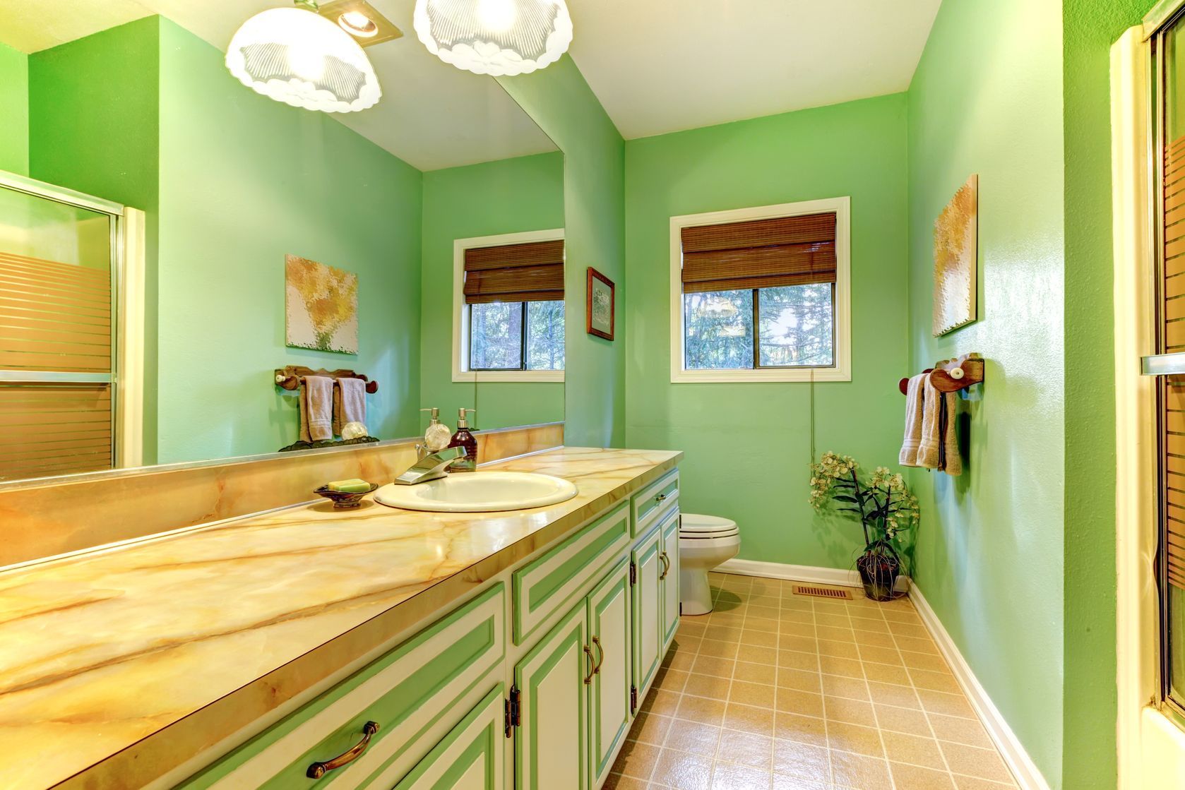
5 Colors To Avoid In A Bathroom
Modified: December 7, 2023
Looking to optimize your bathroom storage? Discover 5 colors to avoid in a bathroom for a functional and stylish space.
(Many of the links in this article redirect to a specific reviewed product. Your purchase of these products through affiliate links helps to generate commission for Storables.com, at no extra cost. Learn more)
Introduction
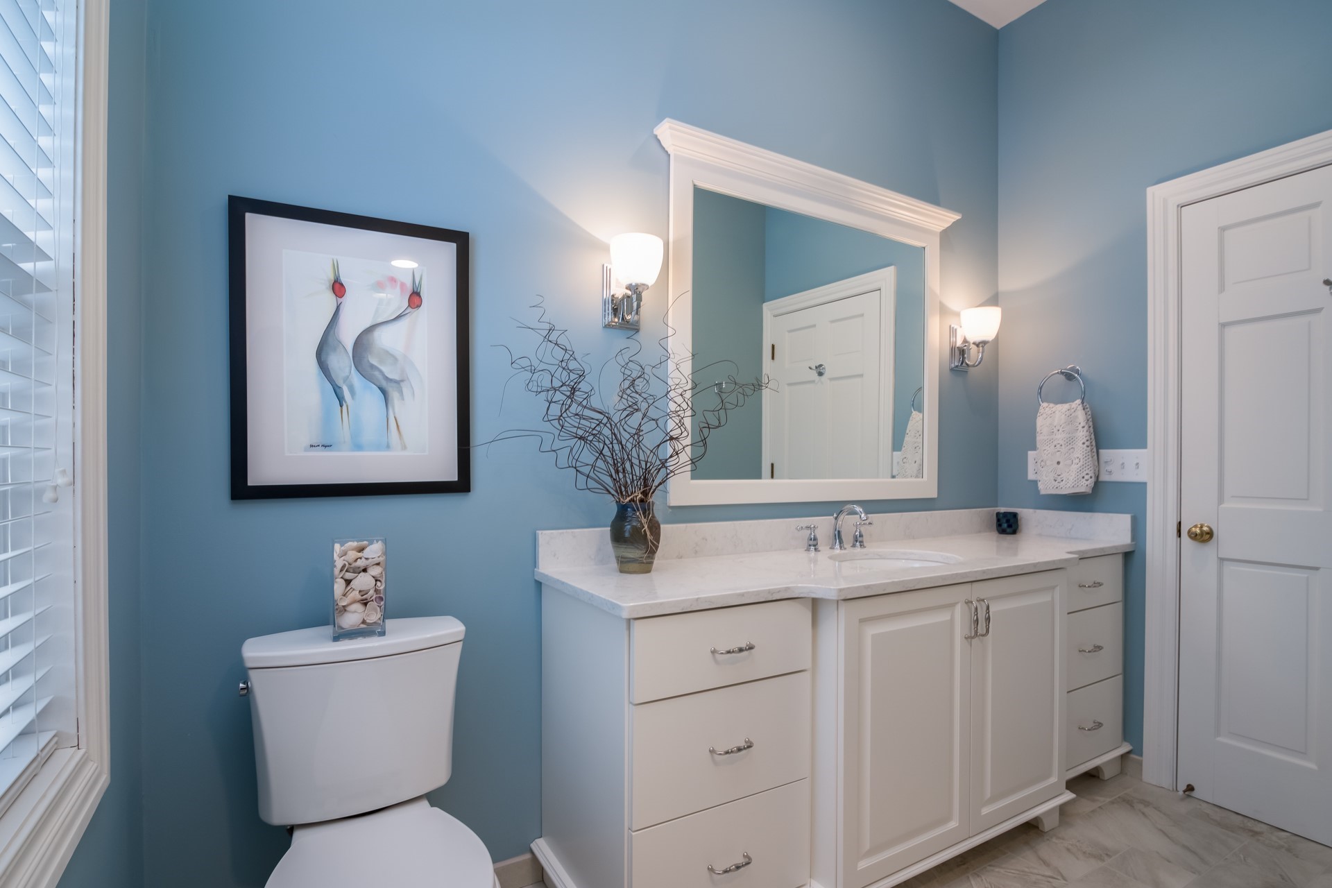
When it comes to bathroom design, color plays a crucial role in creating a harmonious and inviting space. The right choice of colors can transform a simple bathroom into a sanctuary of relaxation, while the wrong colors can make the room feel cramped and uninviting. While personal preferences and style trends can influence color choices, there are certain colors that are best avoided in a bathroom.
In this article, we will explore five colors that should be avoided when it comes to bathroom design. These colors can have a negative impact on the overall aesthetic and functionality of your bathroom. By understanding these color choices and their potential drawbacks, you can make informed decisions when designing or remodeling your bathroom space.
Key Takeaways:
- Avoid red, black, dark brown, dark gray, and vibrant yellow in your bathroom design. Opt for soothing, light colors to create a tranquil and inviting space for relaxation and self-care.
- When choosing bathroom colors, consider light and airy tones to reflect light and create a sense of openness. Avoid intense and dark colors that can make the space feel cramped and unwelcoming.
Red
Despite being a bold and attention-grabbing color, red is generally not recommended for bathroom design. Red can be overwhelming in small spaces, causing the room to feel smaller and confining. It can also create a sense of urgency or intensity, which is not ideal for a space that is meant to be a calming retreat.
In addition to its visual impact, red is also associated with high energy and stimulation. This can make it difficult to unwind and relax in a bathroom that is predominantly red. It is important to create a serene and tranquil atmosphere in the bathroom, and red can create an opposite effect.
Furthermore, red can be a challenging color to coordinate with other bathroom elements such as fixtures, tiles, and accessories. It can clash with other colors or create an overwhelming visual effect when combined with certain materials. If you still want to incorporate red into your bathroom, consider using it as an accent color in small doses or opting for shades like coral or muted burgundy that have a softer and more soothing effect.
Overall, it is best to steer clear of red when it comes to bathroom design. There are plenty of other color options that can create a more calming and inviting atmosphere in your bathroom space.
Black
While black can be an elegant and sophisticated color choice for certain rooms in the house, it is generally not recommended for bathrooms. One of the main reasons to avoid black in the bathroom is that it tends to absorb light rather than reflect it. This can make the space feel dark, gloomy, and even smaller than it actually is.
In addition, black can show water spots, fingerprints, and other marks more easily, requiring frequent cleaning and maintenance to keep the bathroom looking pristine. This can be particularly challenging in a high-traffic area like the bathroom, where moisture and humidity are common.
Another consideration when using black in the bathroom is that it can be difficult to match with other colors, especially lighter shades. Pairing black with other colors may result in a stark contrast that can be visually jarring.
If you still want to incorporate black into your bathroom design, consider using it as an accent color rather than the main color. Use black sparingly in accessories, such as towel hooks or soap dispensers, to add a touch of sophistication without overwhelming the space.
Ultimately, it is important to strike a balance between style and functionality when choosing colors for your bathroom. While black may look sleek and stylish, it is important to consider the practicality and overall ambiance it will create in the space.
Avoid using dark and intense colors like black, deep red, and navy blue in a bathroom as they can make the space feel smaller and less inviting. Stick to lighter, softer tones to create a more spacious and relaxing atmosphere.
Dark Brown
Dark brown may seem like a warm and inviting color choice for a bathroom, but it can have some drawbacks that make it less than ideal. Like black, dark brown has a tendency to absorb light rather than reflect it. This can make the space feel dim and smaller, especially if the bathroom has limited natural light.
Furthermore, dark brown can create a sense of heaviness and make the room appear outdated or cramped. In smaller bathrooms, it is important to create an open and airy feel, and dark brown can work against this goal.
Another consideration with dark brown is its potential to show water spots and stains more prominently. This can be a challenge in a bathroom where water and moisture are present on a regular basis. Dark brown surfaces may require more frequent cleaning and maintenance to keep them looking fresh and free of water marks.
If you still want to incorporate brown tones in your bathroom design, consider opting for lighter shades of brown or incorporating it as an accent color. Lighter shades of brown can still bring warmth to the space without creating a heavy or claustrophobic feel. Pairing it with lighter colors or using it in small doses, such as in accessories or ceramic tiles, can create a balanced and visually appealing bathroom design.
Ultimately, it is important to consider the size of your bathroom, the amount of natural light, and the overall ambiance you wish to create when choosing colors. While dark brown can bring a sense of warmth and richness, it may not be the most suitable choice for every bathroom space.
Dark Gray
Although gray has become a popular color choice in interior design, opting for a dark gray in the bathroom may not be the best decision. Dark gray can create a sense of dreariness and make the space feel cold and uninviting. It can also give the impression of a lack of cleanliness, as any dust or water spots will be more noticeable on a dark gray surface.
Another consideration with dark gray is its impact on the overall lighting of the bathroom. Similar to black and dark brown, dark gray tends to absorb light rather than reflect it. This can make the room feel smaller and more confined, especially if the bathroom lacks natural light sources.
Additionally, dark gray can be challenging to match with other colors and materials. It may limit your options when it comes to coordinating bathroom fixtures, tiles, and accessories. This can make it difficult to create a cohesive and visually pleasing bathroom design.
If you still want to incorporate gray into your bathroom, consider opting for lighter shades of gray. Light gray can create a more open and airy feel while still providing a neutral backdrop for other colors and elements in the bathroom. Pairing light gray with white or pastel shades can create a fresh and modern look.
Remember, the goal of a bathroom is to create a tranquil and relaxing space. By avoiding dark gray, you can ensure that your bathroom feels bright, welcoming, and visually appealing.
Vibrant Yellow
Yellow is often associated with brightness and positivity, but using vibrant yellow in a bathroom can be overwhelming and have some drawbacks. While a splash of yellow can add a cheerful touch to a space, opting for a vibrant and intense shade of yellow can make the bathroom feel too energetic and intense.
One of the main concerns with vibrant yellow is its potential to create visual fatigue. A bright and bold yellow can be visually stimulating, making it difficult to relax and unwind in the bathroom. This is especially important considering that bathrooms are often used as a sanctuary for relaxation and self-care.
Another consideration with vibrant yellow is its ability to reflect light. While this can create a brighter and more spacious feel, it can also lead to an excessive glare, particularly if the bathroom receives a lot of natural light. This can make the space uncomfortable and harsh on the eyes.
Furthermore, vibrant yellow can be challenging to coordinate with other colors and materials. It may clash with certain fixtures, tiles, or accessories, making it difficult to create a cohesive and visually pleasing bathroom design.
If you still want to incorporate yellow into your bathroom, consider opting for softer and muted shades of yellow. Pale yellows or pastel tones can still bring a touch of warmth and brightness without overwhelming the space. Pairing yellow with neutral colors, such as white or light gray, can create a harmonious and calming combination.
Remember, the goal of a bathroom is to create a serene and soothing environment. By avoiding vibrant yellow, you can ensure that your bathroom feels relaxing, inviting, and visually appealing.
Frequently Asked Questions about 5 Colors To Avoid In A Bathroom
Was this page helpful?
At Storables.com, we guarantee accurate and reliable information. Our content, validated by Expert Board Contributors, is crafted following stringent Editorial Policies. We're committed to providing you with well-researched, expert-backed insights for all your informational needs.

0 thoughts on “5 Colors To Avoid In A Bathroom”