Articles
What Rug Colors Go With Grey Couch
Modified: January 19, 2024
Discover the perfect rug colors to complement your grey couch with our informative articles. From neutral shades to bold hues, find the ideal match for your living space.
(Many of the links in this article redirect to a specific reviewed product. Your purchase of these products through affiliate links helps to generate commission for Storables.com, at no extra cost. Learn more)
Introduction
When it comes to interior design, finding the perfect color scheme can make all the difference in creating a cohesive and visually appealing space. And if you have a grey couch as your centerpiece, you may be wondering what rug colors will complement it best.
Grey couches are a popular choice for many homeowners due to their versatile and sophisticated look. The neutral tone of the couch allows for a wide range of options when it comes to choosing rug colors. Whether you prefer a bold and vibrant statement or a more subtle and complementary blend, there are several factors to consider before deciding on the perfect rug color for your grey couch.
In this article, we will explore the different factors to consider when choosing rug colors for grey couches. We will look at neutral rug colors that provide a classic and timeless look, bold rug colors that add a pop of excitement, subtle rug colors that create a harmonious ambiance, and the role of patterns and prints in enhancing the overall aesthetic.
By the end of this article, you will have the knowledge and inspiration needed to select the ideal rug color that complements your grey couch and elevates the overall style of your living space.
Key Takeaways:
- When choosing a rug color for your grey couch, consider factors like overall color scheme, intensity, and personal preference. Neutral, bold, subtle colors, and patterns all offer unique ways to enhance your living space.
- Rug colors play a crucial role in transforming your living space. From creating a harmonious backdrop to adding a striking contrast, the right rug color can elevate the style and ambiance of your room.
Read more: What Color Pillows Go With A Grey Couch
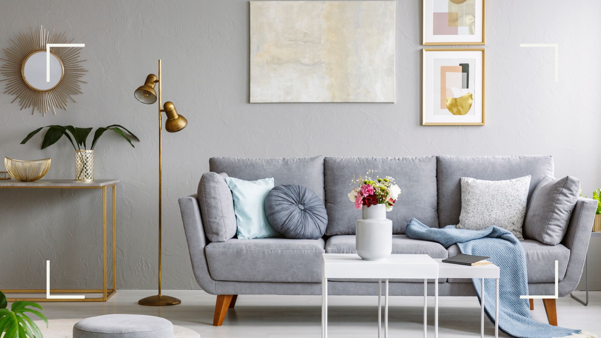
Understanding Grey Couches
Before delving into the world of rug colors, it’s important to have a solid understanding of grey couches and their characteristics. Grey is often considered a neutral color, making it a versatile choice for furniture. It can range from light shades of silver to deep, charcoal tones.
Grey couches are incredibly popular due to their ability to seamlessly blend into various design styles. They provide a modern and sophisticated look that can complement both contemporary and traditional interiors. Additionally, grey couches have the unique ability to transition between different color palettes, allowing for endless possibilities when it comes to choosing rug colors.
One advantage of grey couches is their ability to create a visually calming and soothing atmosphere. They have a calming effect on the space and can serve as a neutral canvas for other elements to shine. Grey couches also tend to be less prone to showing stains and dirt, making them a practical choice for households with pets or children.
Another advantage of grey couches is their versatility in coordinating with various accent colors. Whether you prefer a monochromatic color scheme, a complementary palette, or even a contrasting pop of color, grey couches can accommodate it all. With the right choice of rug colors, you can enhance the style and ambiance of your living space.
Now that we have a better understanding of grey couches, let’s explore the factors to consider when choosing rug colors that will complement your couch.
Factors to Consider When Choosing Rug Colors
When selecting rug colors to pair with your grey couch, there are several factors to consider. These factors will help you achieve a balanced and cohesive look in your living space. Let’s take a closer look at each one:
- Overall Color Scheme: Consider the existing color scheme in your room. Take into account the colors of your walls, curtains, and other furniture pieces. Determine whether you want your rug color to blend seamlessly or make a bold statement.
- Intensity and Contrast: Consider the level of contrast you want to achieve. A muted or tonal rug color can create a harmonious and calming effect, while a contrasting color can add a vibrant pop to the room. Assess the level of impact you desire.
- Size and Shape: Consider the size and shape of your rug. A larger rug can anchor the space and create a sense of coziness, while a smaller rug can add a touch of color without overpowering the room. Additionally, choose a rug shape that complements the shape of your couch and the layout of the room.
- Lighting and Natural Elements: Take into account the natural lighting in your space. Natural light can greatly affect the appearance of colors. Additionally, consider any natural elements, such as wood or stone, present in your room. Harmonize your rug color with these elements for a cohesive look.
- Personal Preference: Above all, consider your personal preference and the atmosphere you want to create. Your home should reflect your style and personality. Choose rug colors that resonate with you and evoke the desired mood and ambiance.
By considering these factors, you can narrow down the options and select rug colors that will enhance the beauty of your grey couch and create a visually stunning living space. Now, let’s explore some specific rug color options that complement grey couches.
Neutral Rug Colors for Grey Couches
Neutral rug colors are a timeless and versatile option for complementing grey couches. They create a harmonious and balanced look, allowing the couch to take center stage while providing a subtle enhancement to the overall aesthetic of the space. Here are some neutral rug color options that work well with grey couches:
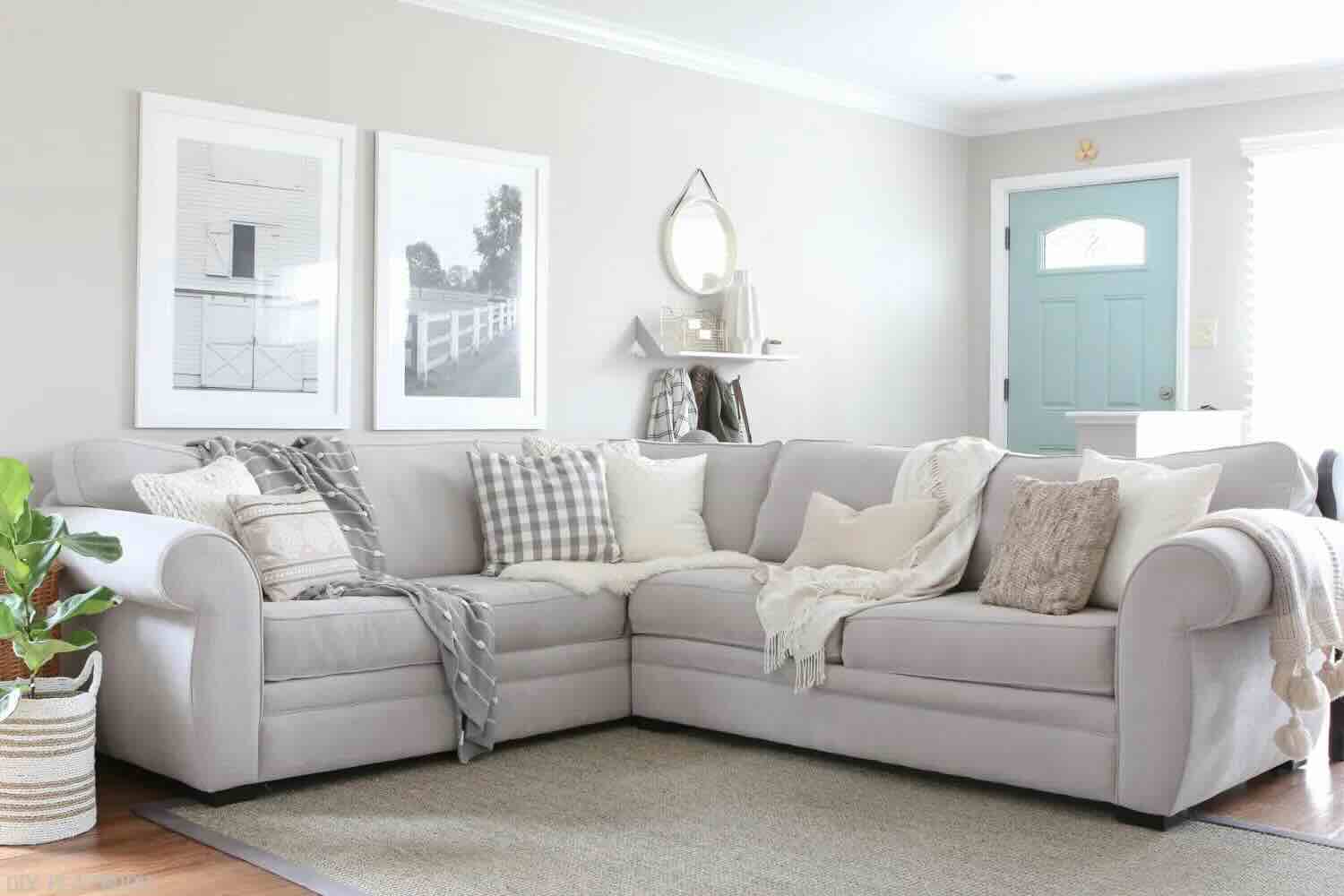
- Beige: Beige rugs offer a warm and inviting feel, creating a cozy atmosphere. The softness of beige complements the cool tones of grey, resulting in an elegant and sophisticated look.
- Cream: Cream rugs add a touch of lightness and airiness to a room with a grey couch. The combination of cream and grey creates a clean and serene ambiance, perfect for creating a relaxing living space.
- Taupe: Taupe rugs bring a sense of depth and richness to a room with a grey couch. This earthy tone complements the neutral tones of grey, creating a warm and inviting environment.
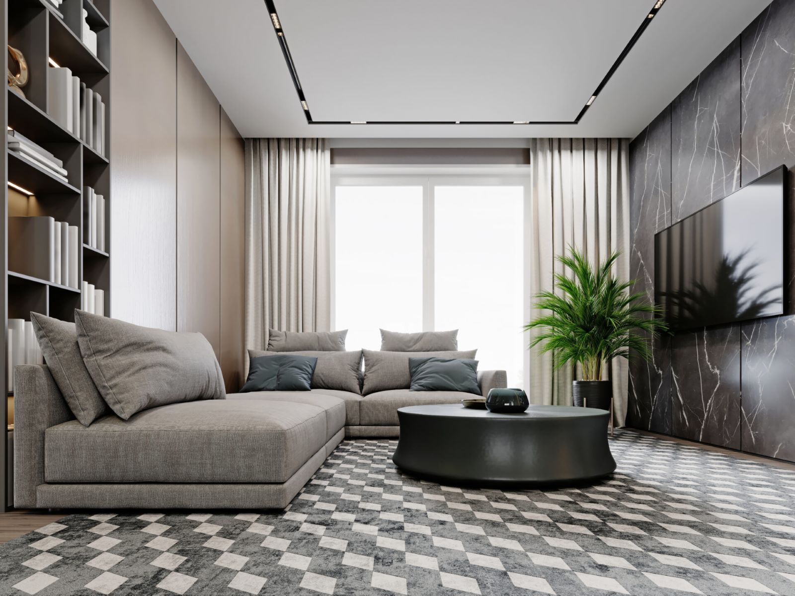
- Charcoal: While technically a shade of grey, a charcoal rug can work well with a lighter grey couch. The contrast creates a sophisticated and modern look, adding depth and dimension to the space.
- Natural Fiber: Natural fiber rugs, such as jute or sisal, provide a textural element that complements the simplicity of a grey couch. These rugs add warmth and a touch of earthiness to the room.
When choosing a neutral rug color, consider the shade and texture that best fits your style and complements the overall design of your space. Neutral rug colors can be a safe and elegant choice, providing a timeless foundation for your grey couch.
Next, let’s explore some bolder rug color options that can add a pop of excitement to your living space.
When choosing a rug color to go with a grey couch, consider a rug in a complementary color such as navy, teal, or mustard yellow to add a pop of color to the room. Alternatively, a neutral rug in shades of cream, beige, or charcoal can create a cohesive and calming look.
Bold Rug Colors for Grey Couches
If you want to make a statement and add a touch of vibrancy to your living space, bold rug colors are the way to go. Pairing a bold rug color with a grey couch can create a bold and eye-catching look. Here are some bold rug color options that work well with grey couches:
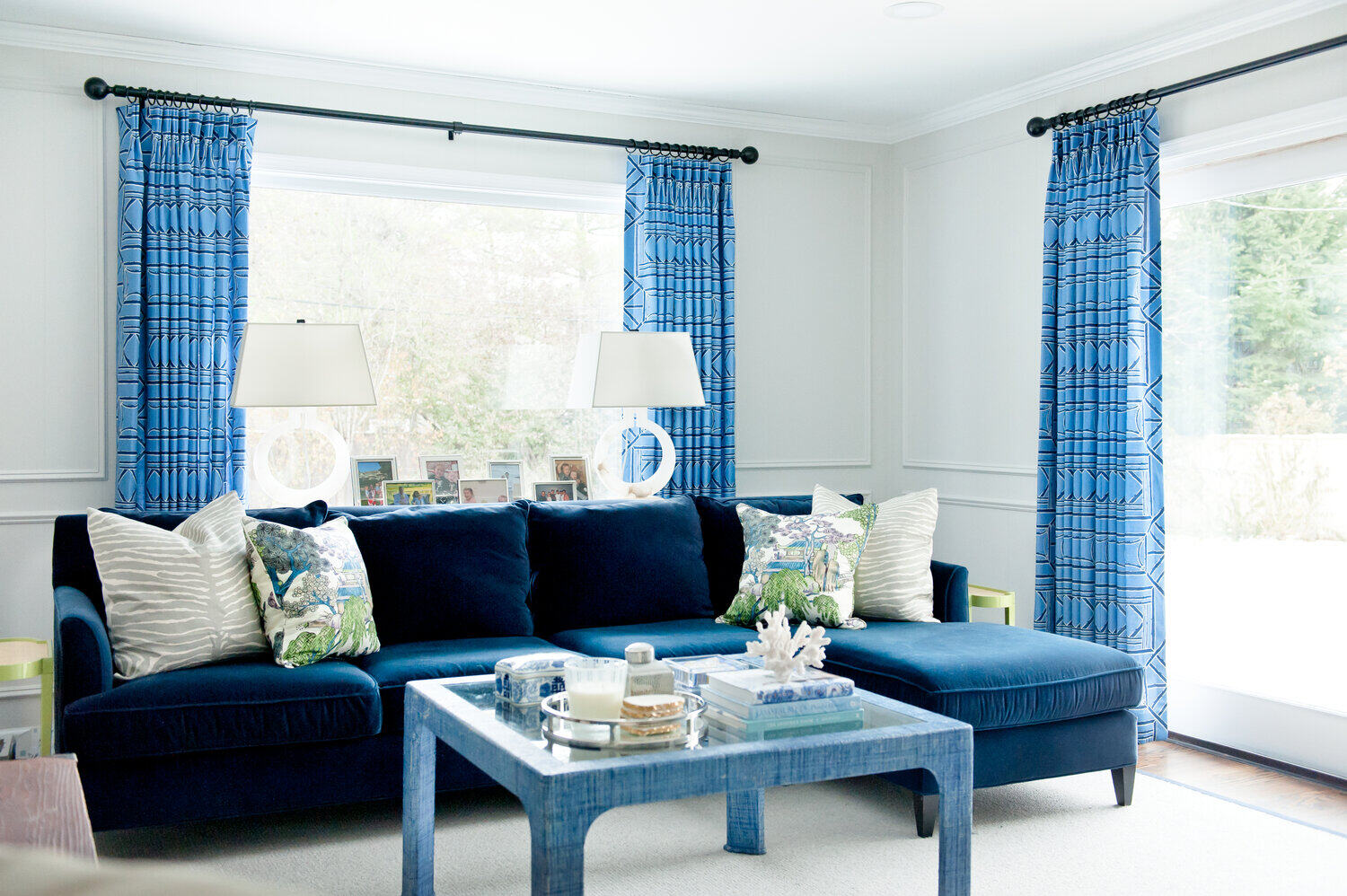
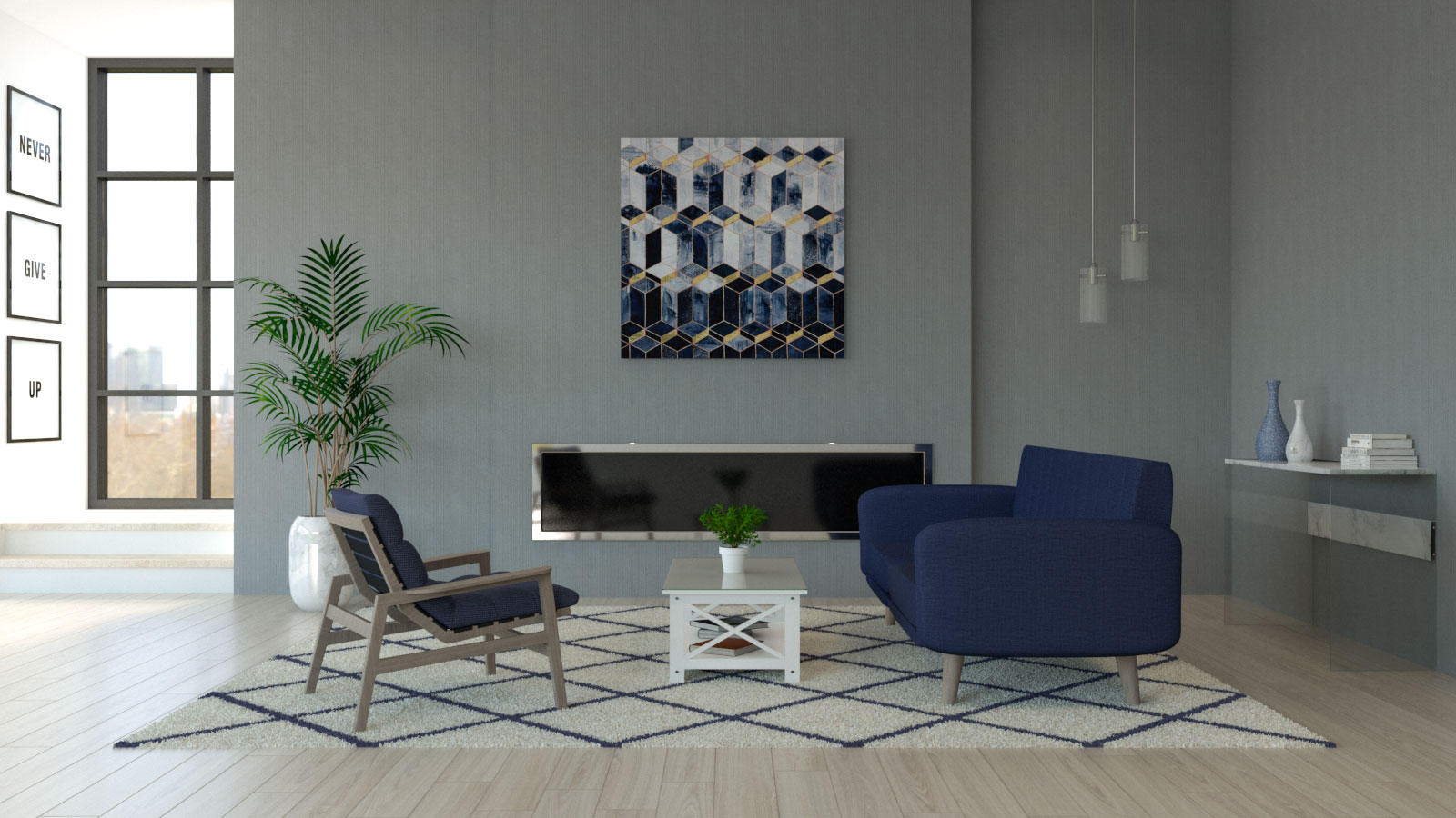
- Deep Blue: A deep blue rug can create a stunning contrast against a grey couch. This combination evokes a sense of sophistication and elegance, adding depth and visual interest to the room.
- Emerald Green: For a luxurious and vibrant look, consider an emerald green rug. This bold color adds a pop of nature-inspired freshness and creates a mesmerizing visual impact when paired with a grey couch.
- Rich Red: A rich red rug can infuse warmth and drama into your living space. This bold hue brings an element of passion and energy, creating a captivating focal point with your grey couch.
- Sunny Yellow: If you want to create a cheerful and lively ambiance, opt for a sunny yellow rug. This vibrant color instantly brightens up the room and pairs beautifully with the cool tones of grey.
- Fuchsia: For a bold and modern aesthetic, consider a fuchsia rug. This vivid pink hue adds a sense of playfulness and personality, creating a visually stunning contrast with the grey couch.
When choosing a bold rug color, consider the overall color scheme and the desired level of impact. The key is to strike a balance and create a cohesive look that showcases your style and personality.
Now, let’s move on to exploring subtle rug colors that can create a harmonious ambiance with your grey couch.
Read more: What Color Recliner Goes With Grey Couch
Subtle Rug Colors for Grey Couches
If you prefer a more subdued and understated look, opting for subtle rug colors can create a harmonious and calming ambiance with your grey couch. These colors provide a gentle touch of color without overpowering the space. Here are some subtle rug color options that work well with grey couches:
- Pale Pink: A pale pink rug can add a touch of femininity and softness to your living space. This subtle color creates a serene and delicate atmosphere when paired with a grey couch.
- Muted Green: Soft, muted shades of green, such as sage or mint, can create a soothing and natural ambiance. The combination of green and grey evokes a sense of tranquility and a connection to the outdoors.
- Lavender: For a calming and ethereal look, consider a lavender rug. This delicate hue adds a touch of elegance and creates a serene and dreamy atmosphere in your living space.
- Dusty Blue: Dusty blue rugs offer a subtle hint of color that complements the cool tones of grey. This combination creates a serene and tranquil ambiance, perfect for creating a relaxing atmosphere.
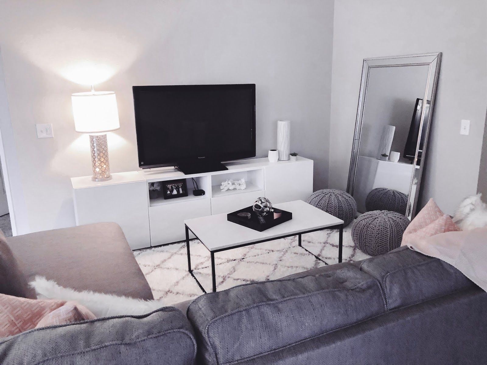
- Soft Grey: If you want to maintain a monochromatic look, choose a soft grey rug. This subtle yet stunning combination maintains a cohesive and sophisticated aesthetic, allowing your grey couch to be the focal point.
When selecting a subtle rug color, consider the undertones and shades that best complement your grey couch. Subtle rug colors create a calming and cohesive look, allowing for a relaxing and harmonious living space.
Finally, let’s explore the role of patterns and prints in enhancing the overall aesthetic with your grey couch.
Patterns and Prints for Rug Colors with Grey Couches
When it comes to rug colors for grey couches, patterns and prints can add a dynamic and visually captivating element to your living space. They can introduce texture, depth, and personality to the room. Here are some popular patterns and prints that work well with grey couches:
- Geometric Patterns: Geometric patterns, such as chevron, herringbone, or diamond motifs, can create a modern and contemporary look. These patterns add a sense of structure and visual interest to the room, augmenting the sleekness of a grey couch.
- Floral Prints: Floral prints can bring a touch of nature and femininity to your living space. Choose floral patterns with grey undertones or soft pastel hues to complement the grey couch and create a fresh and inviting atmosphere.
- Stripes: Striped rugs can create a sense of movement and energy in the room. Opt for horizontal or vertical stripes in varying thicknesses to add visual interest and complement the lines of your grey couch.
- Oriental or Persian Patterns: Oriental or Persian-inspired patterns offer a timeless and luxurious look. These intricate designs add depth and a touch of elegance to the room, creating a stunning contrast against the simplicity of a grey couch.
- Abstract or Art-inspired Designs: Embrace your creative side with abstract or art-inspired rug designs. These bold and expressive patterns add a unique touch to the space, showcasing your personality and creating a visually captivating focal point.
When incorporating patterns and prints, consider the scale and proportion of the rug to ensure it complements the size of your grey couch and the overall layout of the room. Additionally, choose patterns and prints that resonate with your personal style and complement the existing elements in your space.
With these pattern and print options, you can add personality and visual intrigue to your living space, elevating the style and creating a truly unique atmosphere.
Now that we have explored various rug color options, it’s time to wrap up our article.
Conclusion
Choosing the perfect rug color to complement your grey couch is an exciting opportunity to enhance the overall style and ambiance of your living space. By considering factors such as the overall color scheme, intensity and contrast, size and shape, lighting, natural elements, and your personal preference, you can narrow down the options and find the ideal rug color.
Neutral rug colors like beige, cream, taupe, charcoal, and natural fibers offer a timeless and versatile choice that creates a harmonious backdrop for your grey couch. Bold rug colors like deep blue, emerald green, rich red, sunny yellow, and fuchsia can create a striking contrast and add vibrancy to the room. Subtle rug colors such as pale pink, muted green, lavender, dusty blue, and soft grey provide a calming and understated look that complements the cool tones of grey.
Incorporating patterns and prints into your rug choice can introduce texture, depth, and personality to the room. Whether you opt for geometric patterns, floral prints, stripes, oriental or Persian designs, or abstract and art-inspired motifs, patterns can create a visually captivating focal point that enhances the overall aesthetic.
Remember, as you choose the rug color for your grey couch, consider your personal style, the atmosphere you want to create, and the existing elements in your space. Your home should reflect your personality and provide a comfortable and visually pleasing environment for you and your guests.
With the right rug color, you can transform your living space and create a cohesive, stylish, and inviting ambiance that perfectly complements your grey couch. So go ahead, explore the options, trust your instincts, and transform your living space into a place you love to call home.
Frequently Asked Questions about What Rug Colors Go With Grey Couch
Was this page helpful?
At Storables.com, we guarantee accurate and reliable information. Our content, validated by Expert Board Contributors, is crafted following stringent Editorial Policies. We're committed to providing you with well-researched, expert-backed insights for all your informational needs.


0 thoughts on “What Rug Colors Go With Grey Couch”