Home>Interior Design>The 5 Mistakes To Avoid When Decorating With Gray
Interior Design
The 5 Mistakes To Avoid When Decorating With Gray
Modified: January 18, 2024
Avoid these 5 interior design mistakes when decorating with gray. Transform your space with this versatile color palette.
(Many of the links in this article redirect to a specific reviewed product. Your purchase of these products through affiliate links helps to generate commission for Storables.com, at no extra cost. Learn more)
Introduction
When it comes to interior design, one color that has gained immense popularity in recent years is gray. Its versatility and timeless appeal make it a go-to choice for many homeowners and designers alike. Gray can create a sense of sophistication, tranquility, and modernity in any space. However, when not used correctly, it can also result in a dull and uninviting atmosphere.
In this article, we will explore the five common mistakes that people make when decorating with gray. By understanding and avoiding these pitfalls, you can ensure that your gray-themed interior design projects turn out stunning and captivating.
Key Takeaways:
- Don’t overwhelm your space with too many shades of gray. Create a harmonious color palette by incorporating complementary colors or contrasting textures for a visually dynamic and inviting atmosphere.
- Proper lighting, texture, accent colors, and balance are crucial when decorating with gray. Pay attention to these elements to ensure a visually stunning and sophisticated gray-themed space.
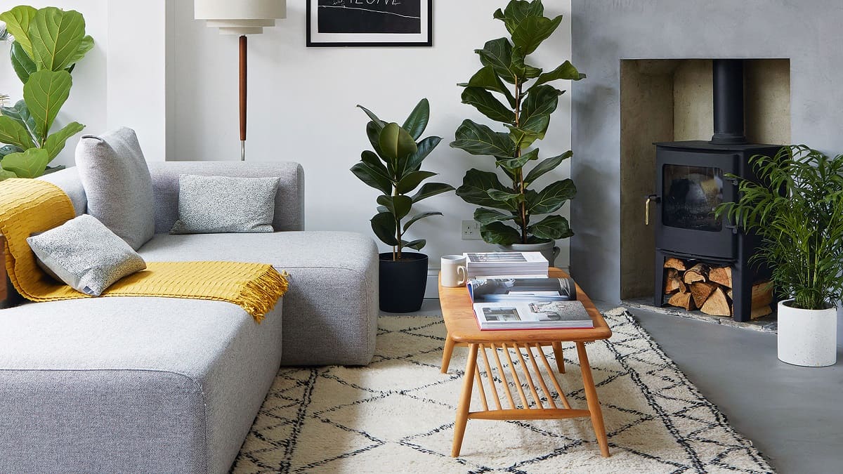
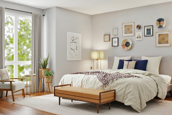
Mistake 1: Using Too Many Shades of Gray
Gray is a versatile color with countless shades and undertones. It ranges from cool, silvery grays to warm, earthy tones. It’s tempting to incorporate as many shades of gray as possible in your design, but this can result in a space that feels monotonous and lacks visual interest.
Instead of using too many shades of gray, strive for a harmonious color palette that incorporates complementary colors or contrasting textures. Consider using a main gray shade as your foundation and then introduce pops of color or different materials to create depth and dimension.
For example, pair a light gray wall with pops of vibrant yellow or teal through accessories and artwork. Alternatively, use a medium gray sofa and complement it with cushions in various textures like velvet or faux fur to add visual interest and tactile appeal.
Remember, the key is to strike a balance between different shades of gray and other colors or textures. This will create a visually pleasing and dynamic space that avoids the monotonous trap of using too many shades of gray.
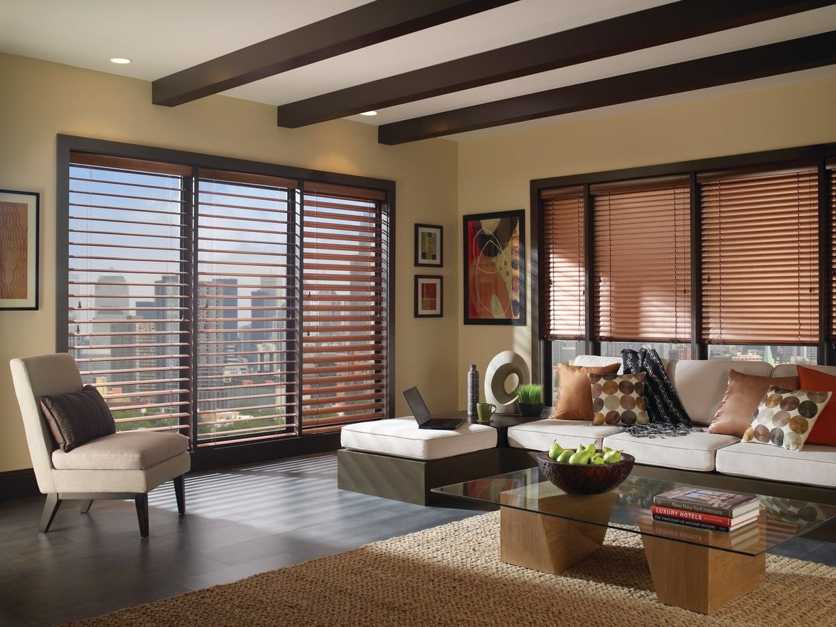
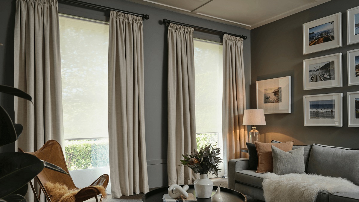
Mistake 2: Neglecting Proper Lighting
Lighting plays a crucial role in interior design, and it becomes even more important when working with a gray color palette. Gray can easily take on different undertones depending on the lighting conditions, so neglecting proper lighting can have a significant impact on the overall look and mood of your space.
A common mistake is relying solely on overhead lighting or using harsh, bright lights that can create a stark and cold atmosphere. Instead, incorporate a combination of ambient, task, and accent lighting to create layers of illumination.
Consider installing dimmer switches to adjust the intensity of the lights and create different moods throughout the day. Soft, warm-colored bulbs can counterbalance the coolness of gray and create a cozy and inviting ambiance. On the other hand, cool-toned lighting can enhance the sleek and modern feel of gray in contemporary spaces.
Furthermore, don’t forget to leverage the natural light available in your space. Keep curtains or blinds light and translucent to allow sunlight to filter in, brightening up the gray tones and providing a sense of natural warmth.
By giving careful thought to your lighting plan and selecting appropriate fixtures, you can bring out the best in your gray-themed design and create the desired atmosphere.
Mistake 3: Forgetting About Texture
Texture is an often overlooked element in interior design, but it can play a significant role in elevating a gray-themed space from ordinary to extraordinary. Without the right balance of textures, a gray color scheme can appear flat and uninteresting.
One mistake to avoid is using too many smooth and sleek surfaces without incorporating any textured elements. By incorporating different textures, you can add depth and visual interest to your gray-themed space.
Consider incorporating materials such as plush fabrics like velvet, chunky knits, or faux fur to create a cozy and inviting atmosphere. Combine these with contrasting textures like rough-hewn wood or stone to add a touch of natural warmth and visual balance.
Another way to introduce texture is through wall treatments or decorative accessories. Consider using textured wallpaper, accent walls with exposed brick or stone, or even incorporating woven wall hangings or tapestries to add visual and tactile interest to the space.
Additionally, don’t forget about the importance of layering textures in furnishings and textiles. Mix and match different patterns and fabrics in pillows, rugs, and curtains to create a visually appealing and dynamic space.
By paying attention to texture and incorporating various tactile elements, you can enhance the overall aesthetic of your gray-themed space and create a truly captivating environment.
When decorating with gray, avoid using too many cool tones as it can make the space feel cold. Balance it out with warm accents to create a cozy atmosphere.
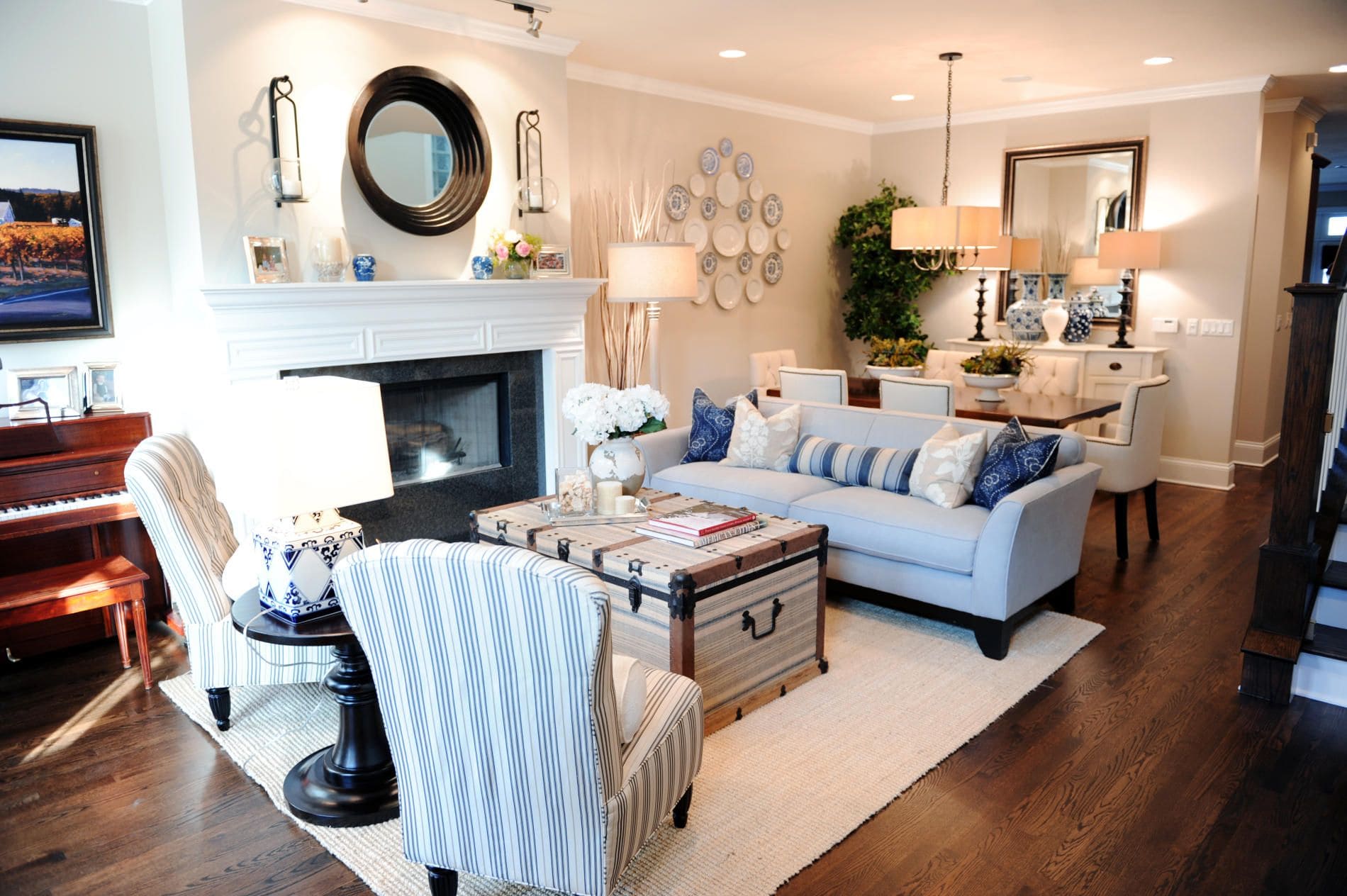
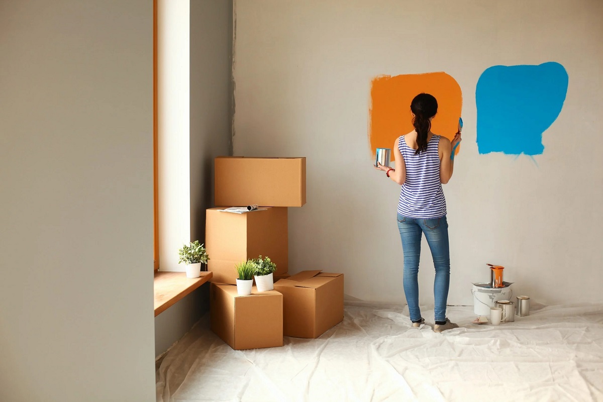
Mistake 4: Ignoring Accent Colors
While gray can be an elegant and versatile base color, it is essential to incorporate accent colors to add vibrancy and interest to your space. One common mistake when decorating with gray is ignoring the importance of accent colors, resulting in a monochromatic and lackluster design.
When choosing accent colors, consider colors that complement or contrast with gray. This will help create a visually pleasing and balanced color scheme. For example, if you have cool-toned gray walls, consider incorporating warm accent colors like yellows, oranges, or reds to add a pop of energy and warmth.
On the other hand, if you have warm-toned gray, you can introduce cool accent colors like blues or greens to create a refreshing and calming effect. These accent colors can be incorporated through accessories, artwork, furniture pieces, or even painted accent walls.
When working with accent colors, aim for a cohesive and harmonious look by repeating these colors throughout the space. This can be achieved through different elements such as throw pillows, rugs, curtains, artwork, or even small decorative items.
However, be cautious not to overwhelm the space with too many accent colors. Stick to a limited palette of two to three accent colors to maintain a cohesive and balanced design.
By incorporating accent colors strategically, you can breathe life into your gray-themed space and create a visually stunning and dynamic environment.
Mistake 5: Overlooking Balance in Decor
When decorating with gray, it’s crucial to pay attention to the balance of your decor. Neglecting balance can lead to a space that feels either too heavy or too empty. Achieving the right balance is key to creating a harmonious and visually pleasing design.
One common mistake is overcrowding a space with too many furniture pieces and accessories. This can make the room feel cramped and overwhelming. On the other hand, having too little furniture or decor can leave a room feeling bare and lacking in personality.
To achieve balance, start by analyzing the size and scale of your space. Consider the proportions of the room and choose furniture and decor that are appropriately sized. Ensure that there is enough breathing room around each piece of furniture to allow for easy movement and flow.
Additionally, consider the visual weight of your furniture and decor. Balance out heavier pieces with lighter elements to achieve equilibrium. For example, if you have a large, dark gray sectional, balance it out with lighter-colored accents like a white coffee table or light-colored rugs and curtains.
Another aspect of balance is symmetry versus asymmetry. While symmetrical arrangements can create a sense of order and formality, asymmetrical arrangements can add visual interest and a touch of modernity to your space. Experiment with both approaches and find the balance that suits your personal style.
Lastly, consider the balance of colors and patterns in your decor. If you have a predominantly gray color scheme, introduce pops of color or patterns strategically to avoid an overwhelming or monotonous look. Distribute these accents evenly throughout the space to create a cohesive and balanced design.
By paying attention to balance in your decor, you can create a harmonious and visually pleasing gray-themed space that feels inviting and well thought-out.
Conclusion
Decorating with gray can be a fantastic choice for creating a sophisticated and timeless interior design. However, it’s important to avoid common mistakes that can hinder the overall impact and beauty of a gray-themed space. By addressing these mistakes head-on, you can ensure that your gray-focused design projects are successful and visually captivating.
First, be mindful of using too many shades of gray. Instead, focus on creating a harmonious color palette that incorporates complementary colors or textures to add depth and interest. Next, pay attention to proper lighting to highlight the different undertones of gray and create the desired atmosphere. Don’t forget about the importance of texture – incorporate different textures through materials, finishes, and decorative accessories to bring dimension and tactile appeal to your design.
Furthermore, ignoring accent colors can result in a monochromatic and dull space. Choose accent colors that either complement or contrast with gray to add vibrancy and visual interest. Lastly, remember the importance of balance in decor. Pay attention to the size, scale, and visual weight of furniture and decor pieces, and strive for a careful balance between symmetry and asymmetry in your arrangements.
By avoiding these five common mistakes, you can confidently embark on your gray-themed interior design projects, creating spaces that are visually stunning, inviting, and reflective of your personal style.
Remember, interior design is both an art and a science, and making the right choices can truly transform a space. So, embrace the elegance and versatility of gray, but do so with intention and attention to detail, ensuring that your gray-themed spaces shine with beauty and sophistication.
Frequently Asked Questions about The 5 Mistakes To Avoid When Decorating With Gray
Was this page helpful?
At Storables.com, we guarantee accurate and reliable information. Our content, validated by Expert Board Contributors, is crafted following stringent Editorial Policies. We're committed to providing you with well-researched, expert-backed insights for all your informational needs.


0 thoughts on “The 5 Mistakes To Avoid When Decorating With Gray”