Home>Interior Design>How To Choose Paint Colors: 10 Expert Tips For Superb Schemes
Interior Design
How To Choose Paint Colors: 10 Expert Tips For Superb Schemes
Modified: January 5, 2024
Learn how to choose the perfect paint colors for your interiors with these 10 expert tips. Create superb and cohesive schemes for your home's interior design.
(Many of the links in this article redirect to a specific reviewed product. Your purchase of these products through affiliate links helps to generate commission for Storables.com, at no extra cost. Learn more)
Introduction
Choosing the right paint colors for your home can be a daunting task. The colors you select will not only determine the mood and ambiance of each room but also leave a lasting impression on anyone who enters your space. Whether you’re redecorating, remodeling, or starting from scratch, understanding how to choose paint colors is essential.
In this article, we’ll provide you with 10 expert tips that will help you create superb color schemes for your home. Whether you’re a seasoned interior designer or a novice homeowner, these tips will guide you through the process and ensure that you make the right choices.
So, let’s dive in and discover how to choose paint colors that will transform your home into a stunning and harmonious space.
Key Takeaways:
- Understand color psychology and consider the room’s purpose to create a harmonious and mood-enhancing color scheme for your home. Take inspiration from existing elements and trust your instincts to reflect your unique style.
- Utilize the color wheel, create color flow, and test colors in different lighting conditions to ensure a visually appealing result. Don’t be afraid to add bold accents and seek professional advice when needed. Trust your instincts and have fun with the process!
Tip 1: Understand color psychology
Color plays a significant role in our emotions and can greatly impact the overall atmosphere of a room. Before diving into the world of paint colors, it’s crucial to understand the basics of color psychology.
Colors can be divided into warm and cool tones, each evoking different emotions and moods. Warm colors like red, orange, and yellow are known for their energizing and stimulating qualities. They can create a sense of coziness and make a room feel more intimate. On the other hand, cool colors like blue, green, and purple are calming and soothing. They are perfect for creating a serene and peaceful environment.
Consider the purpose of the room and the emotions you want to evoke. For example, a bedroom should have calming and relaxing colors, while a home office might benefit from energizing and focused tones. Understanding color psychology will help you choose the right colors that align with the function and ambiance you desire.
In addition to warm and cool colors, it’s important to consider the saturation and intensity of a color. Light and pastel shades tend to create a sense of airiness and space, while dark and rich colors can add depth and drama to a room.
Another aspect of color psychology to keep in mind is personal preference and cultural associations. Different cultures may have different meanings and symbolisms attached to certain colors. Additionally, individuals may have personal preferences or emotional connections to specific colors. Take these factors into account when selecting paint colors to ensure a space that aligns with your personal style and preferences.
Overall, understanding color psychology is a valuable foundation for choosing paint colors. By considering warm and cool tones, saturation and intensity, cultural associations, and personal preferences, you can create a color scheme that not only looks aesthetically pleasing but also enhances the desired mood and atmosphere of each room.
Tip 2: Consider the room’s purpose and mood
When choosing paint colors for each room in your home, it’s essential to consider the room’s purpose and the mood you want to create. Each room serves a different function and requires a unique color scheme to support that purpose.
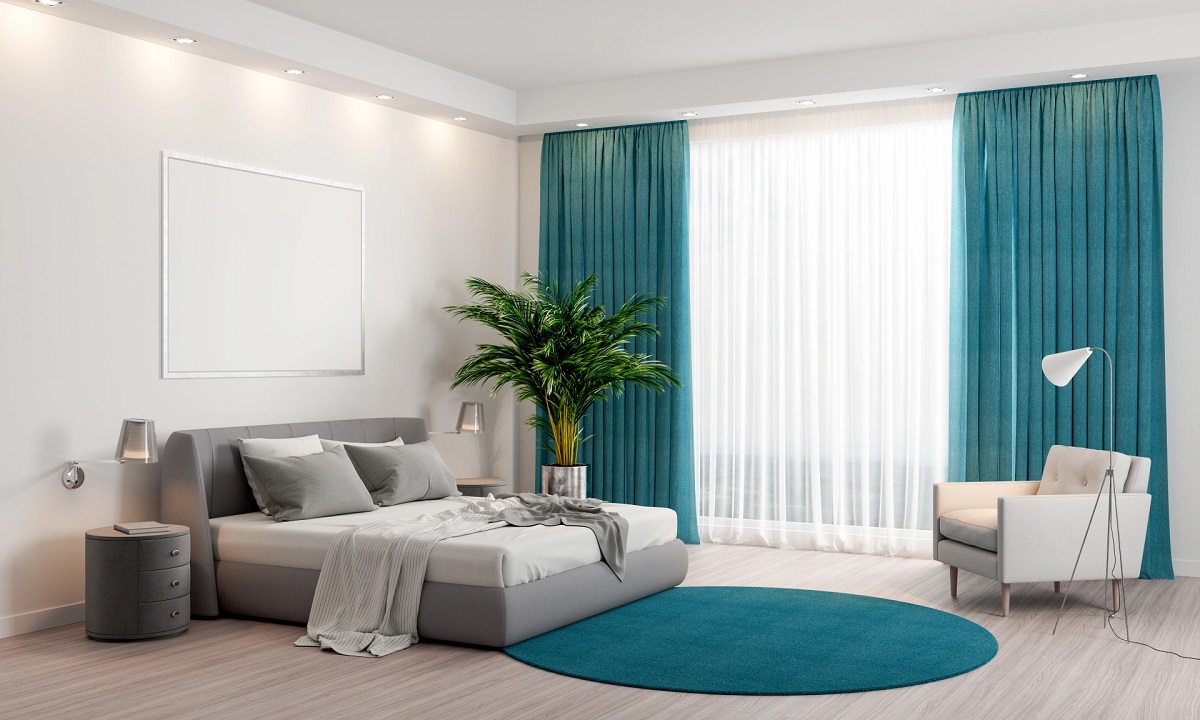
For example, in the bedroom, you’ll want to create a calm and serene atmosphere that promotes relaxation and sleep. Opt for soothing colors like soft blues, muted greens, or warm neutrals. These colors can help create a tranquil environment that is conducive to rest and rejuvenation.
In contrast, a home office or study needs colors that promote focus and productivity. Consider using shades of green or blue, which are known to enhance concentration and stimulate creativity. You may also want to incorporate neutral tones to create a sense of balance and keep distractions to a minimum.
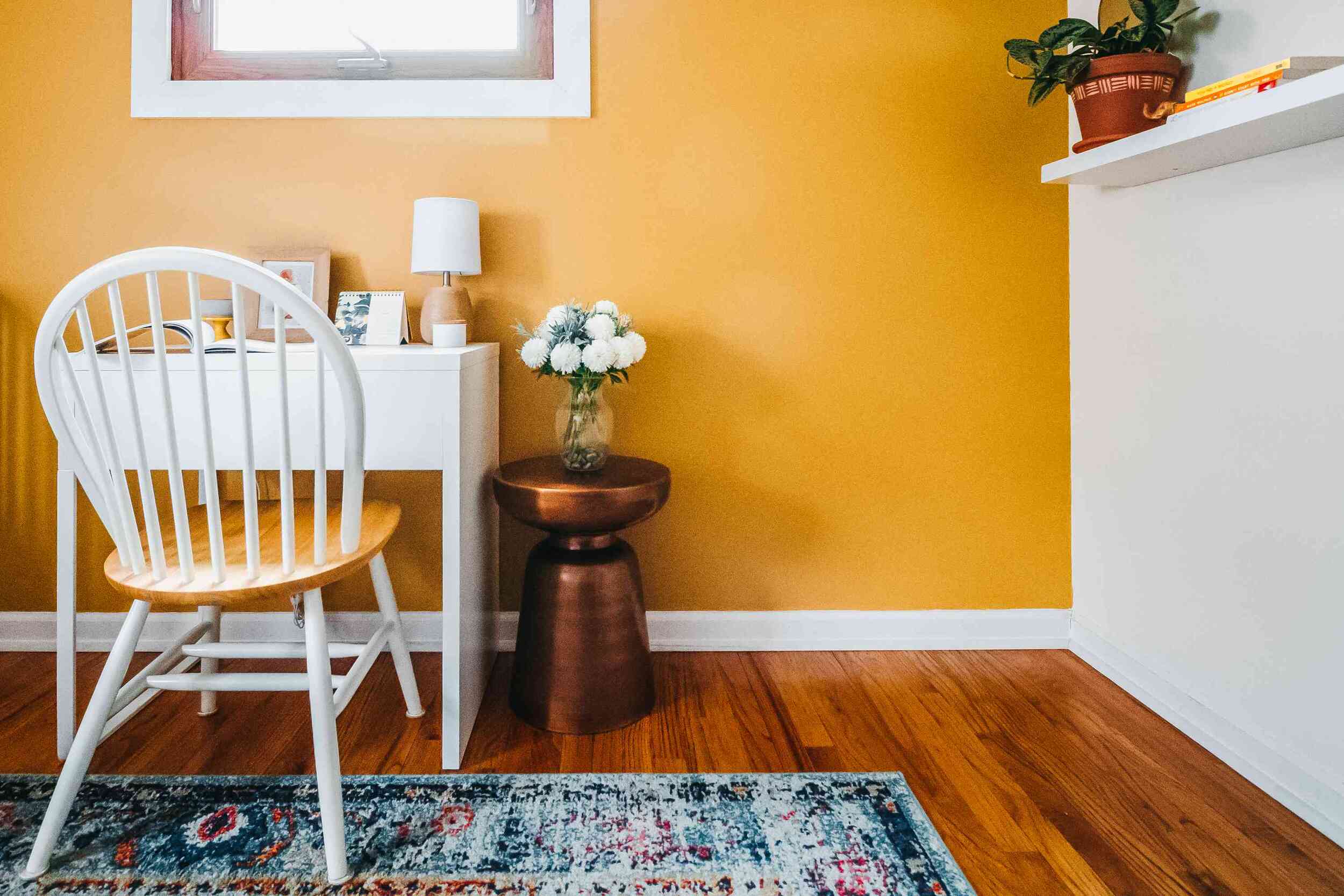
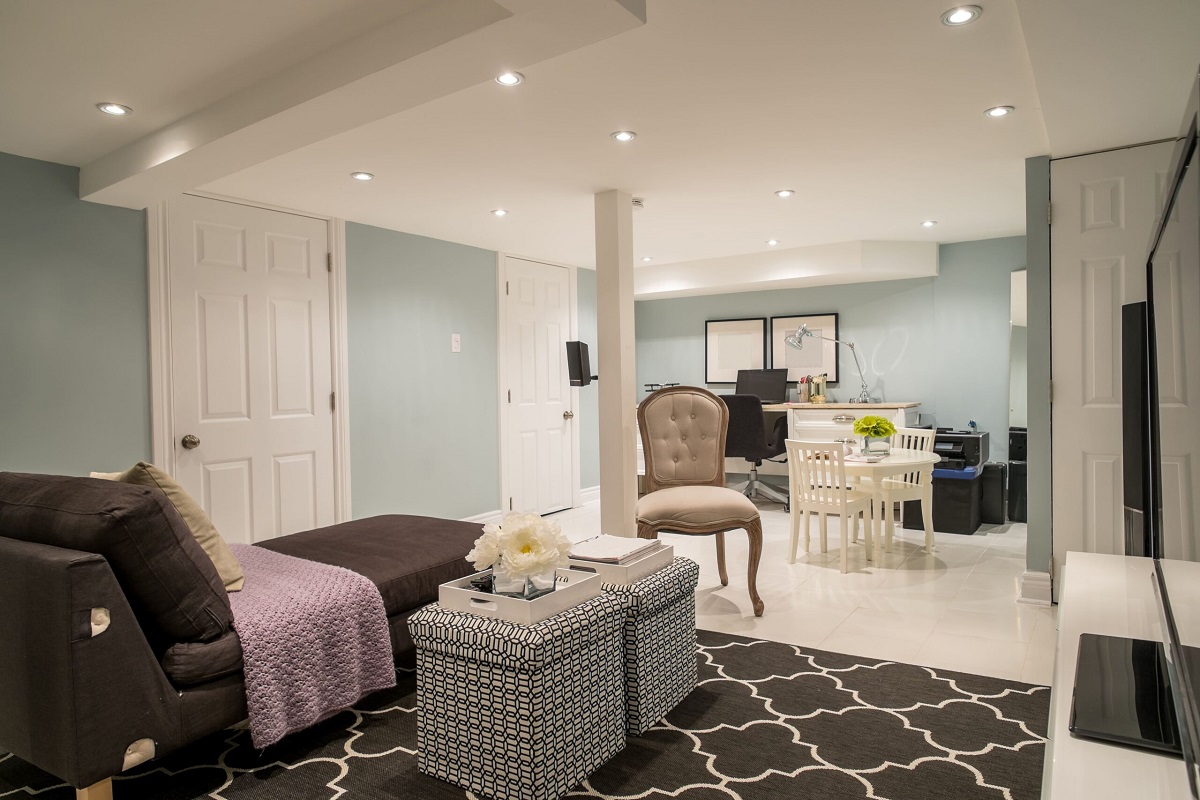
The living room is often the heart of the home, where families and friends gather to socialize and relax. You can choose warm and inviting colors like earthy browns, warm grays, or creamy neutrals to create a cozy and welcoming ambiance. Accent colors in red or orange can add a touch of energy and vibrancy to the space.
The dining room is an area for enjoying meals and entertaining guests. Consider using warm and inviting colors like rich reds, deep browns, or elegant neutrals to create a sophisticated and inviting atmosphere. These colors can stimulate conversation and enhance the dining experience.
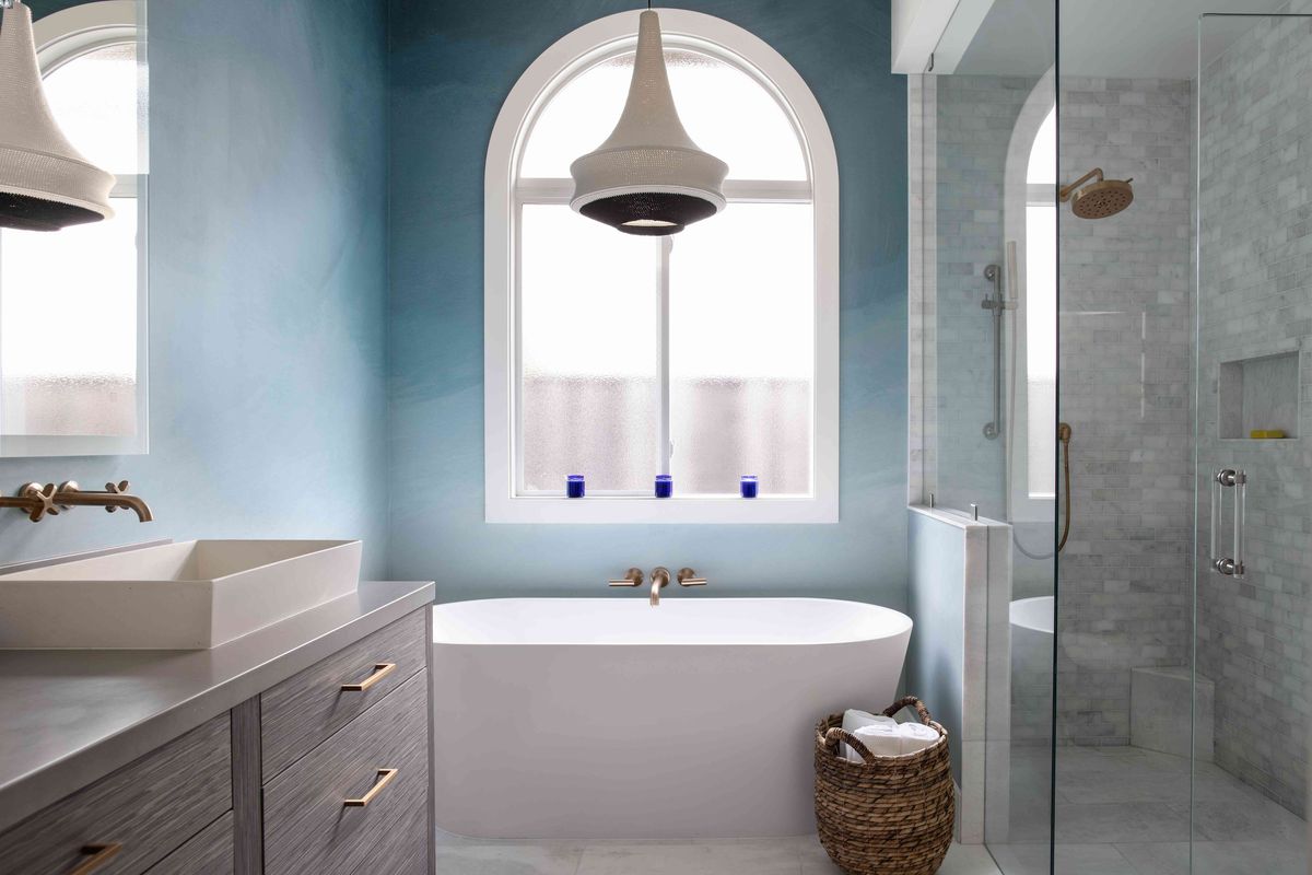
Lastly, the bathroom can benefit from bright and clean colors like whites and light blues or greens. These colors can create a fresh and spa-like feel, perfect for relaxation and rejuvenation.
When considering the room’s purpose and mood, it’s important to remember that there are no hard and fast rules. Use your intuition and personal preferences to guide you in selecting paint colors that resonate with the purpose and desired atmosphere of each room.
By considering the function and mood of a room, you can choose paint colors that not only align with your personal style but also enhance the functionality and ambiance of each space in your home.
Tip 3: Take inspiration from existing elements
Choosing paint colors shouldn’t be done in isolation. It’s important to take inspiration from the existing elements in your space, such as furniture, fabrics, artwork, and architectural details.
Start by assessing the dominant colors and patterns in your existing furniture and fabrics. Look for common color themes or complementary hues that you can incorporate into your paint color selection. This will help create a cohesive and harmonious look throughout the room.
Consider the undertones of the existing elements as well. For example, if you have a sofa with warm undertones, you might want to choose paint colors that have a similar warmth to create a sense of unity. On the other hand, if you have cool-toned elements like a blue rug or artwork, choose paint colors that complement those cool tones.
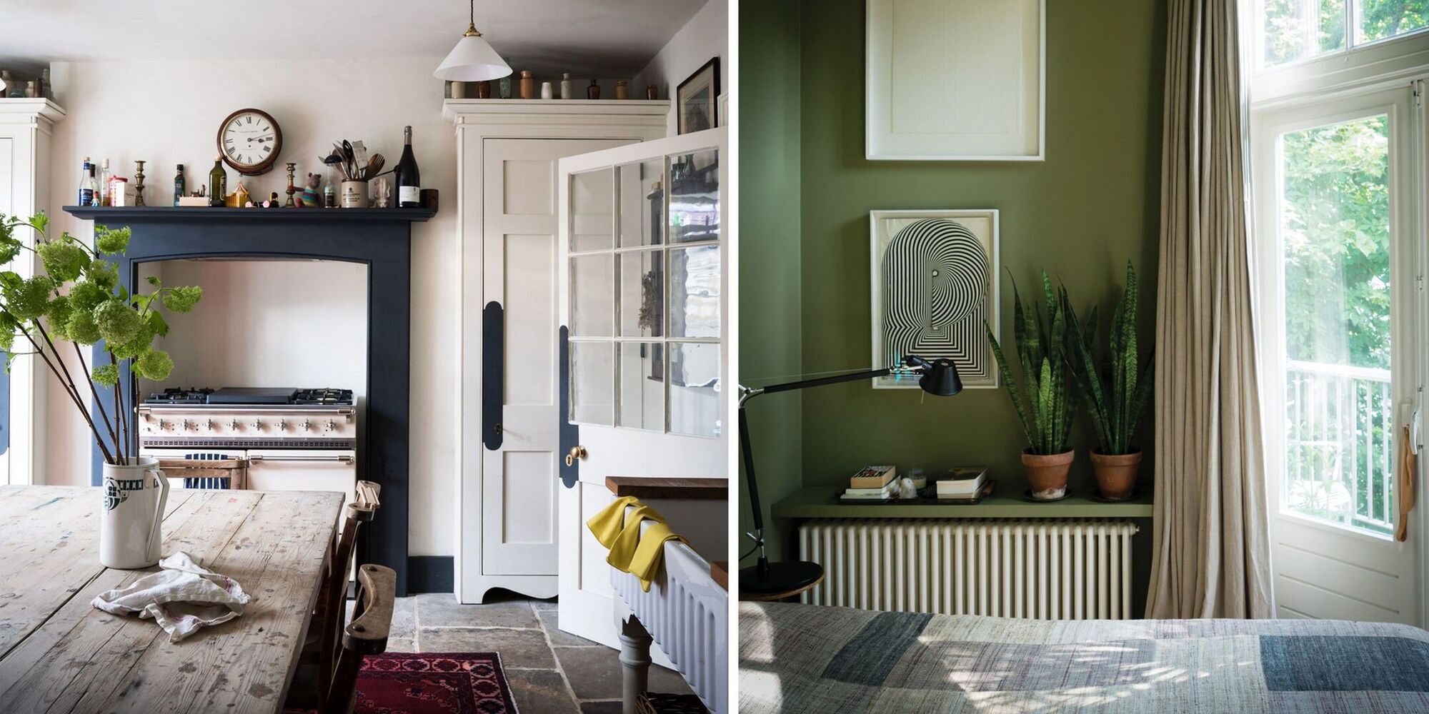
Architectural details such as trim, molding, and cabinetry can also provide inspiration for paint colors. If you have beautiful crown molding or intricate woodwork, consider choosing paint colors that highlight and enhance those features. For example, a contrasting color on the trim can make it stand out and add visual interest to the room.
Artwork and decorative items are another source of inspiration for paint colors. Take cues from the colors and tones in your favorite artwork or decor pieces and use them as a starting point for your color scheme. This can create a cohesive and integrated look throughout your space.
Keep in mind that the goal is not to match every color exactly. Instead, use the existing elements as a guide to create a color palette that complements and enhances the overall aesthetic of the room.
By taking inspiration from the existing elements in your space, you can create a paint color scheme that works harmoniously with your furniture, fabrics, artwork, and architectural details. It will ensure a cohesive and visually appealing look that ties the entire room together.
Tip 4: Use the color wheel
The color wheel is an essential tool for selecting paint colors that harmonize and complement each other. It provides a visual representation of the relationships between different colors and can help you create a cohesive and balanced color scheme.
There are three primary colors on the color wheel: red, blue, and yellow. These colors cannot be created by mixing other colors together. When you combine two primary colors, you create secondary colors. The secondary colors are orange (red + yellow), green (yellow + blue), and violet (blue + red).
By using the color wheel, you can identify color schemes that work well together. Here are a few popular color schemes:
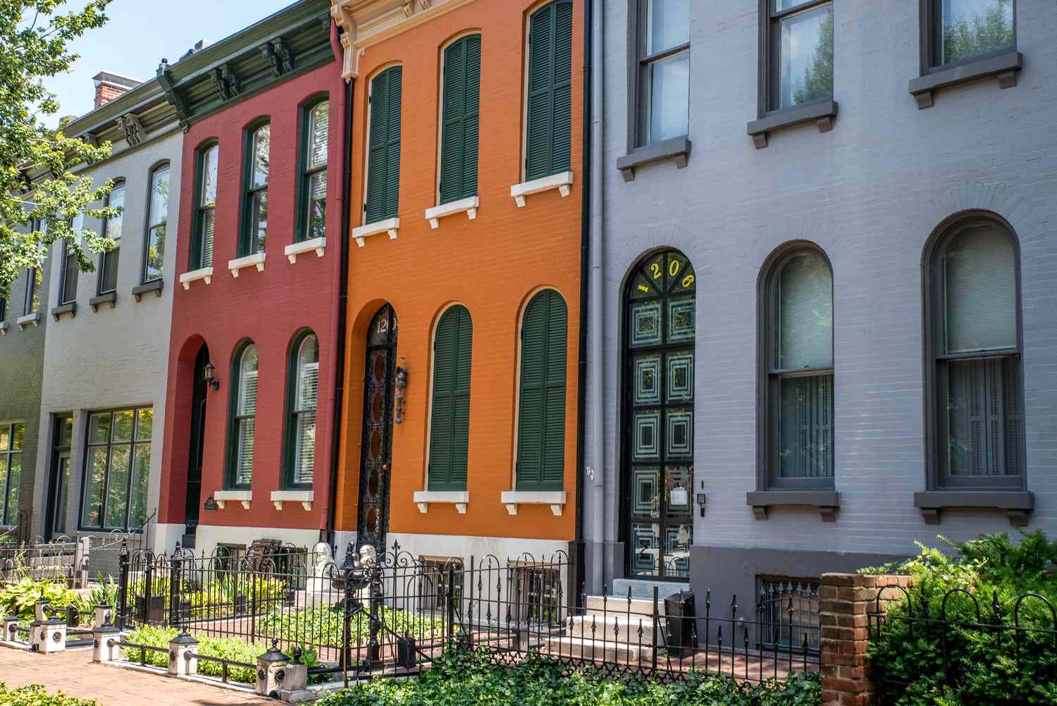
- Complementary colors: These are colors that are opposite each other on the color wheel, such as blue and orange or red and green. Complementary colors create a high contrast and can make a color scheme visually striking.
- Analogous colors: These are colors that are next to each other on the color wheel, such as blue and green or orange and yellow. Analogous colors create a harmonious and cohesive look and are often found in nature.
- Monochromatic colors: This color scheme involves using different shades, tints, and tones of a single color. For example, using various shades of blue. Monochromatic schemes create a sense of harmony and simplicity.
- Triad colors: This color scheme involves choosing three colors that are evenly spaced on the color wheel, such as red, yellow, and blue. Triad colors create a vibrant and energetic look.
When using the color wheel, it’s important to consider the intensity and brightness of the chosen colors. You can choose different shades, tints, and tones within your selected color scheme to add depth and variation to your paint colors.
Experiment with different combinations and variations on the color wheel to find the perfect color scheme for your space. Remember, the color wheel is merely a guide, and you can mix and match colors based on your personal preferences and the overall mood you want to create.
Using the color wheel as a reference will help you create a well-balanced and visually appealing color scheme for your home. It’s a valuable tool in selecting complementary, analogous, monochromatic, or triad color combinations that work harmoniously together.
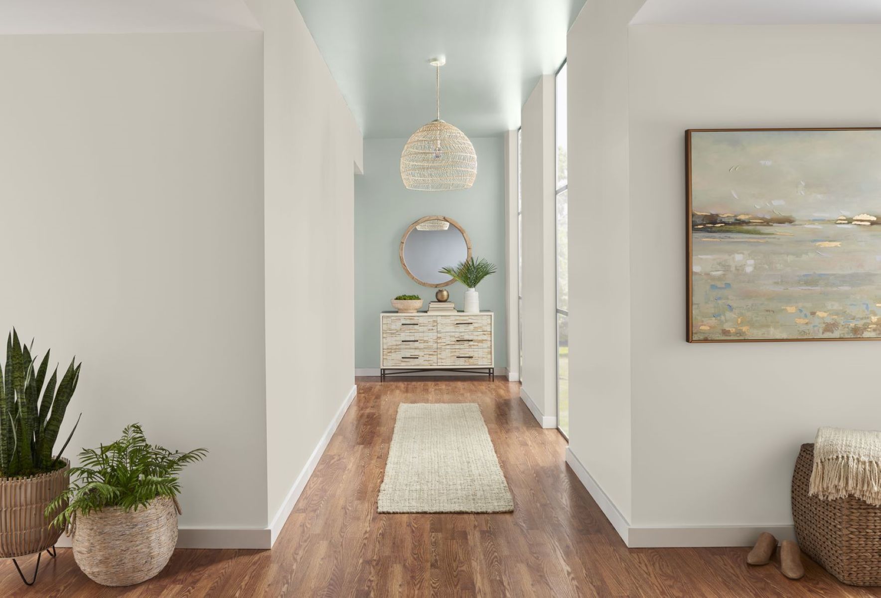
Tip 5: Create color flow throughout your home
When choosing paint colors for your home, it’s important to consider the overall flow and connection between different rooms. Creating a cohesive color flow throughout your home can make the space feel more harmonious and visually appealing.
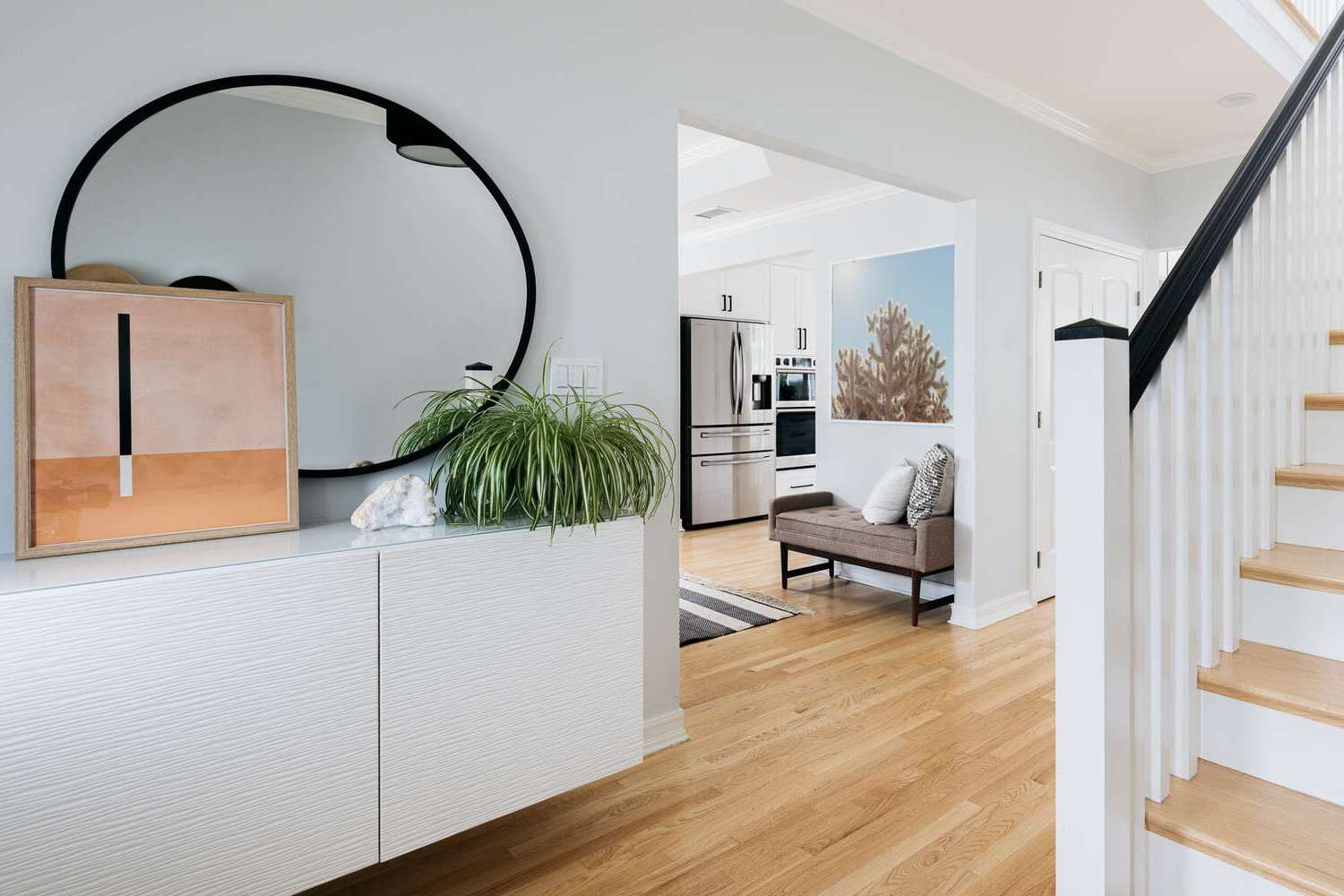
One way to achieve color flow is by selecting a color palette with a consistent undertone. Undertones refer to the subtle hues that can be present in a color, such as warm undertones (yellow, red) or cool undertones (blue, green). When the undertones of the paint colors in each room align, it creates a seamless transition from one space to another.
For example, if you choose a warm neutral tone like beige or taupe for your living room, consider incorporating similar warm undertones in the adjacent dining room or hallway. This could be achieved through the use of similar warm neutral tones or coordinating colors with similar undertones.
Another way to create color flow is by using a common accent color throughout your home. This accent color can be a unifying element that ties different rooms together. For instance, you might choose to use a deep burgundy as an accent color in your living room, and then incorporate small touches of burgundy in the pillows, artwork, or accessories in adjacent rooms.
Consider also the saturation and intensity of the colors you choose. If you prefer a more serene and cohesive color flow, opt for similar shades and intensities throughout your home. On the other hand, if you want to create visual interest and variety, you can play with different shades and intensities of the same color family.
While creating color flow, it’s important to ensure that each room has its own unique character and personality. You can achieve this by varying the intensity or shade of the chosen colors or by introducing complementary accent colors to add depth and interest.
By creating color flow throughout your home, you can establish a sense of continuity and cohesiveness. It allows for a smooth transition from one room to another, creating a visually pleasing and harmonious environment.
Consider the mood you want to create in the space – warm and inviting, calm and serene, or bold and energetic – and choose paint colors that align with that feeling.
Tip 6: Test the colors in different lighting conditions
One crucial step in choosing paint colors for your home is to test them in various lighting conditions. Lighting can have a significant impact on how colors appear, and what may look perfect under one type of lighting could appear completely different in another.
Start by observing the natural light in each room. Is it north-facing, which tends to have cooler light, or south-facing, which tends to have warmer light? Consider the direction the room faces and the amount of natural light it receives throughout the day. Natural light can vary greatly, from bright and harsh midday sun to soft and diffused morning or evening light.
Once you’ve identified the natural lighting conditions, it’s time to test the paint colors. Purchase sample-sized paint cans or paint swatches and apply them to the walls in different areas of the room. Be sure to test the colors on all walls, as each wall may receive light differently.
Observe the colors at different times of the day. Pay attention to how the colors look in both natural and artificial light. Artificial lighting, such as incandescent, fluorescent, or LED lights, can also alter the appearance of paint colors. Warm-toned lighting can make colors appear more yellow or orange, while cool-toned lighting can make them appear bluer.
Take note of how the colors change with different lighting conditions. Some colors may appear more vibrant and lively in natural daylight, while others may appear darker or more subdued in artificial light. It’s important to assess how the colors make you feel and whether they create the desired mood and ambiance under different lighting scenarios.
Additionally, consider the surrounding elements in the room when testing the colors. How do the colors interact with the flooring, furniture, and other decor? Do they complement or clash with the existing elements in the space?
Testing the colors in different lighting conditions allows you to see the true appearance of the paint colors and how they interact with the room’s surroundings. It ensures that you select colors that look beautiful and harmonious no matter the time of day or type of lighting in the room.
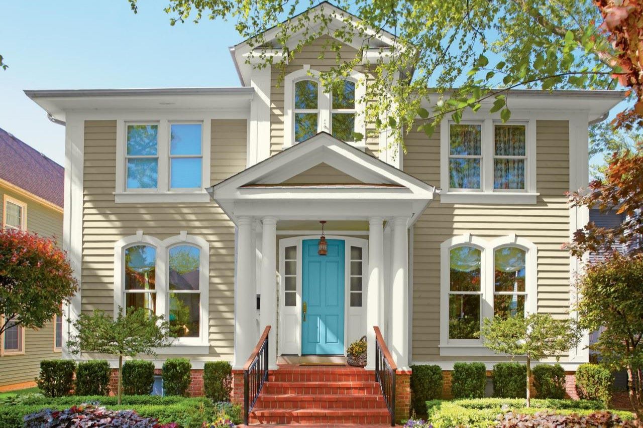
Tip 7: Don’t be afraid to go bold with accents
While choosing paint colors for your home, don’t shy away from adding bold and vibrant accents to create visual interest and personality in your space. Accents can be in the form of statement walls, furniture pieces, or accessories that stand out and add a pop of color to the room.
One way to incorporate bold accents is by choosing a focal wall in a room and painting it with a bold color. This can be a vibrant shade like deep blue, rich red, or even a bold pattern. The accent wall serves as a focal point and adds drama and personality to the room. To create balance and harmony, choose complementary or coordinating colors for the remaining walls.
Another option is to introduce bold colors through furniture pieces. Consider selecting a statement sofa in a bold hue or choosing vibrant chairs or ottomans to liven up the space. Adding colorful and patterned throw pillows, rugs, or curtains can also create a bold and dynamic look.
Accessories are another fantastic way to incorporate bold accents. Think colorful artwork, bold patterned wallpaper, or decorative items that catch the eye. It’s a great opportunity to infuse your personal style and bring a unique touch to each room.
Don’t be afraid to mix and match different colors and patterns in your accents. Experiment with color combinations that you may not have initially considered. Bold accents can inject energy and personality into your space, creating a vibrant and visually stimulating environment.
When using bold accents, it’s essential to strike a balance. If you opt for a bold focal wall, consider using more neutral and subdued colors for the rest of the room to avoid overwhelming the space. Similarly, if you choose vibrant furniture or accessories, use a more restrained color palette for the walls to allow the accents to shine.
Remember, accents can always be changed or updated, so don’t be afraid to take risks and have fun with your choices. They offer an opportunity to experiment and add a personal touch to your home’s decor.
By incorporating bold accents, you can add personality and drama to your space, creating a visually exciting and unique atmosphere that reflects your individuality.
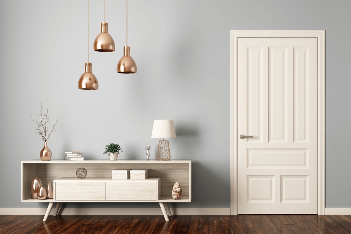
Tip 8: Consider the size of the space
When choosing paint colors for your home, it’s essential to take into account the size of the space. The color you select can have a significant impact on the perceived size and proportions of a room.
For small rooms, light and neutral colors are often the preferred choice. Light colors, such as whites, creams, and pastels, have the ability to reflect natural and artificial light, creating an illusion of space and airiness. These colors can make a room feel more open and visually expansive.
Consider using a light monochromatic color scheme, where different tones and shades of the same color are used. This creates a subtle variation while maintaining a sense of continuity and spaciousness. Avoid using strong contrasts or intense colors, as they can make the space feel closed in and smaller.
If you prefer darker colors for a small room, consider using them strategically. You can opt for a single accent wall in a deeper shade to create depth and emphasis without overwhelming the space. Using darker colors sparingly can add sophistication and drama to the room while still maintaining an overall feeling of openness.
On the other hand, for larger rooms, you have more flexibility when it comes to color choices. While light colors can still work well to enhance the sense of space, you can also explore bolder and darker hues that can create a cozy and intimate atmosphere. Warm, earthy tones or deep jewel tones can add richness and depth to a larger room.
When considering the size of the space, don’t forget about the ceiling. Painting the ceiling a lighter color than the walls can create the illusion of height and make the room feel more expansive. Conversely, painting the ceiling a darker color can add a sense of intimacy and make the space feel cozier.
Remember that these are general guidelines, and it’s essential to take into account other factors such as the amount of natural light the room receives, the purpose of the room, and your personal preferences. Ultimately, creati
Tip 9: Seek professional advice if necessary
Choosing paint colors for your home can be a challenging task, especially if you lack confidence or expertise in interior design. In such cases, it’s beneficial to seek professional advice to ensure that you make the best color choices for your space.
Interior designers and color consultants are experts in the field of color and can provide valuable insights and guidance. They have a deep understanding of color psychology, trends, and how different colors interact with each other and the surrounding elements in a space.
Working with a professional can help you navigate through the overwhelming number of paint options available and narrow down the choices based on your preferences, the style of your home, and the specific requirements of each room.
A professional can assess the unique characteristics of your space, such as the lighting conditions, architectural features, and existing elements, and provide tailored recommendations that suit your needs. They can help you create a cohesive color scheme that flows seamlessly throughout your home and reflects your personal style.
Additionally, professionals often have access to a wide range of resources, including paint samples, color palettes, and industry knowledge. They can provide you with detailed color swatches and samples to visualize how the chosen colors will look in your space, taking the guesswork out of the process.
If you decide to work with a professional, be sure to communicate your goals, preferences, and budget clearly. Provide them with information about the mood you want to create in each room and any specific design inspirations you might have. This will help them better understand your vision and deliver results that align with your expectations.
Remember, seeking professional advice doesn’t mean relinquishing control over your home’s design. It’s an opportunity to collaborate with someone who has expertise in color selection and can help you make informed decisions that will enhance the overall look and feel of your space.
Whether you choose to work with an interior designer, color consultant, or even consult with knowledgeable staff at a paint store, seeking professional advice can provide you with the assurance and support you need to choose the perfect paint colors for your home.
Tip 10: Trust your instincts and personal taste
While it’s important to consider various factors and seek professional advice, at the end of the day, trust your instincts and personal taste when choosing paint colors for your home. Your home is a reflection of your personality and should be a space that makes you feel comfortable and happy.
Take the time to explore different color options and gather inspiration from various sources, such as magazines, online platforms, or even nature. Pay attention to the colors that catch your eye and evoke positive emotions within you. This can help guide you in the right direction.
Consider your personal preferences and the ambiance you want to create in each room. Think about what colors make you feel calm and relaxed, energized and inspired, or cozy and warm. Your home should be a sanctuary that reflects your unique style and preferences.
When selecting paint colors, don’t be influenced solely by trends or others’ opinions. Trends come and go, and what works for someone else may not necessarily work for you. Trust your intuition and choose colors that you genuinely love and resonate with. It’s your space, so make it yours.
Remember that paint colors can be changed relatively easily compared to major design elements like furniture or flooring. If you’re unsure about a particular color, start with a small area or a test patch to see how it looks in your space. Paint colors can appear slightly different in different environments, so it’s important to see them in your own home before committing to a full application.
In the end, the most important aspect of choosing paint colors is that you feel happy and comfortable in your space. Trust your instincts, embrace your personal taste, and let your home reflect your unique style and personality.
By trusting your instincts and incorporating your personal taste into the color selection process, you’ll create a home that truly feels like your own, a place where you can relax, recharge, and enjoy the beauty of the colors you’ve chosen.
Conclusion
Choosing paint colors for your home is an exciting and creative process that can transform your living space into a personalized haven. By following these 10 expert tips, you can make informed decisions and create superb color schemes that enhance the ambiance and aesthetic appeal of your home.
Understanding color psychology, considering the room’s purpose and mood, and taking inspiration from existing elements are the foundational steps to selecting the right colors. Utilizing the color wheel and creating color flow throughout your home will ensure a harmonious and visually pleasing result. Testing colors in different lighting conditions is crucial to seeing how they will appear throughout the day. And don’t be afraid to add bold accents or seek professional advice when needed.
Ultimately, it’s important to trust your own instincts and personal taste throughout the process. Your home should be a reflection of your unique style and preferences, a place where you feel comfortable, inspired, and at peace.
So, embark on your paint color journey with confidence, creativity, and an open mind. Experiment with different hues, shades, and combinations until you find the perfect colors that bring your vision to life. Be bold, be adventurous, and most importantly, have fun!
Remember, paint colors have the power to evoke emotions, set the mood, and create a welcoming environment. With careful consideration and attention to detail, you can transform your home into a stunning sanctuary that reflects your personality and brings joy for years to come.
Frequently Asked Questions about How To Choose Paint Colors: 10 Expert Tips For Superb Schemes
Was this page helpful?
At Storables.com, we guarantee accurate and reliable information. Our content, validated by Expert Board Contributors, is crafted following stringent Editorial Policies. We're committed to providing you with well-researched, expert-backed insights for all your informational needs.

0 thoughts on “How To Choose Paint Colors: 10 Expert Tips For Superb Schemes”