Home>Interior Design>Joanna Gaines Reveals Her Secret To Choosing Color Schemes
Interior Design
Joanna Gaines Reveals Her Secret To Choosing Color Schemes
Modified: October 19, 2024
Joanna Gaines shares her secret to choosing color schemes for interior design. Discover expert tips and tricks to create the perfect palette for your home.
(Many of the links in this article redirect to a specific reviewed product. Your purchase of these products through affiliate links helps to generate commission for Storables.com, at no extra cost. Learn more)
Introduction
When it comes to interior design, one of the key elements that can transform a space is the choice of color schemes. Colors have the power to evoke emotions, set the mood, and create a sense of harmony within a room. A well-designed color palette can breathe life into a space, making it visually appealing and inviting.
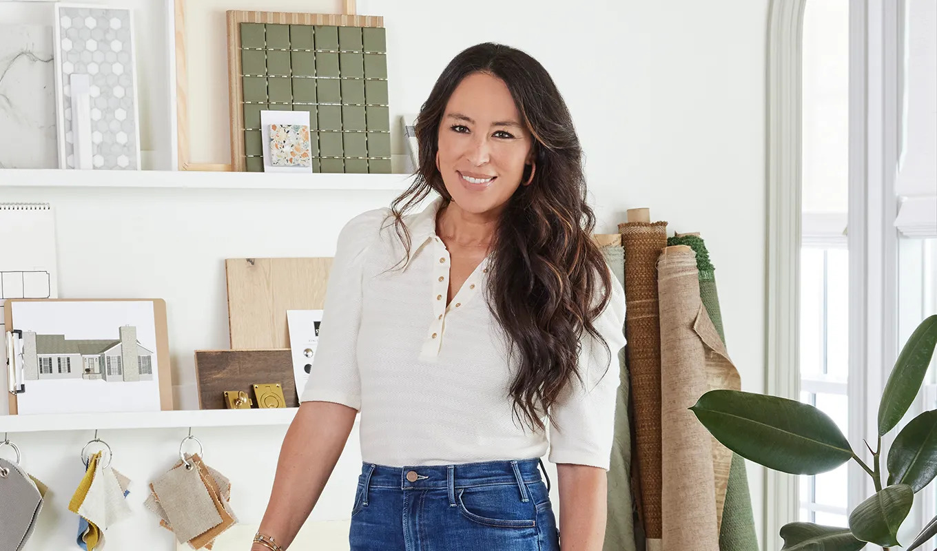
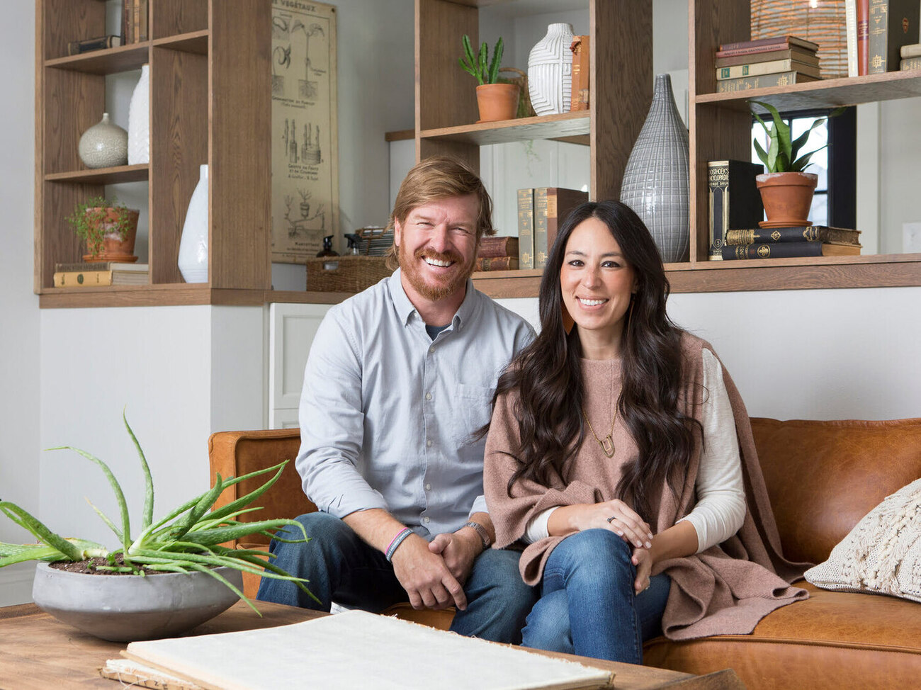
One expert who has mastered the art of selecting color schemes is the renowned interior designer, Joanna Gaines. With her signature modern farmhouse style, Joanna has become a household name in the design world. Her ability to effortlessly blend colors and create stunning spaces has captivated audiences worldwide.
So, what is Joanna Gaines’ secret to choosing color schemes? Let’s delve into her approach and gain some insights into creating beautiful and cohesive color palettes for your own home.
Key Takeaways:
- Joanna Gaines’ color scheme secret: Start with neutrals, draw inspiration from nature, experiment with textures, and use accent colors strategically to create visually appealing and harmonious spaces.
- Joanna Gaines emphasizes balance in color selection, incorporating nature-inspired palettes, experimenting with textures and patterns, and using accent colors to create cohesive and emotionally stirring designs.
Joanna Gaines’ Approach to Color Schemes
Joanna Gaines believes that color is a powerful tool that can transform a space and make it feel warm, inviting, and personalized. Her approach to choosing color schemes starts with understanding the purpose and function of the room. She considers the overall style and ambiance she wants to achieve and then selects colors that align with that vision.
One of the key aspects of Joanna’s approach is the use of neutral tones as a foundation. She often starts with a neutral color, such as white, beige, or gray, to create a calming and versatile base. This allows her to incorporate pops of color in a way that is both impactful and balanced.
Another aspect of Joanna’s approach is finding inspiration in nature. She believes that nature provides the most beautiful color combinations, and she often looks to the outdoors for guidance. Whether it’s the colors of a serene sunset or the vibrant hues of a blooming garden, Joanna takes cues from nature to create harmonious color palettes.
Experimenting with texture and patterns is another element of Joanna’s approach. She likes to mix and match different textures to add depth and interest to a space. Whether it’s a plush rug, textured wallpaper, or patterned fabrics, combining these elements allows for a dynamic and visually appealing color scheme.
Incorporating accent colors is also an important part of Joanna’s approach. She believes that accent colors can bring life and personality to a room. Whether it’s a bold pop of red, a vibrant blue, or a lush green, accents colors can create focal points and add visual interest.
Ultimately, Joanna Gaines seeks balance in color selection. She understands the importance of creating a harmonious flow throughout a space and avoids overwhelming a room with too many colors. By carefully curating a color palette that includes a mix of neutrals, accents, and complementary shades, she creates a sense of unity and cohesiveness.
In the next sections, we will explore some of Joanna Gaines’ favorite color combinations and how she uses them to bring her designs to life.
Understanding Color Psychology
Color psychology is the study of how colors can impact our emotions, moods, and behaviors. Different colors can evoke different reactions in individuals, making it essential to consider the psychological effects of color when choosing a color scheme. Joanna Gaines understands the power of color psychology and incorporates it into her designs to create the desired atmosphere in each space.
Here are some common associations and emotions associated with various colors:
- Blue: Blue is often associated with calmness, tranquility, and serenity. It can create a sense of relaxation and peacefulness in a room, making it an ideal choice for spaces like bedrooms or bathrooms.
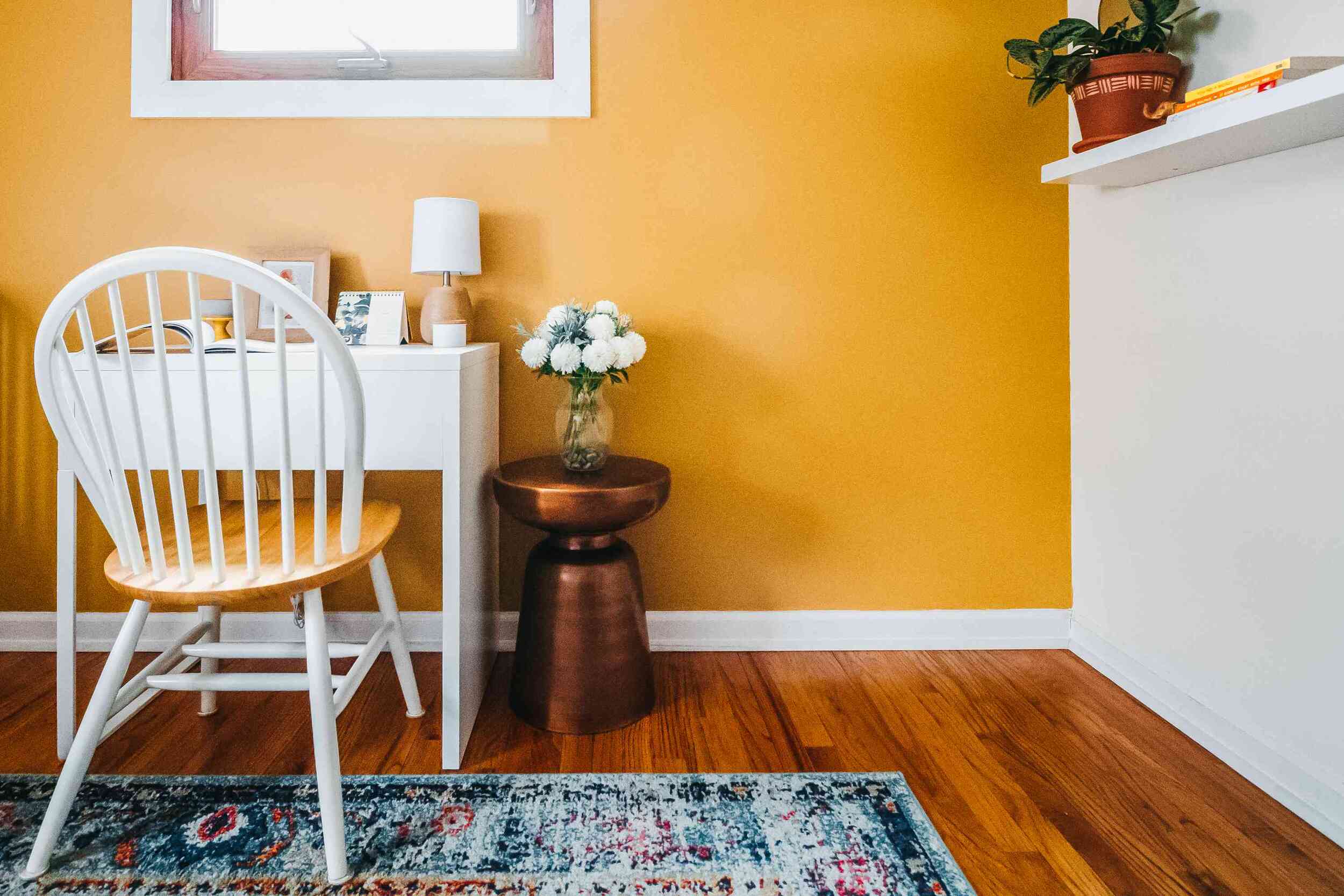
- Yellow: Yellow is associated with happiness, positivity, and energy. It can bring warmth and cheerfulness to a space and works well in kitchens, living rooms, or areas where you want to create a vibrant and uplifting atmosphere.
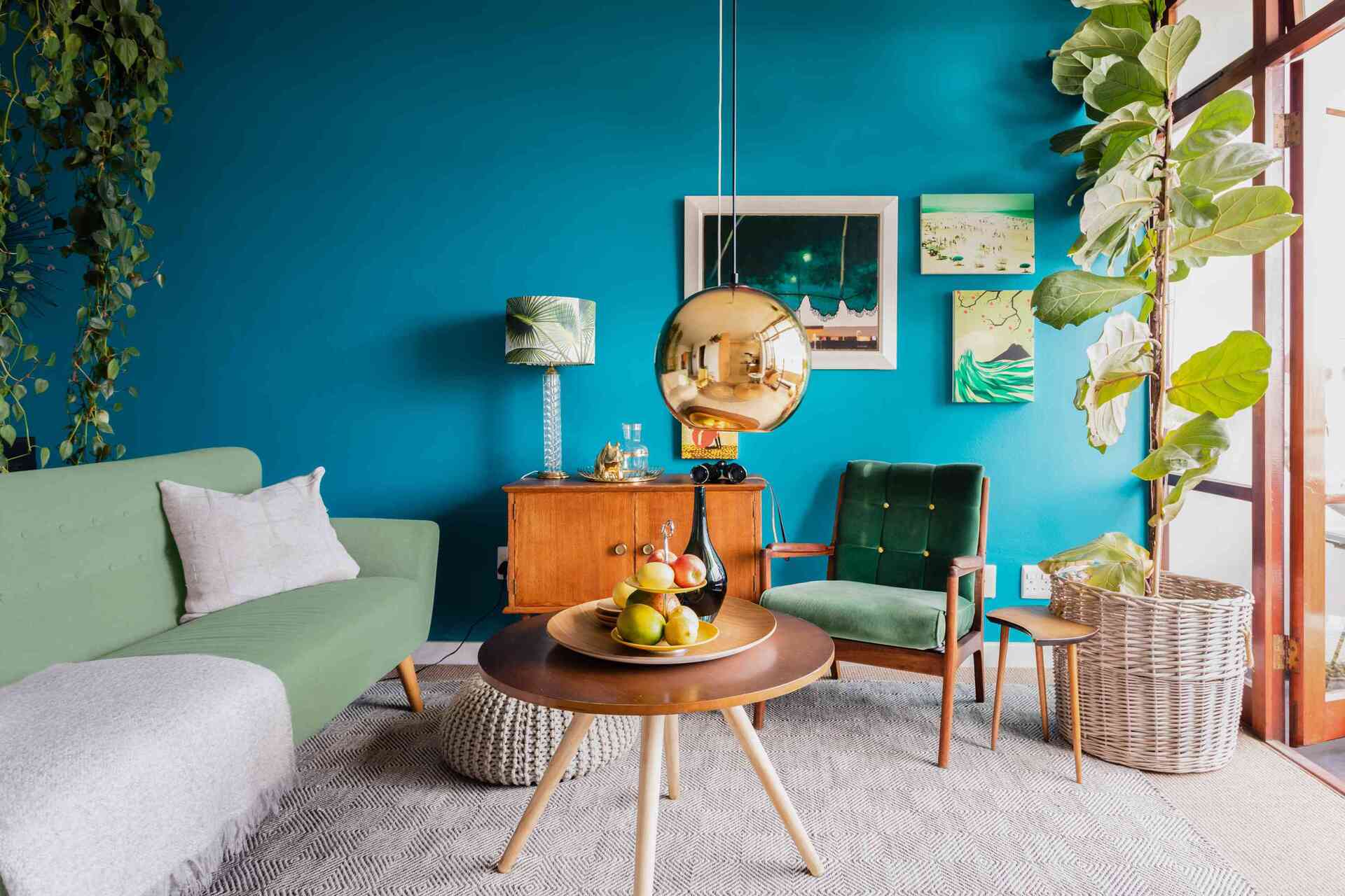
- Green: Green represents nature, growth, and harmony. It is known to have a calming and refreshing effect, making it suitable for bedrooms, offices, or any space where you want to create a sense of balance and tranquility.
- Red: Red is a bold and exciting color that is often associated with passion, energy, and intensity. It can create a sense of warmth and vibrancy, making it a great choice for accent walls or areas where you want to make a statement.
- Neutral Tones: Neutrals such as white, beige, and gray are versatile and timeless. They can create a sense of sophistication and serve as a backdrop for other colors to shine. Neutrals are often used as a foundation in design, allowing other elements to take center stage.
Understanding how colors can impact our emotions and moods can help guide the color selection process. By choosing colors that align with the desired atmosphere of a room, you can create a space that not only looks beautiful but also evokes the intended feelings.
Now that we have explored color psychology and Joanna Gaines’ approach to color schemes, let’s dive into some of her favorite color combinations and how she incorporates them into her designs.
Joanna Gaines’ Favorite Color Combos
In her design projects, Joanna Gaines has showcased a variety of color combinations that have become her signature. These color palettes reflect her love for creating spaces that are visually stunning and evoke a sense of warmth and comfort. Here are some of Joanna Gaines’ favorite color combos:
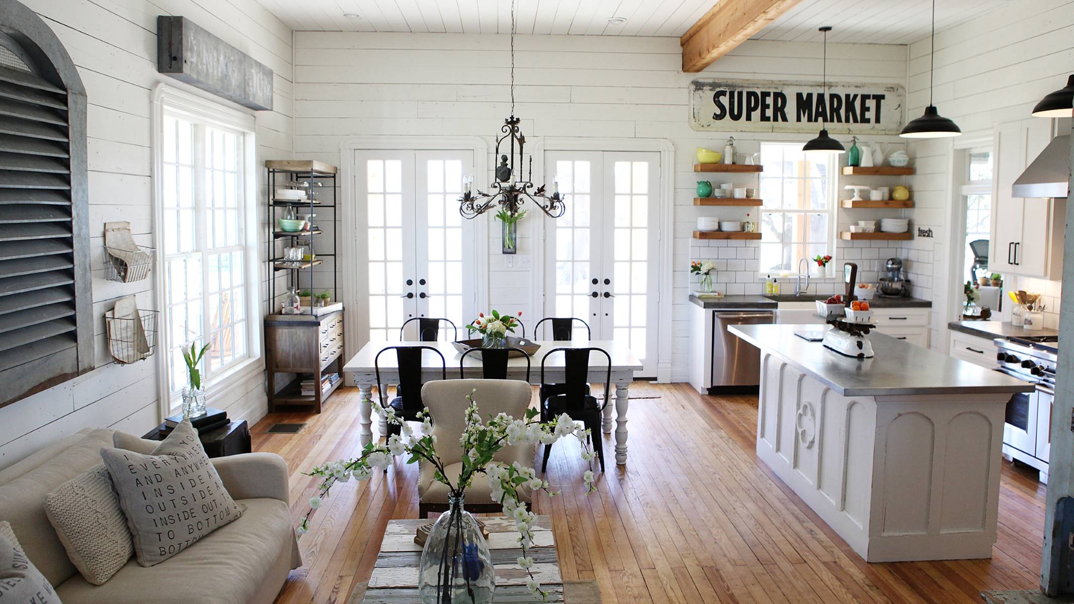
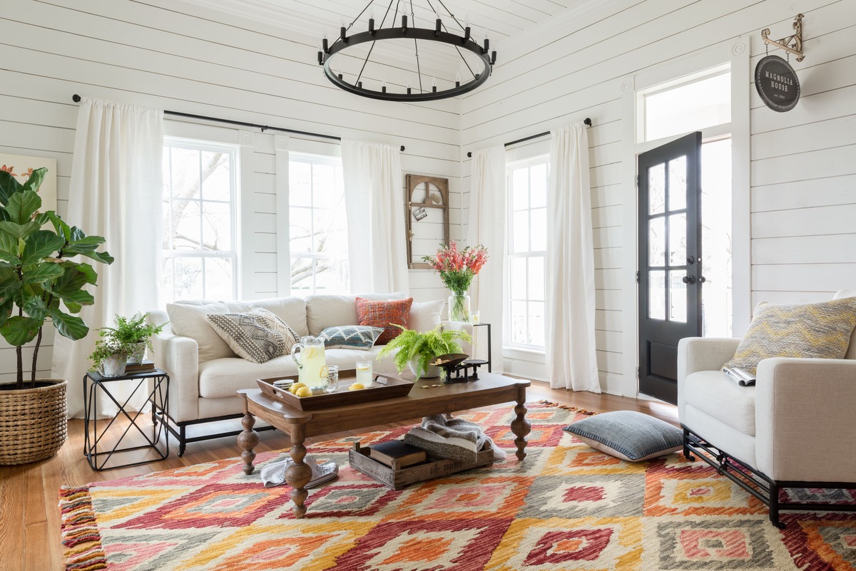
- White and Wood: One of Joanna’s go-to color combinations is the classic pairing of white and natural wood tones. This combination brings a timeless and rustic charm to a space. The clean and bright white walls and furniture provide a fresh backdrop, while the warmth and texture of the wood accents add depth and character. This combination is often seen in her farmhouse-style designs.
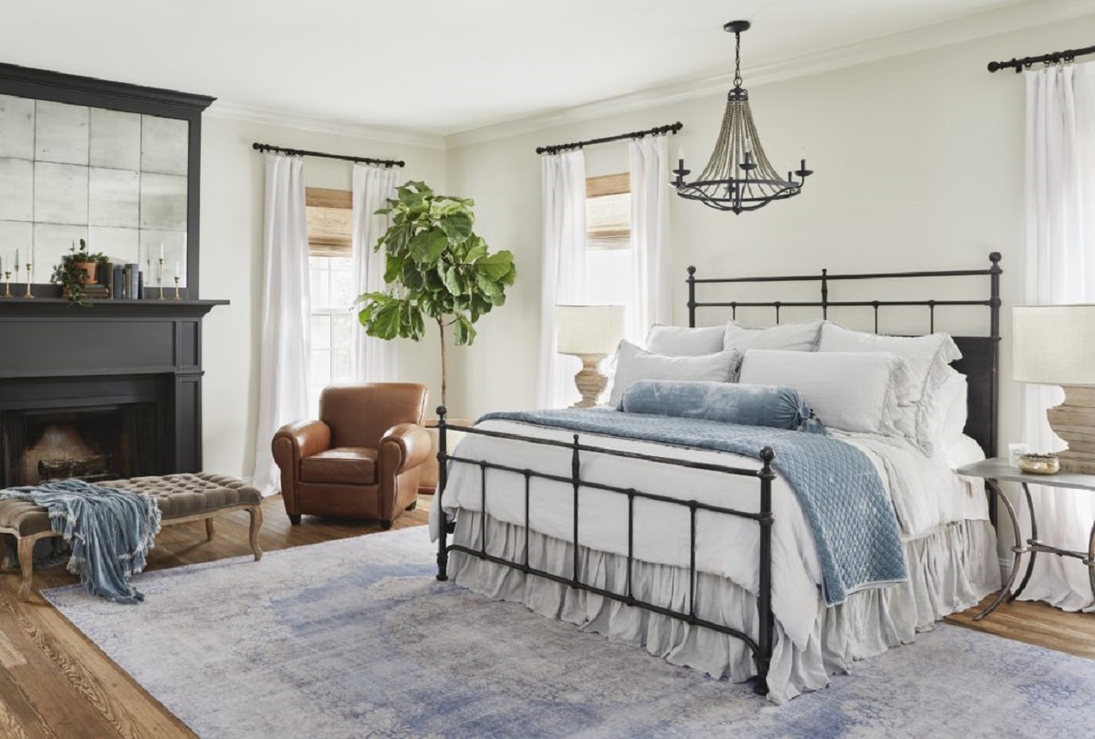
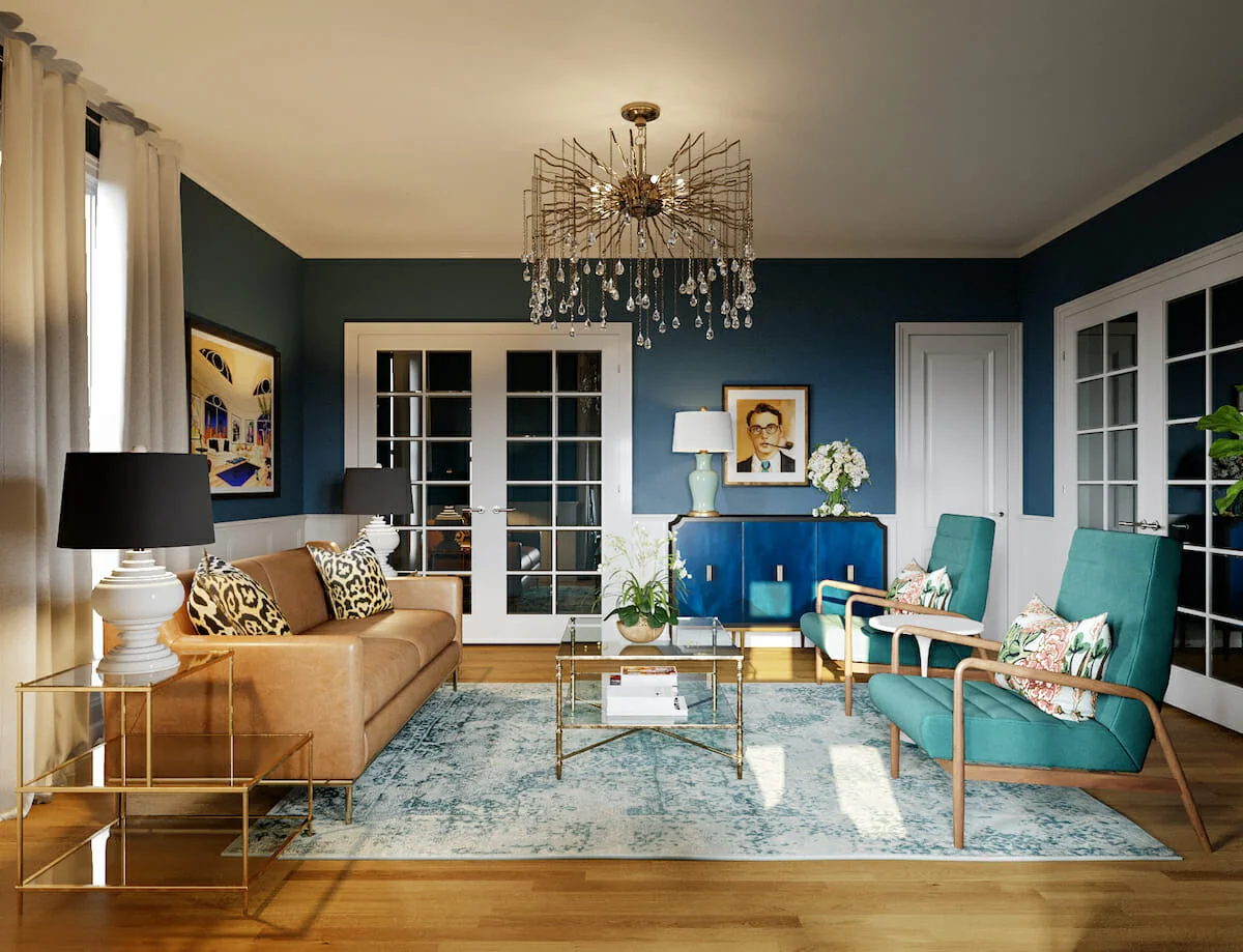
- Gray and Soft Pastels: Joanna frequently incorporates soft pastel colors with gray tones to create a serene and relaxing atmosphere. The use of pale blues, blush pinks, and soft greens adds a touch of femininity and tranquility to a space, while the gray acts as a calming and grounding element.
- Black and White: Joanna loves the timeless elegance of a black and white color scheme. This combination creates a striking contrast and adds a touch of sophistication to any space. The crisp white walls and furniture paired with black accents in decor and fixtures create a bold and modern look.
- Navy Blue and Brass: Another color combination often seen in Joanna’s designs is navy blue and brass. The rich and deep navy blue brings a sense of depth and drama to a room, while the warm tones of brass add a touch of elegance and sophistication. This combination works well in creating a luxurious and inviting ambiance.
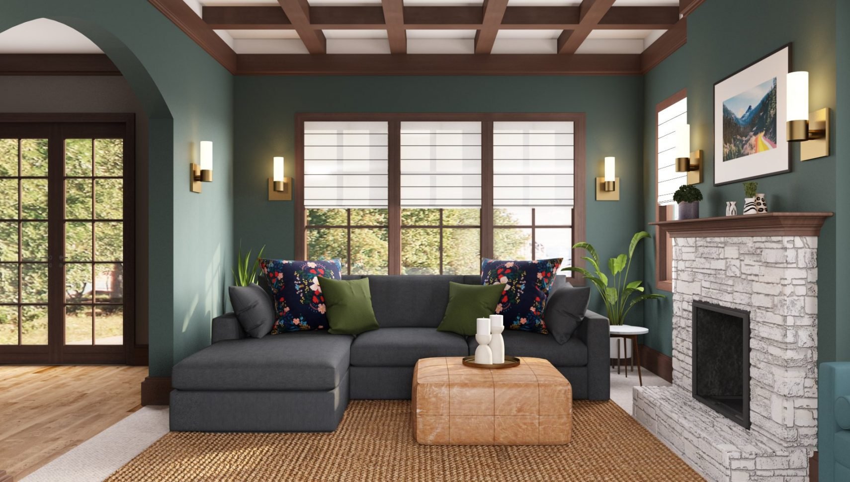
- Beige and Sage Green: Joanna loves incorporating earthy tones into her designs, and the combination of beige and sage green is a favorite of hers. The soft and neutral beige provides a warm and inviting base, while the sage green adds a touch of freshness and nature-inspired tranquility. This combination is often seen in her cozy and welcoming spaces.
These are just a few examples of Joanna Gaines’ favorite color combinations. Each pairing creates a distinct and cohesive look that reflects her design philosophy and style. By incorporating these color combinations into your own home, you can create spaces that are visually pleasing and reflect your personal taste.
Next, we will explore how Joanna Gaines finds inspiration in nature and incorporates it into her color schemes.
Finding Inspiration in Nature
Nature is a boundless source of inspiration, and Joanna Gaines is no stranger to harnessing its beauty in her designs. She finds inspiration in the colors and textures found in the natural world and incorporates them into her color schemes. By bringing elements of nature indoors, she creates spaces that feel organic, serene, and inviting.
One way Joanna draws inspiration from nature is by observing the colors found in landscapes. Whether it’s the soft hues of a sunrise, the vibrant shades of a flower garden, or the earthy tones of a forest, she takes note of the harmonious color combinations that exist in the outdoors. These palettes serve as a starting point for her design process, helping her create spaces that evoke the same sense of beauty and tranquility.
Incorporating natural materials is another way Joanna finds inspiration from nature. She often incorporates wood, stone, and other natural elements into her designs. These materials not only bring in texture and warmth but also introduce earthy tones that reflect the colors found in nature. By blending these materials with her chosen color schemes, she creates a sense of harmony between the indoors and outdoors.
Furthermore, Joanna draws inspiration from the changing seasons. She pays attention to how colors shift and evolve with each season and applies these observations to her design choices. For example, in the spring, she may incorporate lighter and fresher colors, like pastel hues, to emulate the blooming flowers and new growth. In the fall, she might lean towards warm and cozy colors, like rich oranges and deep browns, to capture the essence of the changing leaves.
By finding inspiration in nature, Joanna Gaines crafts color schemes that are not only visually appealing but also create a sense of peace and harmony within the home. Nature serves as her guide, reminding her of the beauty that surrounds us and encouraging her to incorporate its elements into her designs.
In the next section, we will explore how Joanna experiments with texture and patterns to enhance her color schemes.
When choosing a color scheme, start with a main color that you love and then use a color wheel to find complementary or analogous colors to create a cohesive and balanced palette.
Experimenting with Texture and Patterns
Texture and patterns are essential elements in interior design, and Joanna Gaines understands how to utilize them to enhance her color schemes. By incorporating different textures and patterns, she adds depth, visual interest, and a touch of personality to her spaces.
One way Joanna experiments with texture is by mixing and matching materials with different finishes. For example, she may pair a smooth and glossy surface with a rough and matte one to create a contrast that adds intrigue to a room. This can be seen in her use of a sleek marble countertop paired with a rustic farmhouse-style wooden table.
In addition to varying textures, Joanna also incorporates patterns to add visual interest and create focal points in her designs. Whether it’s bold geometric patterns, delicate floral patterns, or intricate tile patterns, she uses them strategically to enhance her chosen color scheme. Patterns can be introduced through wallpaper, textiles, or accent pieces, allowing for versatility and easy changeups in the future.
When it comes to choosing patterns, Joanna often selects ones that reflect her design style and the overall aesthetic of the space. For her modern farmhouse designs, she may opt for classic patterns such as gingham or plaid, while for more eclectic spaces, she might experiment with bolder and more abstract patterns.
Furthermore, Joanna believes that texture and pattern can also be found in nature itself. She might incorporate natural fibers like jute or bamboo, or choose fabrics with organic patterns inspired by leaves, flowers, or even animal prints. These elements create a connection to the natural world and add a sense of warmth and comfort to the space.
By experimenting with texture and patterns, Joanna Gaines brings her color schemes to life. The combination of different textures and patterns adds dimension and personality, elevating the overall design aesthetic of her projects.
Next, let’s explore how Joanna incorporates neutral tones in her color schemes.
Incorporating Neutral Tones
Neutral tones are a staple in Joanna Gaines’ color palette, and she understands the power of these versatile hues. Neutrals create a sense of balance, provide a timeless backdrop, and allow other colors and elements to shine. By incorporating neutral tones, she creates spaces that are serene, sophisticated, and effortlessly chic.
One of the key benefits of using neutral tones is the ability to create a calming atmosphere. Colors like white, beige, and gray have a soothing effect, making them ideal choices for bedrooms, living rooms, and other areas where relaxation is a priority. They create a blank canvas that can be layered with other colors and textures to add depth and interest to the space.
Neutrals also provide a timeless and versatile foundation for a room. They can easily adapt to changes in style or trends, making them a practical and long-lasting choice. A neutral backdrop allows for greater flexibility in adding pops of color or accents that can be easily updated without needing a complete overhaul of the space.
Joanna Gaines often uses neutral tones as the primary color in her designs, and then infuses warmth and depth through the use of different shades and textures in furnishings, decor, and textiles. This layering of neutrals creates a visually appealing space that feels cohesive and inviting.
Furthermore, Joanna believes that the use of natural materials complements neutral tones perfectly. The warmth of wood, the texture of stone, or the softness of natural fibers can enhance the neutral color scheme, adding richness and tactile interest to the space.
By incorporating neutral tones, Joanna Gaines creates a foundation that allows her to play with different colors, textures, and patterns. Neutrals serve as the anchor while providing a sense of calmness and versatility, resulting in spaces that are both timeless and welcoming.
In the next section, let’s explore how Joanna uses accent colors to add vibrancy and personality to her color schemes.
Using Accent Colors
Accent colors play a crucial role in interior design, and Joanna Gaines knows how to use them to add pops of vibrancy and personality to her color schemes. Whether it’s a bold hue or a subtle shade, accent colors create focal points, add visual interest, and infuse energy into a space.
Joanna often selects accent colors that complement the overall color palette while providing a striking contrast. For example, in a predominantly neutral room, she might introduce accents of rich blues, vibrant yellows, or deep reds. These bold hues instantly draw attention and create a focal point in the space.
Accent colors can be introduced through various elements, such as artwork, throw pillows, rugs, or even painted accent walls. By strategically placing these accent pieces, Joanna creates visual impact and adds depth to a room.
Another way Joanna uses accent colors is by incorporating them in smaller details and accessories. She loves to play with unexpected pops of color through decorative objects, vases, or even books. These subtle accents can add a playful touch and inject personality into the space.
In addition to bold accent colors, Joanna also appreciates the power of subtle accents. Soft pastels, muted tones, or earthy shades can act as accents to create a more subdued and sophisticated look. These understated colors add a layer of depth without overpowering the overall color scheme.
When selecting accent colors, Joanna considers the emotions and moods they evoke. Bold and vibrant colors, like red or bright yellow, can energize and create a sense of excitement. On the other hand, calming and soothing colors, like soft blues or greens, can create a serene and peaceful ambiance.
By using accent colors strategically, Joanna Gaines adds visual interest and personality to her designs. Whether it’s through bold and vibrant hues or subtle and understated shades, accent colors play a vital role in creating a cohesive and visually appealing space.
Now that we’ve explored how Joanna incorporates accent colors, let’s discuss the importance of balance in color selection.
Seeking Balance in Color Selection
When it comes to choosing color schemes, Joanna Gaines understands the importance of seeking balance. Finding the right balance between colors is essential for creating a harmonious and visually pleasing space. By carefully curating a color palette, she ensures that no one color dominates and that each hue complements the others.
One aspect of achieving balance is considering the proportions of different colors. Joanna avoids overwhelming a room by ensuring that no single color is overpowering. Instead, she blends colors in a way that allows each one to have its moment and contribute to the overall aesthetic. This balanced approach creates a sense of unity and coherence.
Another consideration in seeking balance is the distribution of colors throughout the space. Joanna carefully chooses where and how to incorporate colors to ensure a visual flow. She may use accent colors as focal points, strategically placing them in areas that naturally draw attention. By distributing colors in a thoughtful manner, she maintains a balanced and visually pleasing composition.
Furthermore, Joanna understands that balance is not just about colors but also about textures and patterns. She combines smooth and rough textures, as well as bold and subtle patterns, to create contrast and interest. This balance of textures and patterns adds depth and dimension to her color schemes.
Moreover, Joanna pays attention to the scale of colors within a room. She balances lighter hues with darker shades, as well as warm tones with cool tones, to create visual equilibrium. This consideration ensures that colors don’t overpower or clash with each other, resulting in a cohesive and well-balanced design.
Seeking balance in color selection allows Joanna Gaines to create spaces that are visually appealing, harmonious, and welcoming. By carefully considering proportions, distribution, textures, patterns, and scales, she achieves a cohesive and balanced color palette that enhances the overall design.
As we conclude our exploration of Joanna Gaines’ approach to color schemes, it’s clear that her expert understanding of balance and harmony sets her designs apart. By understanding color psychology, finding inspiration in nature, experimenting with texture and patterns, incorporating neutral tones, using accent colors, and seeking balance, Joanna creates stunning and unforgettable spaces.
So, whether you’re embarking on a home design project or simply looking for inspiration, consider incorporating some of Joanna Gaines’ techniques to create a space that is both visually appealing and emotionally stirring.
Final Thoughts by Joanna Gaines
When it comes to selecting color schemes, I believe that it’s important to trust your instincts and choose colors that resonate with you. Your home should be a reflection of your personality and a place where you feel comfortable and inspired.
Color plays a vital role in setting the mood and creating a specific ambiance in a room. Whether you want a calming retreat or a vibrant and energetic space, the right combination of colors can help you achieve that desired atmosphere.
It’s also important to remember that color is not just about paint on the walls but also about the overall design and furnishings. Consider how colors interact with different textures, patterns, and materials to create a cohesive and visually appealing space.
Throughout my design journey, I’ve found inspiration in nature, explored the psychology of color, and experimented with different combinations. The key is to find a balance and create a color scheme that feels harmonious to you.
Lastly, don’t be afraid to take risks and get creative with color. Step beyond your comfort zone and try new combinations or unexpected accents. This is where the magic happens and your individual style shines through.
I hope these insights into my approach to color schemes have inspired you to embark on your own design journey. Remember to have fun, trust your instincts, and create a space that reflects your unique style and personality.
Happy designing!
Frequently Asked Questions about Joanna Gaines Reveals Her Secret To Choosing Color Schemes
Was this page helpful?
At Storables.com, we guarantee accurate and reliable information. Our content, validated by Expert Board Contributors, is crafted following stringent Editorial Policies. We're committed to providing you with well-researched, expert-backed insights for all your informational needs.

0 thoughts on “Joanna Gaines Reveals Her Secret To Choosing Color Schemes”