Home>Interior Design>32 Room Color Ideas: A Masterclass In Decorating With Color
Interior Design
32 Room Color Ideas: A Masterclass In Decorating With Color
Modified: October 20, 2024
Discover 32 inspiring room color ideas in this interior design masterclass. Learn expert tips and techniques for decorating with color to transform your space.
(Many of the links in this article redirect to a specific reviewed product. Your purchase of these products through affiliate links helps to generate commission for Storables.com, at no extra cost. Learn more)
Introduction
When it comes to interior design, color plays a crucial role in creating a visually appealing and comfortable space. The right color palette can completely transform a room, evoking different moods and setting the tone for the overall design. Whether you prefer vibrant and bold hues or a more subtle and neutral palette, understanding how to use color effectively can elevate your interior design game to the next level.
In this article, we will delve into the world of color and explore a masterclass in decorating with color. From understanding the psychology of color to choosing the right color scheme, we will provide you with an array of room color ideas that can inspire and guide your design choices. Whether you are looking to revitalize your living room, create a serene bedroom retreat, or add a pop of color to your kitchen, we’ve got you covered.
Before we dive into the vast array of color options, it’s important to understand the power of color and how it can impact our mood and emotions. Color psychology is the study of how different colors can affect human behavior and emotions. For example, warm colors such as red and orange are known to evoke feelings of energy and warmth, while cool colors like blue and green can create a more peaceful and calming atmosphere.
Choosing the right color scheme for your space is crucial to achieving the desired ambiance. The color wheel is a useful tool that can guide you in selecting complementary, analogous, or monochromatic colors. Complementary colors are those that are opposite each other on the color wheel, such as blue and orange or red and green. These combinations create a striking visual contrast. Analogous colors are adjacent to each other on the color wheel, such as blue and green or red and orange. Using analogous colors can create a harmonious and cohesive look. Monochromatic colors, on the other hand, involve using different shades and tones of a single color to create a soothing and unified effect.
In the following sections, we will explore various room color ideas, starting with neutral tones. Beige and cream hues can create a warm and inviting environment, while gray shades offer a contemporary and sophisticated feel. White and off-white colors can give a room a clean and fresh look.
If you’re feeling more adventurous and want to make a statement, bold and vibrant colors can be the perfect choice. Red and crimson shades can add drama and passion to a room, while blue and teal hues can create a calming and serene atmosphere. Yellow and orange tones can infuse energy and warmth, while green and emerald shades bring a touch of nature indoors. Purple and lavender shades add a touch of elegance, while pink and fuchsia hues inject a pop of femininity.
Key Takeaways:
- Master the art of decorating with color by understanding the psychology of different hues and choosing the right color scheme to evoke desired emotions and create a visually pleasing interior design.
- Infuse your space with personality and style by strategically incorporating accent colors, experimenting with warm and cool tones, and reflecting your personal style to create a vibrant and inviting oasis.
Understanding the Power of Color
Color has a profound impact on our mood and emotions. The psychology of color explores how different colors can affect human behavior and evoke specific feelings. Understanding the power of color can help you create a harmonious and balanced interior design that resonates with your personality and desired atmosphere.
Let’s explore some of the most commonly used colors and how they can influence our emotions:
Red:
Red is a bold and powerful color that can evoke strong emotions. It is often associated with passion, love, and energy. In interior design, red can create a sense of excitement and intensity. However, it’s important to use red in moderation as it can be overwhelming if used excessively.
Blue:
Blue is a cool and calming color that can create a sense of tranquility and relaxation. It is often associated with stability and serenity. Lighter shades of blue can lend a refreshing and airy feel to a space, while deeper blues can add depth and sophistication.
Yellow:
Yellow is a vibrant and cheerful color that can evoke feelings of happiness and optimism. It is often associated with sunshine and warmth. Yellow can brighten up a space and make it appear more inviting and energetic. However, be cautious when using bright yellows as they can be overwhelming if not balanced with other colors.
Green:
Green is a color that symbolizes nature, growth, and renewal. It can create a sense of balance and harmony in a space. Lighter shades of green can create a relaxing and peaceful atmosphere, while deeper greens can add richness and depth. Using green in interior design can help bring a touch of the outdoors inside.
Purple:
Purple is a color often associated with royalty, luxury, and creativity. It can evoke a sense of elegance and sophistication. Lighter shades of purple, such as lavender, can create a calm and serene environment, while deeper purples can add drama and opulence.
Orange:
Orange is a warm and energetic color that can evoke feelings of enthusiasm and creativity. It is often associated with vitality and stimulation. Orange can add a pop of brightness and warmth to a space and create an inviting atmosphere. However, like red and yellow, it’s important to use orange in moderation to avoid overwhelming the room.
Each color has its own unique qualities and can impact the overall mood and ambiance of a room. When incorporating colors into your interior design, consider the emotions and atmosphere you want to create. You can use different colors in varying intensities and combinations to achieve the desired effect.
Now that we have explored the psychology of color and how it can impact our emotions, let’s move on to choosing the right color scheme for your space. By understanding the principles of color harmony and balance, you can create a visually pleasing and inviting interior design that reflects your personal style.
Choosing the Right Color Scheme
When it comes to selecting the right color scheme for your interior design, the color wheel is a valuable tool to help you make informed choices. It provides a visual representation of the relationships between different colors, allowing you to create harmonious and balanced combinations.
The Color Wheel:
The color wheel consists of primary, secondary, and tertiary colors. Primary colors are red, blue, and yellow, and they cannot be created by mixing other colors. Secondary colors are created by mixing two primary colors together, resulting in green, orange, and purple. Tertiary colors are created by mixing a primary color with a adjacent secondary color, resulting in a wide range of hues.
Complementary Colors:
Complementary colors are pairs of colors that are directly opposite each other on the color wheel. For example, blue and orange, or red and green. Complementary colors create a striking contrast when used together, making each color appear more vibrant. They can be used to create high impact and visually dramatic interiors. However, it’s important to use complementary colors sparingly to avoid overwhelming the space.
Analogous Colors:
Analogous colors are those that are adjacent to each other on the color wheel. For example, blue and green, or red and orange. Analogous color schemes create a harmonious and cohesive look, as they share similarities in undertones. They are often used in interior design to create a sense of continuity and flow between different areas of a space.
Monochromatic Colors:
Monochromatic color schemes involve using different shades, tints, and tones of a single color. For example, using various shades of blue throughout a room. Monochromatic color schemes create a sense of harmony and balance, as they rely on variations of a single color. They are particularly well suited for minimalist and contemporary interior designs.
When choosing a color scheme, consider the overall mood and atmosphere you want to create. Different color schemes can evoke different emotions and set the tone for a space. Bold and vibrant colors can create a lively and energetic atmosphere, while neutral and muted tones can promote a sense of relaxation and calmness.
Experimenting with different color combinations can help you find the perfect palette for your interior design. Don’t be afraid to mix and match colors to create a unique and personalized space that reflects your style and personality. And remember, the key is to strike a balance between using bold statement colors and incorporating more neutral tones to create a cohesive and visually pleasing environment.
In the next sections, we will explore specific room color ideas that can inspire your design choices. From neutral hues to bold and vibrant shades, we will provide you with a range of options to suit various rooms and design preferences.
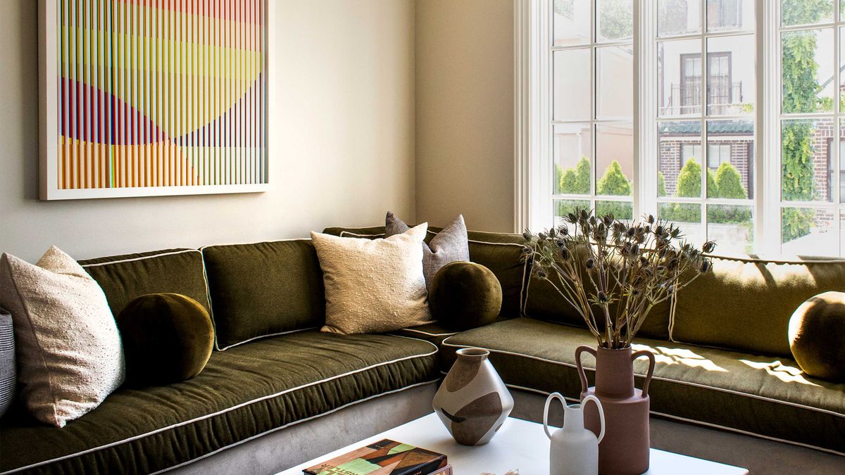
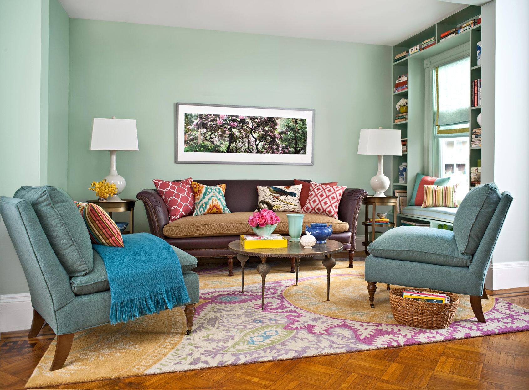
Neutral Room Color Ideas
Neutral colors are a popular choice for interior design as they create a versatile and timeless backdrop for any style. They can evoke a sense of calmness, serenity, and sophistication, making them suitable for a variety of room types. Let’s explore some neutral room color ideas:
Beige and Cream Tones:
Beige and cream tones are warm and inviting, creating a cozy and welcoming atmosphere. They work well in living rooms, bedrooms, and dining areas, providing a soothing backdrop for furniture and décor. Beige and cream hues can vary in undertones, from more yellow-based to pink or taupe-based, allowing for flexible design possibilities. These colors also pair well with other neutrals, earthy tones, and pops of color.
Gray Shades:
Gray is a versatile and sophisticated neutral color that works well in various room settings. Lighter shades of gray can create an airy and elegant ambiance, while darker shades add depth and drama. Gray is a popular choice for modern and contemporary designs, as it complements sleek and minimalist aesthetics. It also serves as an ideal backdrop for showcasing artwork and decorative elements.
White and Off-White Hues:
White and off-white hues are timeless and classic choices that can make a room feel fresh, bright, and spacious. They are often associated with cleanliness and purity, making them ideal for bathrooms and kitchens. White walls can also act as a blank canvas, allowing other elements in the room to stand out. Off-white shades, such as ivory or cream, add warmth and softness, making them suitable for living areas and bedrooms.
When using neutral colors in your interior design, consider layering different shades and textures to create visual interest. For example, you can pair a neutral wall color with darker or lighter furniture, textured fabrics, and decorative accents in varying tones of the same neutral palette. This creates depth and dimension while maintaining a cohesive and relaxed environment.
Neutral colors also provide a great foundation for incorporating pops of color into your room. You can add visual interest and personality by introducing vibrant accessories, artwork, and textiles. This allows you to change the look and feel of a space easily without needing to repaint the walls.
Whether you prefer the warmth of beige and cream tones, the sophistication of gray shades, or the fresh simplicity of white and off-white hues, neutral colors offer endless possibilities for creating a beautiful and inviting space.
Next, let’s explore bold and vibrant room color ideas that can add personality and flair to your interior design.
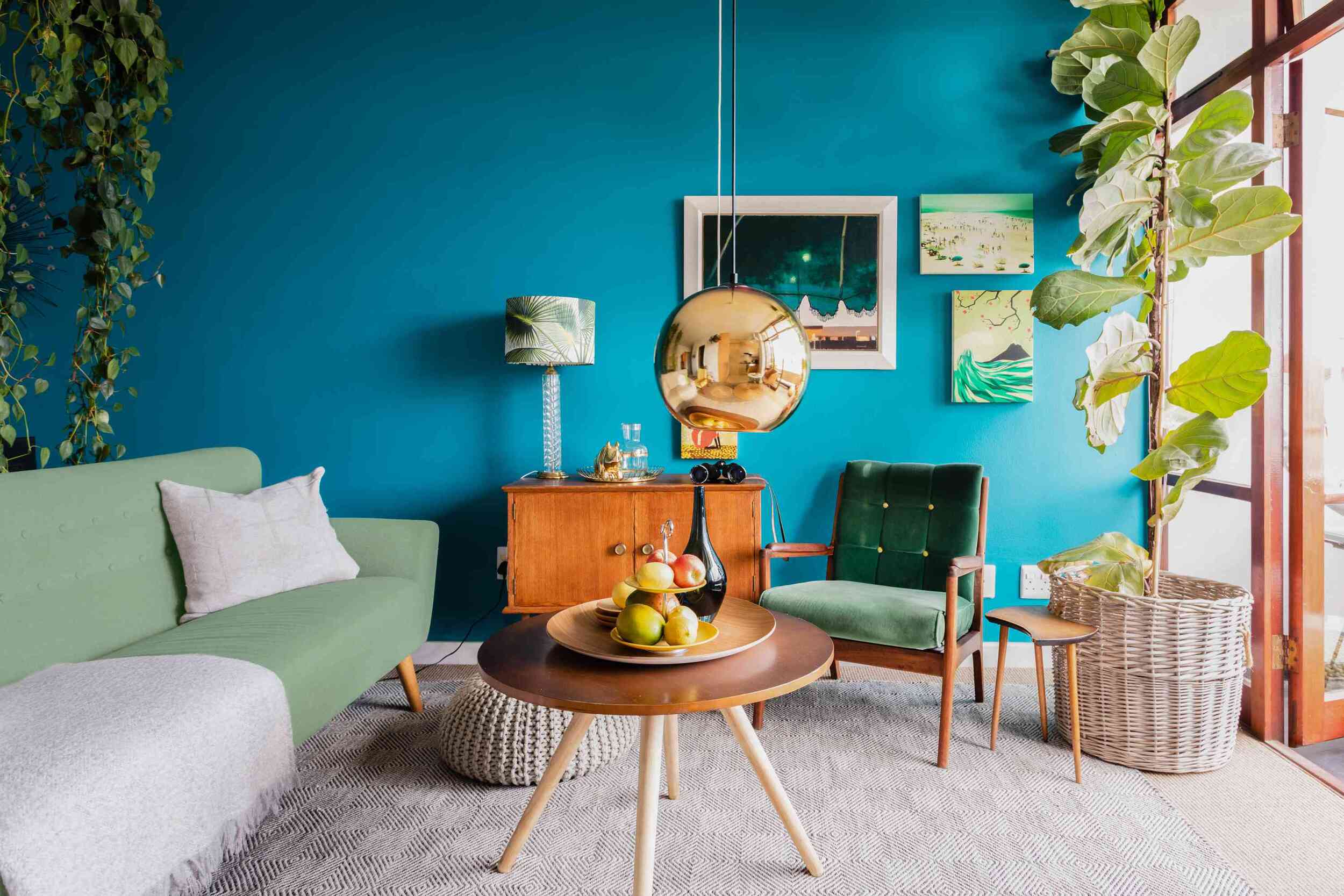
Bold and Vibrant Room Color Ideas
If you’re looking to make a statement and infuse your space with energy and personality, bold and vibrant colors are the way to go. These colors can create a dynamic and lively atmosphere, bringing cheerfulness and excitement to your interior design. Let’s explore some bold and vibrant room color ideas:
Red and Crimson Shades:
Red is a strong and passionate color that demands attention. It can create a bold and dramatic look, particularly in larger spaces where it can be used as an accent wall or in furniture pieces. Crimson shades, with their deeper and richer tones, can add elegance and sophistication. Red is often associated with love, energy, and warmth, making it a great choice for living rooms or dining areas.
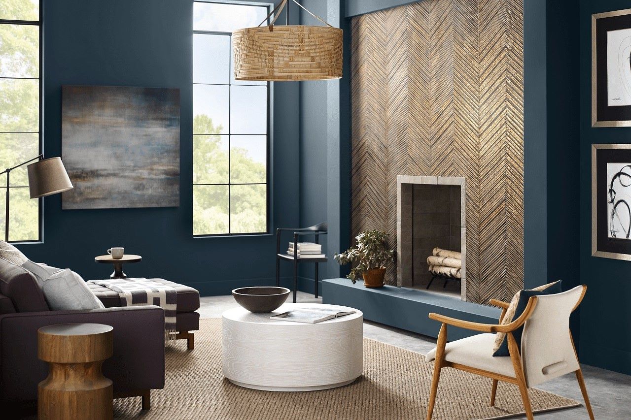
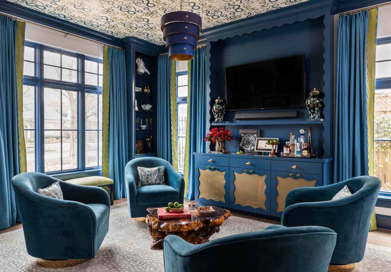
Blue and Teal Hues:
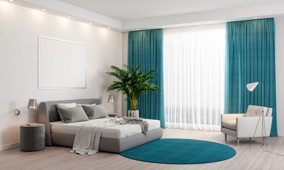
Blue is a calming and serene color that can create a peaceful and relaxing atmosphere. Lighter shades of blue, such as baby blue or sky blue, can give a space a fresh and airy feel. On the other hand, deeper shades of blue, such as navy or royal blue, can bring depth and richness to the room. Teal hues, with their mix of blue and green, can add a touch of vibrancy and uniqueness to the space.
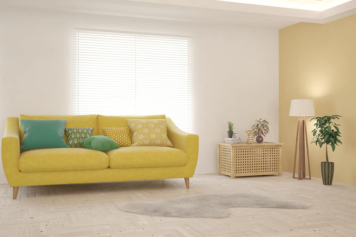
Yellow and Orange Tones:
Yellow and orange tones are warm and vibrant colors that can bring joy and positivity to any room. Yellow is often associated with sunshine and happiness, while orange exudes energy and enthusiasm. These colors work well in spaces where you want to create a lively and cheerful ambiance, such as kitchens, playrooms, or home offices. Use them as accent colors or incorporate them through furniture, artwork, or decorative accessories.
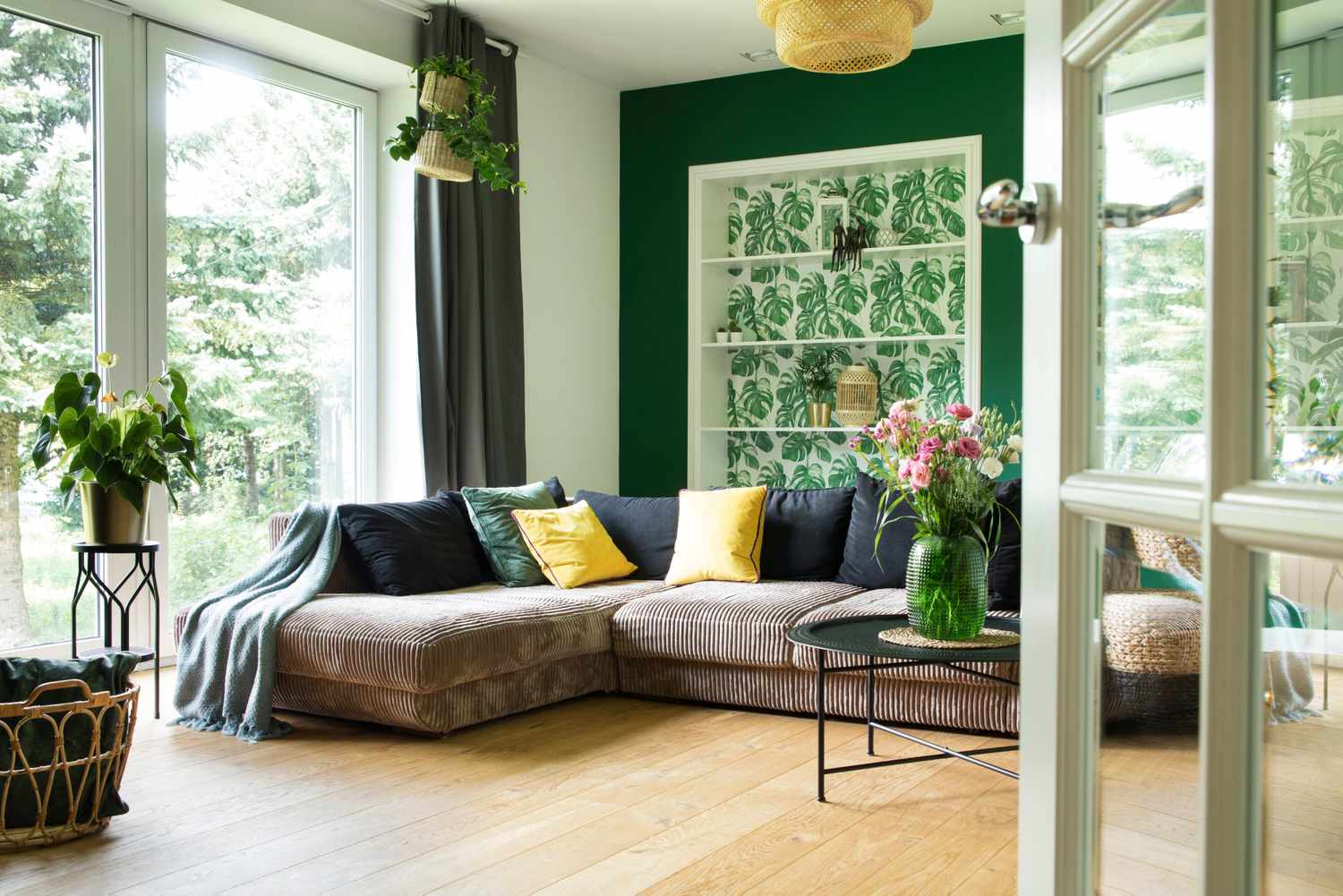
Green and Emerald Tones:
Green is a color that symbolizes nature, freshness, and growth. It can create a calming and harmonious atmosphere. Lighter shades of green, such as mint or sage green, can evoke a sense of tranquility and relaxation, making them ideal for bedrooms or bathrooms. Deeper shades, such as emerald or forest green, can add a touch of opulence and drama, particularly when used in accent pieces or as feature walls.
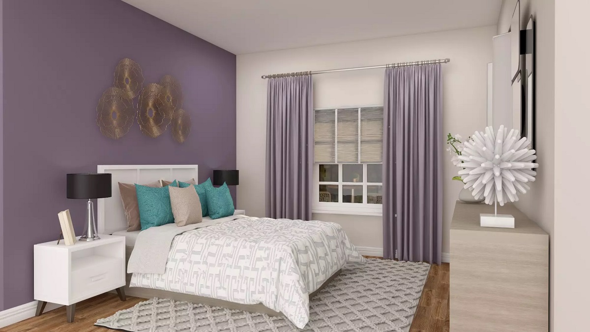
Purple and Lavender Shades:
Purple is a color often associated with royalty, luxury, and creativity. It can add an element of elegance and sophistication to any space. Lighter shades of purple, such as lavender or lilac, can create a serene and calming environment, making them perfect for bedrooms or reading nooks. Deeper shades of purple, such as plum or eggplant, can create a sense of richness and opulence in living areas or dining rooms.
Pink and Fuchsia Hues:
Pink and fuchsia are vibrant and playful colors that can inject a pop of femininity and personality into your interior design. Lighter shades of pink, such as blush or pastel pink, can create a soft and romantic atmosphere. Bolder hues of pink, such as fuchsia or hot pink, can make a bold statement when used sparingly, for example, in accent pieces or artwork.
When incorporating bold and vibrant colors into your interior design, it’s important to strike a balance and consider the overall mood and atmosphere you want to create. These colors can be used as accent walls, in furniture pieces, or through accessories and artwork. When combined with neutrals or lighter tones, they can create a harmonious and visually pleasing balance.
Now that we’ve explored bold and vibrant colors, let’s move on to creating a cozy atmosphere with warm colors in the next section.
Creating a Cozy Atmosphere with Warm Colors
Warm colors have the ability to create a cozy and inviting atmosphere in any room. They evoke feelings of comfort and warmth, making them the perfect choice for creating a welcoming and nurturing space. Let’s explore some warm room color ideas:
Warm Red, Orange, and Yellow Shades:
Red, orange, and yellow are often referred to as the “warm colors” on the color wheel. These shades can create a sense of energy, vitality, and happiness in a room. Warm red hues, such as burgundy or maroon, can add richness and depth to a space. Orange tones can bring warmth and vibrancy, while yellow shades can create a sunny and cheerful ambiance. These colors work well in living rooms, dining areas, or any space where you want to create a lively and energetic atmosphere.
Earthy Brown and Terracotta Hues:
Earthy brown tones and terracotta hues can add a sense of warmth and grounding to a room. These colors are reminiscent of natural elements like earth, wood, and clay. Brown shades can create a cozy and comforting feel, while terracotta shades bring a touch of rustic warmth. These colors work particularly well in bedrooms, living rooms, and study spaces, where you want to create a cozy and intimate ambiance.
When using warm colors, it’s important to consider balance and harmony. While these colors can bring energy and warmth, too much saturation can overpower the room. Combining warm colors with neutral tones or cool accents can help create a more balanced and visually appealing environment.
You can incorporate warm colors through wall paint, furniture upholstery, decorative accessories, and textiles. For example, consider a warm red accent wall paired with neutral furniture or yellow throw pillows and curtains in a living room. Experimenting with different color combinations and shades can help you find the perfect balance that suits your taste and desired ambiance.
Additionally, lighting plays an essential role in enhancing the warmth of these colors. Opt for warm-toned lighting fixtures or use soft lighting techniques to create a cozy and inviting atmosphere. This will further enhance the impact of warm colors in your space.
Creating a cozy atmosphere with warm colors allows you to transform any room into a comforting haven. Whether you choose to incorporate shades of red, orange, yellow, or opt for earthy brown and terracotta hues, the key is to strike a balance and create a space that is both visually appealing and inviting.
Next, let’s explore creating a serene ambiance with cool colors in the upcoming section.
When choosing a color scheme for a room, consider the mood you want to create. Warm colors like red and orange can energize a space, while cool colors like blue and green can create a calming atmosphere. Experiment with different combinations to find the perfect balance for your room.
Achieving Serenity with Cool Colors
Cool colors have a calming effect and can help create a serene and tranquil atmosphere in your space. These colors are often associated with nature and the elements of water and sky. By incorporating cool colors into your interior design, you can achieve a sense of peace and relaxation. Let’s explore some cool room color ideas:
Cool Blue and Green Tones:
Cool blue and green tones can create a refreshing and calming ambiance. Lighter shades of blue, such as sky blue or baby blue, can evoke a sense of serenity and spaciousness. Deeper shades of blue, such as navy or teal, can add richness and depth to a room. Green tones, especially lighter shades like mint or sage, create a sense of harmony and balance. These cool colors work well in bedrooms, bathrooms, or any space where you want to create a serene and refreshing environment.
Serene Lavender and Gray-Blue Shades:
Lavender and gray-blue shades can create a peaceful and serene atmosphere in any room. Lavender, a lighter shade of purple, brings a sense of relaxation and tranquility. It works beautifully in bedrooms or even in meditation spaces. Gray-blue shades, like the colors of the sky or ocean, have a soothing effect, especially when paired with white or other neutral tones. These colors can be incorporated through wall paint, bedding, curtains, or accent pieces.
When choosing cool colors, it’s important to consider the overall mood and desired ambiance of the space. Cool colors work well in rooms where you want to create a peaceful retreat or promote relaxation, such as bedrooms or reading nooks. They can also be used in common areas to create a refreshing and tranquil environment.
When using cool colors, consider balancing them with warmer or neutral tones to create contrast and harmony. This can be achieved through furniture, accessories, or other elements in the room. It’s important to strike a balance so that the cool colors don’t create a cold or sterile feeling in the space.
In addition to color, lighting also plays a significant role in enhancing the serenity of cool colors. Choosing soft and diffused lighting can help create a calming effect and bring out the best in these colors.
Achieving serenity with cool colors allows you to create a peaceful and tranquil space where you can relax and unwind. Whether you choose cool blue and green tones or serene lavender and gray-blue shades, embrace the calming qualities of these colors to transform your home into a serene sanctuary.
Next, let’s explore the use of accent colors to make a statement in your interior design.
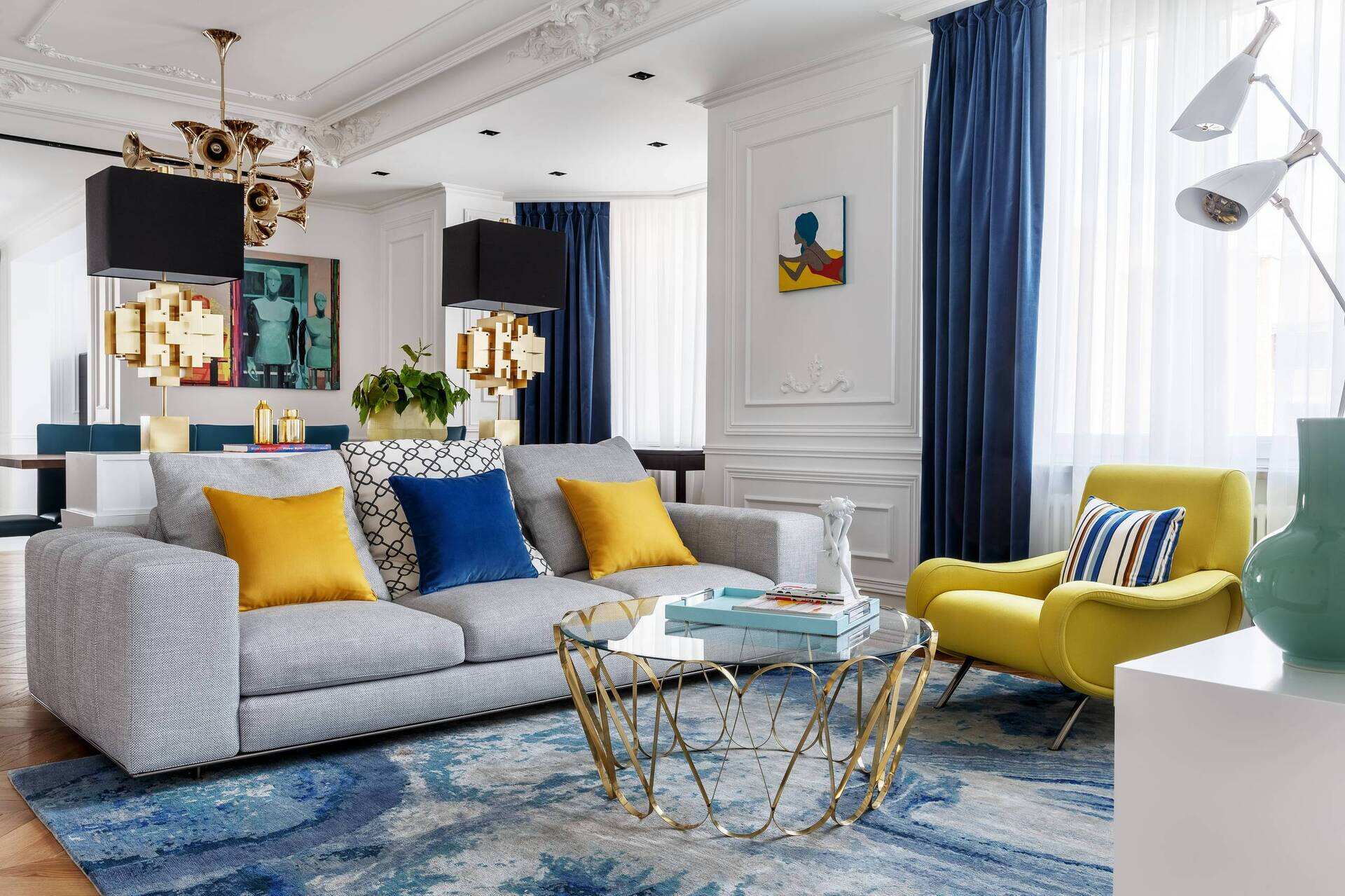
Using Accent Colors to Make a Statement
Accent colors are a powerful tool in interior design that can add excitement and make a bold statement in any room. By strategically incorporating accent colors, you can create focal points and add visual interest to your space. Let’s explore some ways to use accent colors:
High-Impact Accent Walls:
An accent wall is a fantastic way to introduce a bold color or pattern into a room. By painting one wall in a vibrant hue or applying wallpaper with a striking design, you can instantly draw attention to that area and make it the focal point of the room. Whether you choose a deep red, a bold blue, or a vibrant yellow, an accent wall can create a dramatic and eye-catching element in your space.
Pops of Color in Décor and Accessories:
Another way to incorporate accent colors is by using them in your décor and accessories. This allows you to add bursts of color without overwhelming the space. You can choose brightly colored throw pillows, vibrant curtains, or bold artwork to make a statement. Additionally, you can select accent pieces, such as a colorful area rug or a statement furniture piece in a striking color, to add personality and create visual interest in the room.
When using accent colors, it’s important to consider the overall color scheme and balance in the room. Choose accent colors that complement the existing colors in your space to create a cohesive look. For example, if you have a neutral color palette, bold pops of red, orange, or blue can create a stunning contrast. If you have a cool color scheme, warm accent colors like yellow or coral can bring energy and vibrancy.
Additionally, consider the scale and proportion of the accent colors in the room. Use them strategically to create focal points or to highlight specific design elements. This will help ensure that the accent colors have the desired impact without overwhelming the space.
Remember, accent colors can be changed relatively easily, allowing you to experiment and update the look of your room as desired. They offer a versatile and flexible way to make a statement and inject personality into your space without committing to a complete color overhaul.
Using accent colors to make a statement brings life and character to your interior design. Whether through high-impact accent walls or pops of color in décor and accessories, accent colors add vibrancy and visual interest to your space, creating a truly unique and personalized environment.
Next, let’s explore specific room color ideas for different areas of your home.
Color Ideas for Specific Rooms
Choosing the right colors for specific rooms in your home is essential in creating a cohesive and harmonious design. Each room has its own unique purpose and ambiance, and the right color palette can enhance the functionality and atmosphere of that space. Let’s explore some color ideas for specific rooms:
Living Room Color Ideas:
The living room is often the central gathering space in the home, where you entertain guests and relax with family. You can create a warm and inviting atmosphere in the living room with neutral colors like beige or cream, which provide a versatile backdrop for furniture and décor. If you want to make a statement, consider an accent wall in a bold color like deep blue, or incorporate pops of color through throw pillows, artwork, or a vibrant area rug.
Bedroom Color Ideas:
The bedroom should be a peaceful and restful sanctuary. Soft and subdued colors are often preferred in bedrooms to promote relaxation. Cool blues, such as sky blue or pale gray-blue, can create a serene and calming atmosphere. Neutral tones like warm gray or a soft, muted lavender can also contribute to a tranquil ambiance. It’s important to choose colors that promote restful sleep and reflect your personal style and preferences.
Kitchen Color Ideas:
The kitchen is the heart of the home, where you prepare meals and gather with loved ones. Bright and vibrant colors can energize the space and create a lively atmosphere. Consider using warm and inviting colors like soft yellows or muted oranges for kitchen walls. You can also bring in accents of color through colorful backsplashes, vibrant cabinetry, or fun kitchen accessories. Alternatively, if you prefer a sleek and modern look, go for a monochromatic color scheme using shades of gray or white with metallic accents.
Bathroom Color Ideas:
The bathroom is a space dedicated to relaxation and rejuvenation. You can create a spa-like atmosphere with soothing colors like pale blue or soft green. These cool colors can promote a sense of tranquility and serenity. Earthy tones like beige or taupe can also create a warm and cozy feel. To add interest, consider incorporating textures through tiles or wallpaper, or introducing pops of color with vibrant towels or accessories.
Remember, while these color ideas can serve as a starting point, it’s essential to consider your own personal preferences, the size of the room, and the amount of natural light available. Experiment with different shades and combinations to find the perfect color palette that suits the specific room and creates the desired ambiance.
Now that we’ve explored color ideas for specific rooms, let’s move on to some tips for decorating with color in the next section.
Tips for Decorating with Color
Decorating with color can be a fun and creative process that allows you to express your style and personality. To ensure a harmonious and visually pleasing result, it’s important to consider a few key tips. Let’s explore some tips for decorating with color:
Balancing Bold and Neutral Tones:
To create a well-balanced interior design, it’s important to strike a balance between bold and neutral tones. Using bold colors as accents or focal points can add excitement and personality to a space, while neutral colors provide a harmonious backdrop. For example, if you have a bold accent wall, balance it out with neutral furniture and accessories. Remember, too much bold color can overwhelm a room, so aim for a balance that suits your style and taste.
Harmonizing Different Colors in a Room:
When incorporating multiple colors in a room, it’s crucial to ensure they harmonize well together. One approach is to choose colors that are adjacent on the color wheel, such as analogous or monochromatic schemes, as they naturally create a cohesive look. Additionally, consider the undertones of the colors – warm colors tend to complement each other, as do cool colors. Test different color combinations and observe how they interact with one another to achieve a harmonious result.
Experimenting with Color in Small Doses:
If you’re unsure about committing to bold colors, experiment with color in small doses. Start with neutral base colors and then add pops of color through accessories, artwork, or accent furniture. This allows you to introduce color gradually and easily switch it up when desired. By incorporating color in this way, you can create interest and personality without overwhelming the space.
Considering the Role of Lighting:
Remember to consider the role of lighting in how colors appear in a room. Natural and artificial light can affect the way colors are perceived, so keep this in mind when choosing paint colors or coordinating different hues. Test colors under different lighting conditions to ensure they look the way you want them to in your space.
Reflecting Your Personal Style:
Above all, decorating with color is an opportunity to reflect your personal style and create a space that truly feels like home. Don’t be afraid to experiment and take risks with color choices. Whether your design aesthetic is bold and vibrant or calm and neutral, incorporate colors that make you feel happy and inspired.
By following these tips and trusting your instincts, you can create a beautiful and personalized space that reflects your unique style and brings joy to your everyday life.
As we conclude our exploration of tips for decorating with color, remember to have fun and let your creativity shine through. Your home is a reflection of who you are, and color is an essential tool in creating a space that truly feels like yours. Embrace the power of color and enjoy the process of transforming your home into a vibrant and inviting oasis.
Now that you are equipped with valuable knowledge and inspiration, it’s time to embark on your colorful interior design journey.
Conclusion
Decorating with color is a transformative and creative endeavor that allows you to infuse your space with personality and style. Understanding the power of color and its impact on mood and emotions is the first step in creating a harmonious and inviting interior design.
From choosing the right color schemes to exploring specific room color ideas, we have covered a wide range of possibilities for incorporating color into your home. Whether you prefer neutral tones that provide a timeless backdrop, bold and vibrant colors that make a statement, or cool colors that evoke a sense of calmness, there are endless options to suit your taste and desired ambiance.
Using accent colors strategically can enhance your design by creating focal points and adding visual interest. High-impact accent walls and pops of color in décor and accessories can inject energy and personality into your space, while maintaining balance and harmony with the overall color scheme.
When decorating with color, it’s important to consider the individual characteristics of each room and choose colors that align with their purpose and desired atmosphere. Whether you are designing a living room, bedroom, kitchen, or bathroom, selecting the right colors can enhance the functionality and create the ambiance you desire.
Through balancing bold and neutral tones, harmonizing different colors, experimenting with color in small doses, and considering the role of lighting, you can create a beautiful and cohesive interior design. Ultimately, your personal style and preferences should guide your color choices, as your home should be a reflection of your unique personality and taste.
With these tips and ideas in mind, you are now well-equipped to embark on your colorful interior design journey. Embrace the power of color, trust your instincts, and have fun creating a space that truly feels like home.
So, let your creativity soar, experiment with different color palettes, and watch as your home transforms into a vibrant and inviting oasis that brings joy and inspiration every day.
Frequently Asked Questions about 32 Room Color Ideas: A Masterclass In Decorating With Color
Was this page helpful?
At Storables.com, we guarantee accurate and reliable information. Our content, validated by Expert Board Contributors, is crafted following stringent Editorial Policies. We're committed to providing you with well-researched, expert-backed insights for all your informational needs.
0 thoughts on “32 Room Color Ideas: A Masterclass In Decorating With Color”