Home>Interior Design>5 Steps I Take To Create A Focussed Color Palette
Interior Design
5 Steps I Take To Create A Focussed Color Palette
Modified: August 30, 2024
Learn the 5 essential steps to create a focused color palette for interior design. Elevate your space with expert techniques and unleash your creative vision.
(Many of the links in this article redirect to a specific reviewed product. Your purchase of these products through affiliate links helps to generate commission for Storables.com, at no extra cost. Learn more)
Introduction
Welcome to the world of interior design, where every detail matters in creating a cohesive and visually stunning space. One essential aspect of interior design is the color palette, which sets the tone and ambiance of a room. A well-crafted color palette can transform a space from ordinary to extraordinary, evoking emotions and creating a sense of harmony.
In this article, I will share with you the five steps I take to create a focused color palette that enhances the overall design and functionality of a space. From understanding the purpose and mood to testing and refining, these steps will guide you through the process of selecting the perfect colors that complement your interior design vision.
So, let’s dive into the exciting world of color palettes and discover how you can create a harmonious and impactful space.
Key Takeaways:
- Crafting a focused color palette involves understanding the room’s purpose and mood, gathering inspiration, selecting key colors, creating variations, and testing and refining for a harmonious interior design.
- By following the 5 steps of color palette creation, you can transform a space from ordinary to extraordinary, evoking emotions and creating a sense of harmony through a thoughtfully crafted color palette.
Read more: How To Choose A Wardrobe Color Palette
Step 1: Understand the Purpose and Mood
The first step in creating a focused color palette for your interior design project is to understand the purpose and mood you want to achieve. Every space has a specific function and atmosphere that needs to be considered when selecting colors.
Start by identifying the purpose of the room. Is it a living room meant for relaxation and entertainment, or a home office that requires focus and productivity? Understanding the purpose will help you determine the appropriate color scheme.
Next, consider the desired mood or atmosphere of the room. Do you want it to be calm and serene, energetic and vibrant, or cozy and intimate? Different colors evoke different emotions, so choose colors that align with the desired mood.
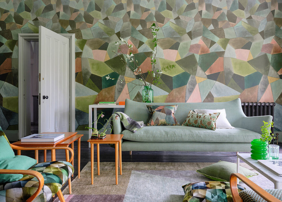
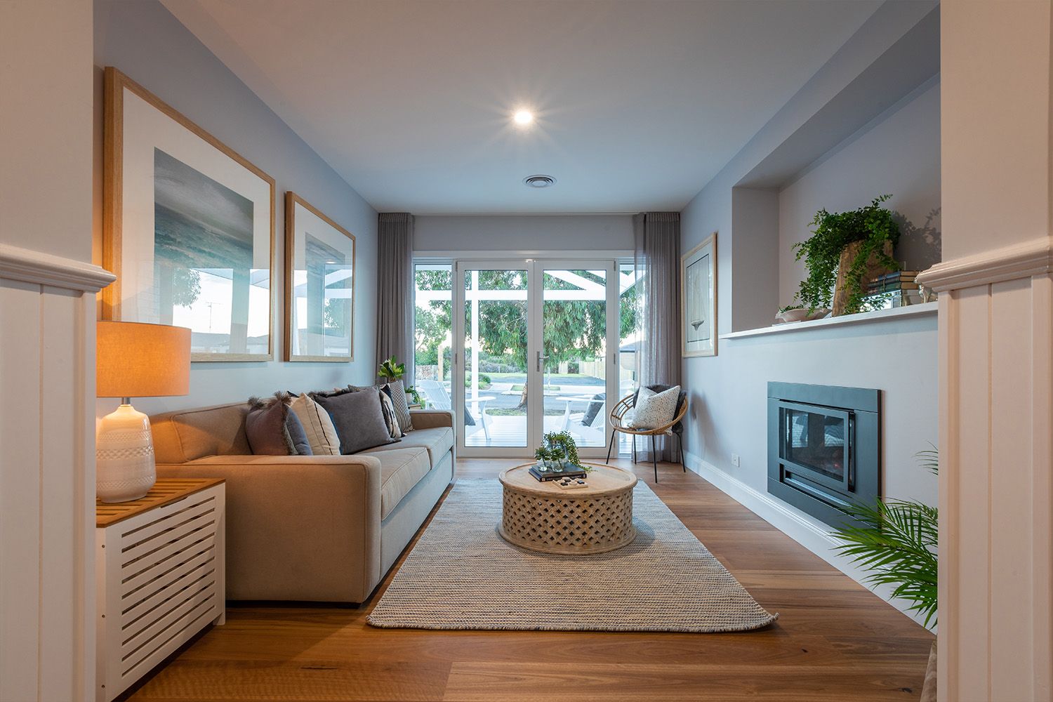
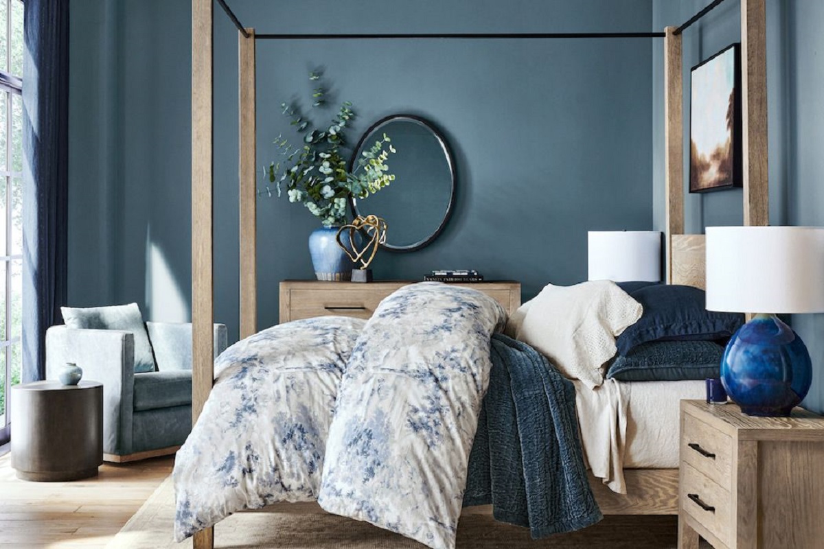
For example, if you want to create a tranquil and serene bedroom, opt for cool and soothing colors like blues and greens. On the other hand, if you want to design a lively and energetic living room, consider using warm and vibrant colors like yellows and oranges.
Additionally, take into account the existing elements in the space. Consider the furniture, flooring, and architectural features. These elements may already have specific colors or undertones that need to be taken into consideration when selecting the color palette.
By understanding the purpose and mood of the room, you can begin to narrow down your color choices and ensure that the final palette aligns with the overall design vision. With this solid foundation, you are ready to move on to the next step.
Step 2: Research and Gather Inspiration
Once you have a clear understanding of the purpose and mood for your interior design project, it’s time to gather inspiration and conduct research to refine your color palette further.
Start by exploring various sources of inspiration. Look for design magazines, websites, social media platforms, and even visit local showrooms or exhibitions. Pay attention to the color combinations used in stunning interiors or any other visual references that catch your eye.
Another excellent source of inspiration is nature. Take a walk in the park, visit botanical gardens, or simply observe the colors around you in the natural environment. Nature often presents us with beautiful and harmonious color combinations that can be translated into interior spaces.
As you gather inspiration, create a mood board or a digital collage to visually organize your ideas. Include images, color swatches, fabric samples, or anything else that resonates with the desired mood and aesthetic of your project. This mood board will serve as a reference point throughout the rest of the color selection process.
Additionally, consider the cultural significance of colors. Different cultures associate various meanings and symbolism with different colors. Research the cultural significance of colors that resonate with your design concept to ensure your color palette aligns with the intended message or theme.
During this research phase, it’s also essential to consider the latest interior design trends. While trends are not the sole basis for color selection, they can provide insight into popular color combinations and contemporary aesthetics. However, always prioritize your personal style and the overall vision for the space over fleeting trends.
By researching and gathering inspiration, you will expand your color palette possibilities and gain a better understanding of how different colors can work together to create a cohesive and visually pleasing space. Once you have gathered a wealth of ideas, it’s time to move on to the next step of selecting key colors.
Step 3: Select Key Colors
Now that you have gathered inspiration and conducted thorough research, it’s time to narrow down your color choices and select the key colors for your interior design project.
Start by choosing one or two main colors that will act as the foundation of your color palette. These colors will set the overall tone of the space and serve as a starting point for selecting complementary shades.
Consider using the color wheel as a tool to guide your selection process. The color wheel comprises primary, secondary, and tertiary colors, providing a visual representation of how colors relate to one another. Explore different color combinations such as monochromatic (different shades of the same color), complementary (opposite colors on the wheel), or analogous (adjacent colors on the wheel) to create the desired visual impact.
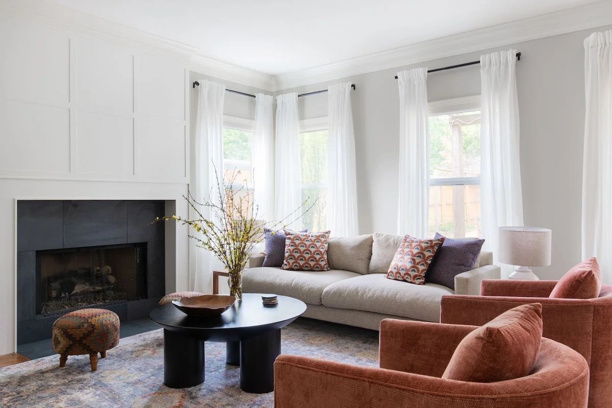
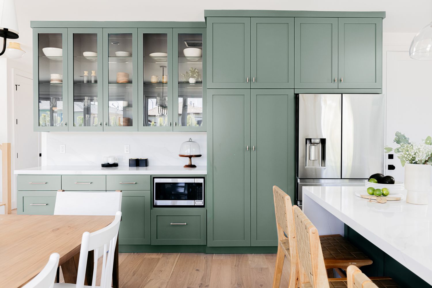
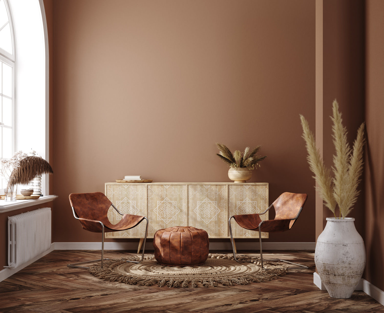
When selecting key colors, keep in mind the purpose, mood, and inspiration gathered in the previous steps. Choose colors that align with the intended atmosphere and convey the desired emotions. For instance, if you want to create a warm and inviting living room, consider rich earthy tones like deep reds or warm browns.
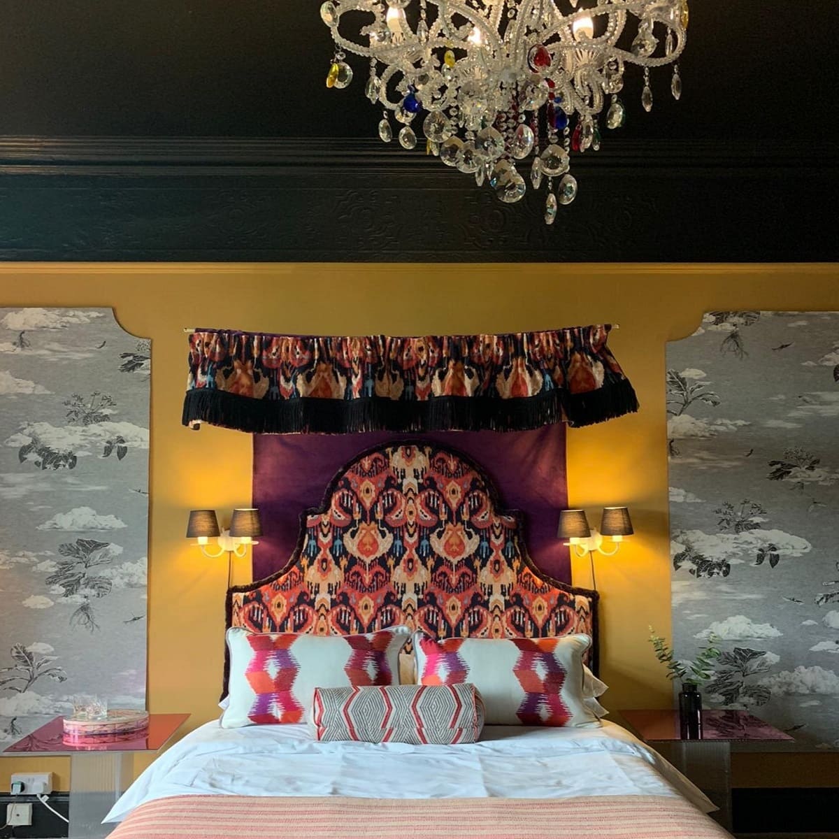
Furthermore, consider the functionality of the space and how colors can influence it. Lighter colors can make a room feel more spacious and airy, while darker hues create a cozy and intimate ambiance. Balance your color choices based on the size, lighting, and purpose of the room.
Additionally, pay attention to the color psychology. Different colors have different psychological effects on individuals. For example, blues and greens are known to promote relaxation, while yellows and oranges evoke energy and optimism.
Remember, the key colors you select will be the focal points around which the rest of your color palette will revolve. Take your time to experiment with different combinations and consider how they interact with each other and the overall design vision for the space.
Once you have chosen your key colors, it’s time to move on to the next step of creating color variations.
When creating a focused color palette, start by identifying the main color that represents the mood or theme you want to convey. Then, choose 2-3 complementary colors that enhance and balance the overall palette.
Step 4: Create Color Variations
With the key colors selected, it’s time to create variations and shades that will add depth and dimension to your color palette. These variations will provide the opportunity to incorporate different intensities, tones, and undertones of the key colors, creating a dynamic and harmonious visual composition.
Start by exploring different shades of the key colors. Shades are created by adding black to a color, resulting in a darker version with a more subdued feel. Experiment with different levels of darkness to see which shades work best in your design concept.
Next, consider creating tints of the key colors. Tints are achieved by adding white to a color, resulting in a lighter and softer version. Tints can add a sense of airiness and lightness to a space, perfect for creating a bright and open atmosphere.
Another option is to work with different undertones of the key colors. Undertones are subtle hues that appear beneath the surface of a color and can greatly influence the overall look and feel. For example, a warm white may have a slight yellow or beige undertone, while a cool white may have a touch of blue or gray. Pay attention to how different undertones interact with the key colors and how they contribute to the overall aesthetic of the space.
Consider creating color variations by combining the key colors with neutral tones such as whites, grays, or beiges. Neutral colors can serve as a backdrop and enhance the impact of the key colors. They also provide balance and flexibility, allowing you to easily introduce other accent colors if desired.
Remember to reference your mood board and design concept throughout this process. Ensure that the color variations you create align with the desired mood, atmosphere, and overall vision for the space. Experiment with different combinations and observe how they contribute to the overall harmony and cohesiveness.
By creating color variations, you are adding depth and visual interest to your color palette. These variations will allow you to incorporate the key colors in different ways throughout the space, creating a sense of balance and dimension. With your color variations complete, it’s time to move on to the final step of testing and refining your color palette.
Read more: Steps For Creating A Minimalist Bedroom
Step 5: Test and Refine
The final step in creating a focused color palette for your interior design project is to test and refine the selected colors. This step involves bringing the colors into the physical space and observing how they interact with the environment, lighting, and other elements.
Start by gathering paint samples or swatches of the selected colors. Apply these samples onto the walls of the space, making sure to test them in different areas and under various lighting conditions. Observe how the colors appear during different times of the day and in different artificial lighting settings.
Pay attention to how the colors interact with the existing elements in the room, such as furniture, flooring, and architectural features. Ensure that the colors enhance and complement these elements, rather than clash or overpower them.
Take your time to observe the colors in the space and how they make you feel. Do they evoke the desired emotions and atmosphere? Do they create the intended focal points or visual harmony? If needed, make adjustments to the color palette by replacing or fine-tuning certain shades or undertones.
Consider seeking feedback from others, such as family members, friends, or professional interior designers. Their fresh perspective can provide valuable insights and help identify any areas that may need further refinement.
Furthermore, take note of the practicality of the colors. Consider factors such as maintenance, durability, and potential longevity of the chosen colors. It’s important to select colors that will withstand the test of time and remain visually appealing for years to come.
Throughout this testing and refining process, don’t be afraid to make changes or explore alternative options. The goal is to create a color palette that not only looks beautiful but also enhances the functionality and overall experience of the space.
Once you feel confident and satisfied with the tested colors, document and finalize your color palette. Create a visual reference or color scheme that includes the selected key colors and their variations. This reference will serve as a guide for implementing the color palette in your interior design project.
Congratulations! By completing this final step of testing and refining, you have successfully created a focused and harmonious color palette that will elevate the overall aesthetic and impact of your interior design project.
Conclusion
Creating a focused color palette is a crucial aspect of interior design that can significantly impact the overall look and feel of a space. By following the five steps outlined in this article, you can confidently select colors that align with your design vision and create a harmonious atmosphere.
Understanding the purpose and mood of the room sets the foundation for selecting appropriate colors. Researching and gathering inspiration allows you to explore different color combinations and find references that resonate with your design concept. Selecting key colors establishes the core tones of your palette, while creating color variations adds depth and dimension.
The final step of testing and refining ensures that your chosen colors work well within the physical space and interact harmoniously with other elements. It is during this step that adjustments can be made to fine-tune the color palette according to practicality, functionality, and personal preference.
Throughout this process, remember to balance your own style preferences with the intended purpose and mood of the space. Be open to experimentation and don’t be afraid to trust your instincts. Interior design is a creative journey, and your color palette should reflect your unique vision.
By carefully considering the purpose, gathering inspiration, selecting key colors, creating variations, and testing and refining, you will create a color palette that enhances the overall design and creates a captivating and cohesive environment.
Now, armed with these steps, it’s time to embark on your own interior design adventure and bring your vision to life through a thoughtfully crafted color palette. Happy designing!
Frequently Asked Questions about 5 Steps I Take To Create A Focussed Color Palette
Was this page helpful?
At Storables.com, we guarantee accurate and reliable information. Our content, validated by Expert Board Contributors, is crafted following stringent Editorial Policies. We're committed to providing you with well-researched, expert-backed insights for all your informational needs.


0 thoughts on “5 Steps I Take To Create A Focussed Color Palette”