Home>Interior Design>What Colors Cause Anxiety? 5 Colors That Will Ruin Your Mood
Interior Design
What Colors Cause Anxiety? 5 Colors That Will Ruin Your Mood
Modified: December 7, 2023
Discover the interior design colors that can trigger anxiety and ruin your mood. Avoid these 5 anxiety-inducing colors to create a calming and soothing environment.
(Many of the links in this article redirect to a specific reviewed product. Your purchase of these products through affiliate links helps to generate commission for Storables.com, at no extra cost. Learn more)
Introduction
When it comes to interior design, color selection plays a crucial role in setting the desired mood and atmosphere within a space. The right colors can create a harmonious and calming energy, while the wrong colors can have the opposite effect. In fact, certain colors have been found to cause feelings of anxiety and unease in individuals.
Anxiety is a common mental health condition that affects millions of people worldwide. It can manifest in various ways, including restlessness, racing thoughts, and a general sense of unease. For those living with anxiety, creating a calming and stress-free environment at home is of utmost importance.
While there are many factors that contribute to anxiety, such as personal experiences and external stressors, the colors we surround ourselves with can also impact our state of mind. In this article, we will explore five colors that have been known to cause anxiety and potentially ruin the mood in interior design.
Key Takeaways:
- Avoid bright red, electric yellow, vibrant orange, bold black, and chaotic patterns in interior design to reduce anxiety and create a calming environment.
- Opt for softer, soothing tones like muted blues and greens to promote relaxation and tranquility in living or working spaces.
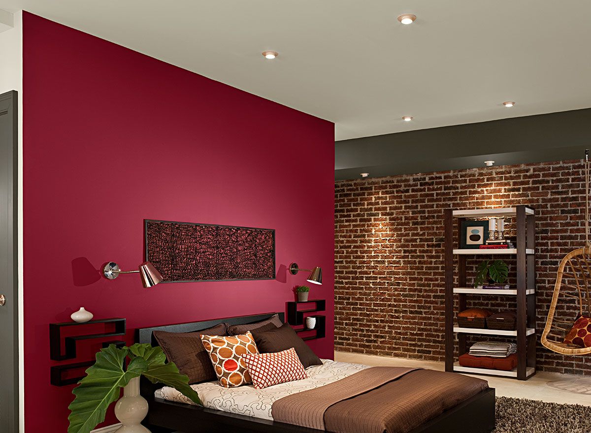
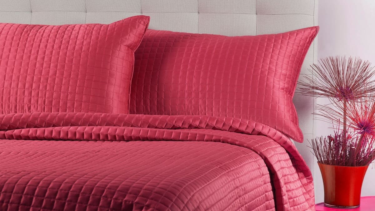
Bright Red: The Agitating Color
Bright red is a color that is often associated with passion, energy, and power. However, it is also a color that can evoke intense emotions and increase anxiety levels in some individuals.
When we see the color red, our bodies have a natural physiological reaction. Our heart rate increases, our blood pressure rises, and we may experience a surge of adrenaline. These physical responses are part of our body’s fight-or-flight response, which can trigger feelings of anxiety and restlessness.
One reason why bright red can cause anxiety is its association with danger and alarm. In nature, many warning signs and signals use the color red to grab attention and evoke a sense of urgency. This instinctive reaction has carried over into our psychological response to the color red in interior design.
Bright red can also be overwhelming and visually stimulating, which can be triggering for individuals who are prone to anxiety. The intensity of the color can create a sense of agitation and overstimulation, leading to increased anxiety levels.
Moreover, the color red has been linked to attributes such as anger, aggression, and impulsivity. These associations can further contribute to feelings of anxiety and unease when surrounded by bright red in a living or working space.
So, if you are looking to create a calm and soothing environment, it is best to avoid using bright red as the dominant color. Instead, opt for softer and cooler tones that promote relaxation and tranquility.
Electric Yellow: The Jarring Color
Electric yellow is a vibrant and attention-grabbing color that can instantly energize a space. However, this intense hue can also have adverse effects on mood and anxiety levels.
One of the reasons why electric yellow can be anxiety-inducing is its high level of brightness. This intense saturation can be overwhelming to the eyes and overstimulate the visual senses, leading to feelings of unease and restlessness.
Psychologically, the color yellow is often associated with conflicting emotions. While it can symbolize joy, happiness, and positivity, it can also evoke feelings of caution and warning. In interior design, the use of electric yellow can create a sense of tension and unsettlement, especially when used in large doses or as the dominant color.
Additionally, yellow has been found to have some connections to anxiety and nervousness. Studies have shown that exposure to electric yellow can increase brain activity and arousal, which can trigger or exacerbate feelings of anxiety in susceptible individuals.
Furthermore, yellow is often associated with high energy and stimulation, similar to red. This higher level of stimulation can activate the fight-or-flight response in our bodies, leading to increased anxiety levels in some individuals.
If you are seeking a calming and serene environment, it is advisable to steer clear of electric yellow as a dominant color. Instead, opt for softer and more soothing colors such as pastel shades of blue or green, which have been found to promote relaxation and tranquility.
Vibrant Orange: The Overwhelming Color
Vibrant orange is a color that exudes warmth, energy, and enthusiasm. However, this bold hue can also be overwhelming and contribute to feelings of anxiety and unease in certain individuals.
One of the main reasons why vibrant orange can be anxiety-inducing is its high level of stimulation. This color is attention-grabbing and visually striking, which can overstimulate the senses and create a sense of restlessness or agitation.
Research has shown that exposure to bright and intense colors like vibrant orange can increase heart rate, blood pressure, and arousal levels. This physiological response is similar to the fight-or-flight response, triggering feelings of anxiety and tension.
Additonally, vibrant orange is often associated with excitement and intensity. While these traits can be positive in some situations, they can also be overwhelming and lead to heightened anxiety levels. The boldness of the color can create a sense of overstimulation, making it difficult for individuals to relax and find calm in their environment.
Furthermore, the color orange has been linked to feelings of impulsivity and agitation. For individuals who are prone to anxiety or have sensory sensitivities, vibrant orange can exacerbate these negative emotions and contribute to an overall sense of unease.
If you are looking to create a calming and anxiety-free space, it is best to avoid using vibrant orange as the dominant color. Instead, consider incorporating softer and more soothing tones like muted oranges or earthy neutrals, which can create a sense of balance and tranquility.
Certain colors like bright red, neon yellow, electric blue, and intense orange can increase feelings of anxiety. Instead, opt for calming colors like soft blues, greens, and neutral tones to create a more relaxing environment.
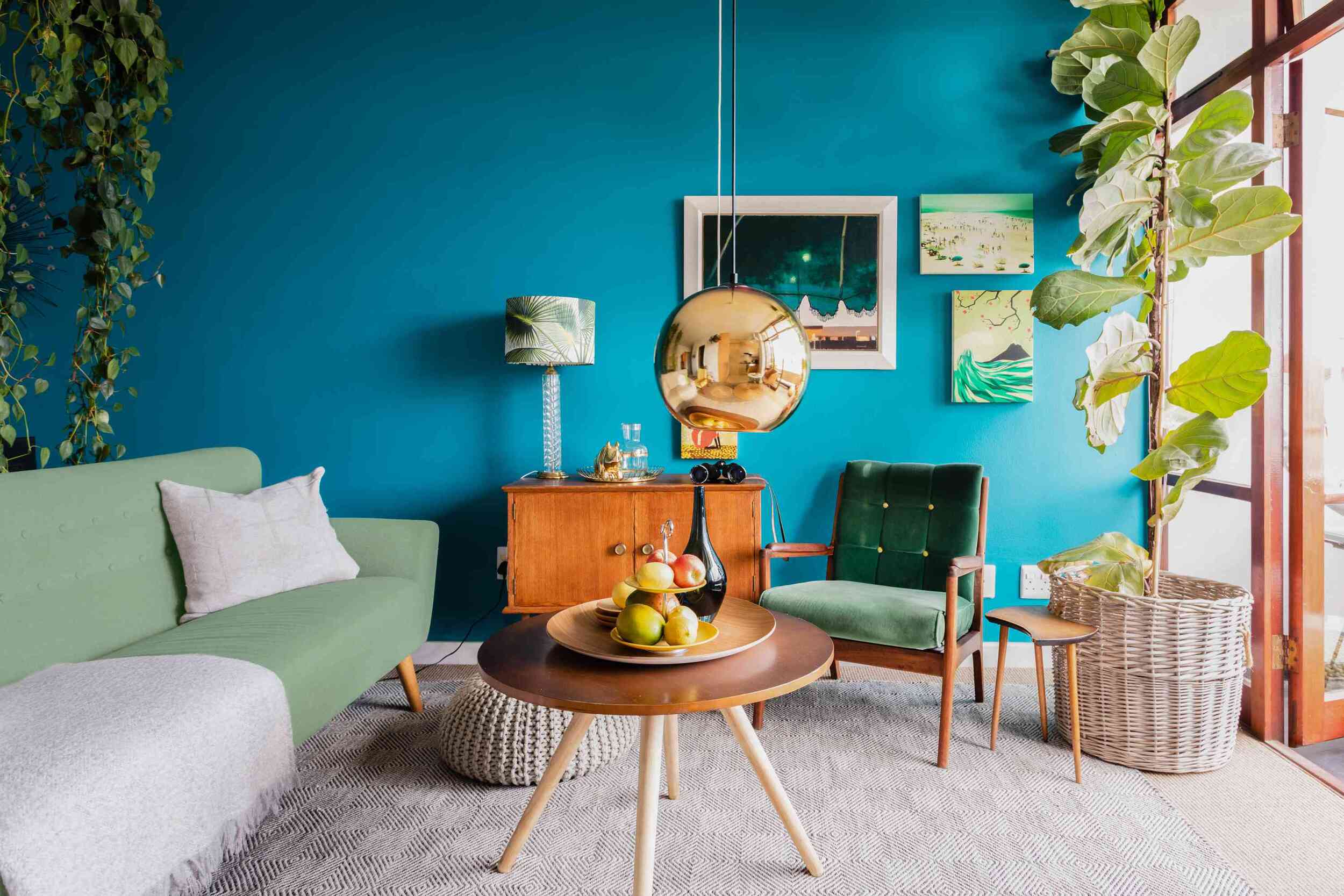
Bold Black: The Oppressive Color
Black is often associated with elegance, sophistication, and mystery. However, when used in excess or as the dominant color in interior design, it can have a negative emotional impact and contribute to feelings of anxiety and oppression.
Symbolically, black is often associated with darkness, negativity, and even death. These associations can subconsciously impact our emotions and create a sense of heaviness or sadness when surrounded by bold black in our surroundings.
Psychologically, the color black has been linked to feelings of powerlessness and constraint. It can evoke a sense of being trapped or overwhelmed, which can trigger or amplify feelings of anxiety in susceptible individuals.
Black is also known for its ability to absorb light, which can create an atmosphere of heaviness and dimness. This lack of light and vibrancy can contribute to a sense of stagnation and limit the sense of space, which may increase feelings of anxiety and claustrophobia.
Moreover, the color black can also be associated with negative life experiences or traumatic events. If someone has had a past negative association with the color black, it can trigger feelings of anxiety or distress when encountered in an interior space.
It’s important to note that black can still be incorporated into interior design in a balanced way, such as through accents, furniture, or accessories. However, it is recommended to use black sparingly and pair it with lighter colors to create contrast and balance, in order to avoid invoking a sense of oppression or anxiety.
Chaotic Patterns and Colors: The Disorienting Combination
In interior design, patterns and colors can be used to create visual interest and add personality to a space. However, when used in a chaotic and overwhelming manner, they can contribute to feelings of anxiety and disorientation.
Combining multiple bold and vibrant colors in busy and intricate patterns can overstimulate the senses and create a sense of sensory overload. Our brains struggle to process and organize the information when faced with such a visually busy environment, leading to increased feelings of anxiety and restlessness.
Research has shown that exposure to chaotic patterns and colors can disrupt our sense of visual balance and harmony. This disorientation can heighten feelings of unease and contribute to a sense of visual chaos, which can further exacerbate anxiety symptoms.
Additionally, chaotic patterns can create a sense of visual clutter and make a space feel more cramped and confined. Clutter has been associated with increased stress levels, as it can act as a constant reminder of unfinished tasks and disorganization.
Furthermore, certain color combinations within chaotic patterns can have a negative impact on mental well-being. For example, combining colors with clashing or high-contrast hues can create a jarring effect and disturb the visual flow. This disruption can lead to feelings of unease and contribute to an overall sense of visual discomfort.
If you are looking to create a calm and anxiety-reducing environment, it is best to opt for more balanced and harmonious patterns and color combinations. Choose designs that have a sense of coherence and flow, allowing the eyes to move smoothly across the space and create a sense of visual calmness.
By creating an environment that promotes visual tranquility, you can help alleviate anxiety symptoms and create a soothing space for relaxation and well-being.
Conclusion
When it comes to interior design, color selection plays a significant role in shaping the mood and atmosphere of a space. While colors can evoke positive emotions and enhance well-being, there are certain colors that can have the opposite effect and contribute to feelings of anxiety and unease.
Bright red, with its association with danger and intensity, can increase anxiety levels and create a sense of restlessness. Electric yellow, with its overwhelming brightness, can overstimulate the senses and lead to heightened feelings of anxiety. Vibrant orange, with its boldness and intensity, can be visually overwhelming and contribute to heightened anxiety levels.
Bold black, with its symbolism of darkness and constraint, can evoke a sense of oppression and contribute to feelings of anxiety. Chaotic patterns and colors, when used in an overwhelming manner, can overstimulate the senses and create a sense of disorientation and sensory overload.
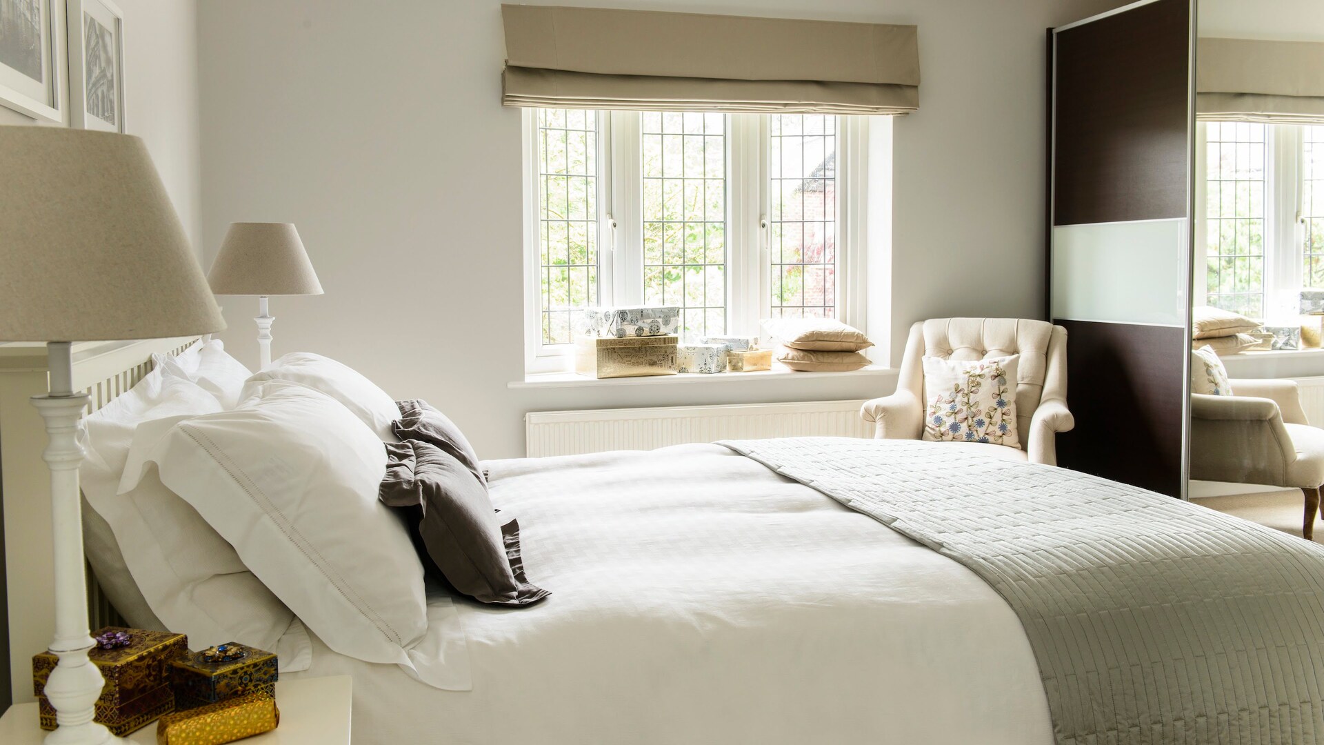
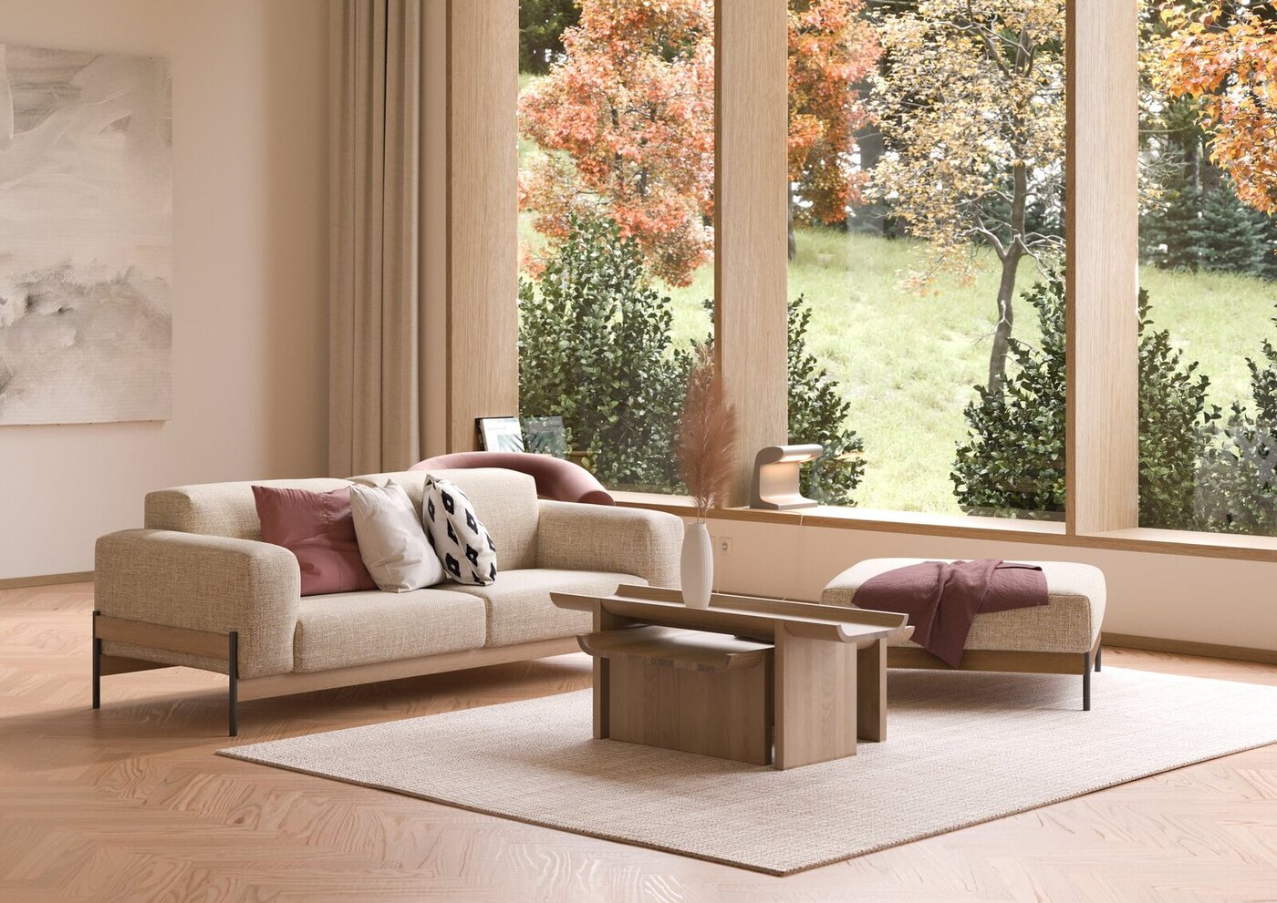
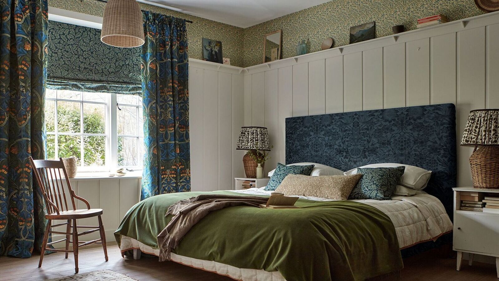
It is important to create a harmonious and calming environment in our living or working spaces to promote well-being and reduce anxiety. When choosing colors, opt for softer and more soothing tones that promote relaxation and tranquility. Incorporating natural elements, such as muted blues and greens, can help create a sense of calmness and promote a peaceful atmosphere.
Avoiding excessive use of intense and overwhelming colors, as well as chaotic patterns, is crucial to promoting a visually balanced and anxiety-free space. Strive for a sense of visual harmony and coherence, allowing the eyes to flow smoothly across the design elements.
By being mindful of the colors we surround ourselves with in our interior spaces, we can create an environment that promotes a sense of calmness, tranquility, and well-being. Remember, the goal is to create an environment that supports our mental health and helps us feel at ease in our own spaces.
Frequently Asked Questions about What Colors Cause Anxiety? 5 Colors That Will Ruin Your Mood
Was this page helpful?
At Storables.com, we guarantee accurate and reliable information. Our content, validated by Expert Board Contributors, is crafted following stringent Editorial Policies. We're committed to providing you with well-researched, expert-backed insights for all your informational needs.
0 thoughts on “What Colors Cause Anxiety? 5 Colors That Will Ruin Your Mood”