Home>Interior Design>Brown Is Back: Here’s How Top Designers Style This Trendy Hue
Interior Design
Brown Is Back: Here’s How Top Designers Style This Trendy Hue
Modified: January 19, 2024
Discover how top interior designers are incorporating the trendy hue of brown back into their designs, bringing warmth and style to any space.
(Many of the links in this article redirect to a specific reviewed product. Your purchase of these products through affiliate links helps to generate commission for Storables.com, at no extra cost. Learn more)
Introduction: The resurgence of brown in design
Brown is making a comeback in the world of design. After years of being overlooked and considered boring, this earthy hue is now experiencing a resurgence as top designers and influencers embrace its warm and versatile qualities. From fashion to interior design, graphic design to branding, brown is being utilized in exciting and creative ways.
With its natural and cozy feel, brown adds a sense of warmth, sophistication, and comfort to any space or design project. In this article, we will explore how brown is being incorporated in various design disciplines and why it has become a trendy color choice.
So, why has brown made its way back into the spotlight? One reason is the increasing popularity of minimalistic and earthy design trends. Brown complements these styles perfectly, adding an element of depth and grounding to minimalistic, neutral color palettes. Additionally, brown evokes a nostalgic and vintage vibe, appealing to those seeking a sense of authenticity and connection to the past.
In the following sections, we will delve into different fields of design, from fashion to web design, and see how brown is being used to create stunning and impactful designs. Whether you are a designer looking to incorporate brown into your projects or simply someone who wants to stay on top of the latest design trends, this article will provide you with insights and inspiration.
Key Takeaways:
- Embrace the versatility of brown in design to create warmth, authenticity, and timeless beauty across various disciplines, from fashion to web design, logo design to photography.
- Incorporate brown thoughtfully and strategically to evoke specific emotions, convey values, and leave a lasting impression on the audience, enriching designs and captivating viewers.
Read more: How To Put Stove Top Back On
Brown in fashion: A timeless trend
Brown has always had a place in the fashion world, but in recent years, it has risen in popularity to become a timeless trend. From earthy browns to rich chocolate tones, this versatile color can be seen on runways, in streetwear, and in everyday wardrobe essentials.
One reason for the enduring appeal of brown in fashion is its ability to create a sense of warmth and simplicity. Brown garments can effortlessly transition between seasons and can be easily paired with other colors, making them a staple in many wardrobes.
Designers are embracing brown in various ways, whether it’s through monochromatic brown outfits or by incorporating brown accents into their designs. Brown leather jackets, boots, and handbags are classic pieces that exude sophistication and style.
Furthermore, brown is often associated with natural and sustainable fashion. With increasing awareness of the environmental impact of the fashion industry, many people are turning to earthy hues like brown to express their commitment to eco-friendly fashion choices.
When styling brown in fashion, consider pairing it with colors that complement its warmth. Soft pastels, such as blush pink or sage green, can create a harmonious and feminine look. On the other hand, pairing brown with bold hues like orange or burgundy can create a striking and attention-grabbing ensemble.
Whether you opt for a head-to-toe brown look or use it as an accent color, incorporating brown into your fashion choices adds a touch of sophistication and timelessness. So embrace this timeless trend and elevate your style with the rich and versatile hues of brown.
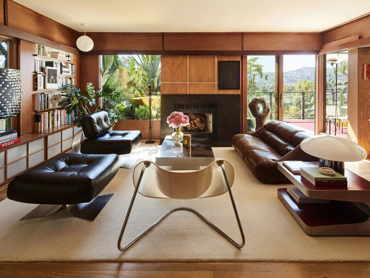
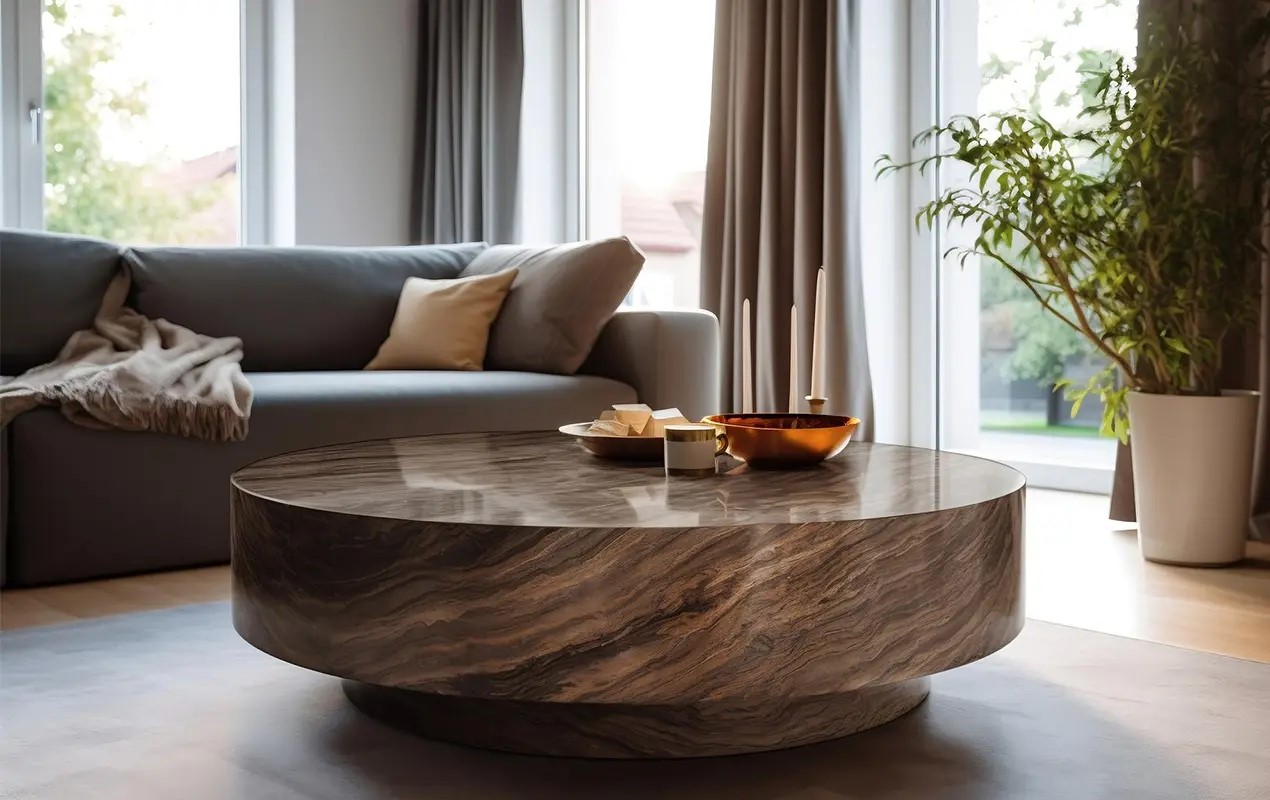
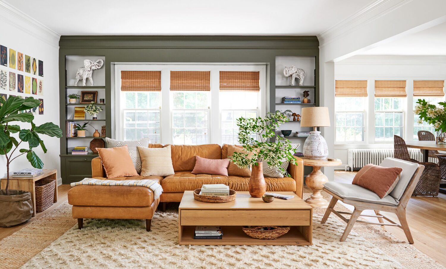
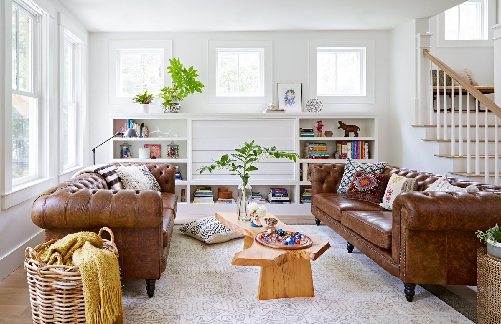
Incorporating brown in interior design: Tips from experts
Brown is a fantastic color choice when it comes to interior design. It brings warmth, earthiness, and a sense of grounding to any space. Whether you want to create a rustic cabin feel or add a touch of elegance to a modern room, incorporating brown can help you achieve the desired ambiance. Here are some tips from experts on how to effectively use brown in interior design.
1. Use different shades of brown
One of the key principles of interior design is creating depth and dimension. To achieve this, experts recommend using different shades of brown. Combining light and dark tones of brown can add contrast and visual interest to a room. Consider incorporating darker browns in furniture and accent pieces, while using lighter browns on walls and flooring.
2. Pair brown with complementary colors
To make the most of brown in interior design, consider pairing it with complementary colors. Shades of blue, cream, gray, and green work particularly well with brown. These colors create a harmonious and balanced look. For example, you can choose brown furniture and pair it with blue accents, such as throw pillows or artwork, to create a cozy yet sophisticated vibe.
3. Use brown as a focal point
If you want to make a bold statement, consider using brown as a focal point in your interior design. This can be achieved by using a large brown furniture piece, like a leather sofa, or by creating an accent wall with brown wallpaper or paint. By making brown the center of attention, you create a visually striking and stylish space.
4. Incorporate natural elements
Brown is often associated with nature and the earth, so incorporating natural elements into your design can enhance the overall effect. Consider using materials like wood, stone, and jute in your furniture and decor choices. These natural textures will complement the brown tones and create a warm and inviting atmosphere.
5. Use lighting to enhance brown tones
Proper lighting is crucial in showcasing the beauty of brown in interior design. Natural light can bring out the warmth of brown tones, so if possible, maximize the amount of natural light in your space. Additionally, using warm white or soft yellow lighting will enhance the earthy feel of brown.
By following these expert tips, you can incorporate brown into your interior design in a way that creates a stylish and inviting space. Whether you opt for a subtle touch of brown or go for a bold statement, this versatile color is sure to elevate the aesthetics of your home or office.
Brown as a versatile color in graphic design
Brown may not be the most commonly used color in graphic design, but it is a versatile and powerful choice when used effectively. The earthy and warm tones of brown can evoke a sense of nostalgia, reliability, and stability. Here are some ways in which brown can be incorporated into graphic design to create impactful and visually appealing designs.
1. Backgrounds and textures
Brown makes for an excellent choice as a background or texture in graphic design. It can add depth and warmth to a design, creating a visually interesting backdrop for other elements. Whether it’s a solid brown background or a textured brown pattern, it can provide a rustic or natural feel to the overall design.
2. Typography and text elements
Brown typography can be a great way to add a classic and sophisticated touch to a design. Brown fonts can convey a sense of reliability and trustworthiness, making them suitable for brands that want to exude a sense of tradition and longevity. Additionally, brown can be used in text elements such as headers, quotes, or callouts to draw attention and create visual hierarchy.
3. Branding and logos
Brown can be an excellent choice for creating a unique and memorable brand identity. It can be used to represent brands that are associated with nature, sustainability, or traditional values. Brown can be combined with other colors to create a distinctive and harmonious logo that stands out from the competition.
4. Product packaging
Brown packaging, whether it’s boxes, bags, or labels, can create an earthy and organic look. This is particularly effective for products related to food, beverages, or natural products. Brown packaging conveys a sense of quality and authenticity, attracting consumers looking for eco-friendly and wholesome choices.
5. Infographics and data visualization
Incorporating brown into infographics and data visualization can add a touch of warmth and sophistication. Whether it’s using brown in charts, graphs, or illustrations, it can help highlight important information and make data more visually appealing and engaging.
Brown may not be the first color that comes to mind in graphic design, but its versatility and ability to evoke certain emotions make it a valuable option. By using brown thoughtfully and strategically, designers can create visually appealing and impactful designs that leave a lasting impression.
Brown as an accent color in branding and packaging
Brown is a versatile color that can add a touch of sophistication and warmth to branding and packaging designs. While it may not be the primary color choice for many brands, brown can serve as an excellent accent color, creating a unique and memorable visual identity. Here’s how brown can be effectively used as an accent color in branding and packaging.
1. Conveying tradition and reliability
Brown is often associated with tradition, reliability, and timeless values. By incorporating brown as an accent color in branding, companies can establish a sense of trustworthiness and a connection to the past. This can be particularly effective for brands in industries such as finance, insurance, and heritage products.
2. Highlighting premium qualities
The richness and depth of brown can be used to highlight the premium qualities of a product or brand. By adding brown accents to packaging designs, such as ribbons, labels, or metallic finishes, brands can create a sense of luxury and exclusivity. This can be especially effective for high-end products in sectors like cosmetics, gourmet food, and fashion.
3. Creating a natural and organic aesthetic
Brown is often associated with nature and the earth. By incorporating brown as an accent color, brands can create a natural and organic aesthetic that appeals to consumers seeking sustainable and eco-friendly options. Brown can be used in packaging materials, such as recycled paper, or in subtle earth-tone patterns, to convey the brand’s commitment to the environment.
4. Adding warmth and comfort
Brown has a warm and comforting quality that can evoke feelings of coziness and familiarity. Brands in industries such as home decor, food, or wellness can use brown accents to create an inviting and comforting atmosphere. This can be achieved through brown typography, labels, or packaging materials that have a tactile quality.
5. Differentiating from competitors
In a crowded marketplace, using brown as an accent color can help brands stand out from competitors who may rely on more common color choices. Brown can provide a distinctive and memorable visual identity that catches consumers’ attention. By strategically incorporating brown into branding and packaging, brands can create a unique and recognizable presence in the market.
When using brown as an accent color in branding and packaging, it’s essential to consider the overall message and values of the brand. Brown can convey a sense of tradition, reliability, luxury, nature, or comfort, depending on how it is used. By carefully incorporating brown as an accent color, brands can create visually appealing designs that resonate with their target audience and leave a lasting impression.
When styling the trendy brown hue, consider pairing it with other earthy tones like olive green or mustard yellow for a cohesive and on-trend look.
Brown in web design: Creating warmth and depth
Brown is not a commonly used color in web design, but when used effectively, it can create a unique and inviting user experience. The warm and earthy tones of brown can bring a sense of comfort, authenticity, and depth to a website. Here’s how brown can be incorporated into web design to create a warm and engaging online presence.
1. Backgrounds and textures
Brown can be used as a background color or textured element in web design to create a warm and inviting atmosphere. Whether it’s a solid brown background or a subtle brown textured pattern, it can add depth and visual interest to the overall design. Brown backgrounds work particularly well for websites that aim to convey a rustic, natural, or vintage vibe.
2. Typography and text elements
Brown typography can be used to create a sense of elegance and reliability. When incorporated into headings, subheadings, or call-to-action buttons, brown can make the text stand out while maintaining a warm and welcoming feel. Combining brown typography with contrasting colors can create a visually striking and impactful design.
3. Accent elements and buttons
Using brown as an accent color for elements such as buttons, icons, or navigation menus can add a touch of warmth and sophistication to the web design. Brown accents can create visual emphasis and draw attention to important elements, enhancing user experience and guiding users through the website’s interface.
4. Photography and image overlays
Brown tones can be used in photography and image overlays to create a cohesive and harmonious visual experience. By applying a brown overlay or using images with brown hues, a website can evoke a warm and natural atmosphere. This is particularly effective for websites related to travel, nature, and lifestyle.
5. Harmonious color combinations
When incorporating brown into web design, it’s important to consider the overall color scheme and create a harmonious palette. Brown can be paired with warm tones like beige, cream, or orange for a cozy and inviting look. Alternately, combining brown with cool tones like blue or green can create a balanced and serene aesthetic.
Brown is a versatile color that can add a sense of warmth and depth to web design. By using it thoughtfully and strategically, designers can create websites that are visually appealing, engaging, and communicate the desired message. Whether used as a background, accent color, or in typography, brown can create a unique and inviting online experience for users.
Brown in product design: Creating earthy and rustic aesthetics
Brown is a popular choice in product design to create earthy and rustic aesthetics. With its warm and natural appeal, brown evokes a sense of authenticity and connection to the environment. Whether it’s furniture, home decor, or everyday products, brown can enhance the overall design and create a unique visual experience. Here’s how brown is used in product design to create earthy and rustic aesthetics.
1. Material choice
Brown is often associated with natural materials like wood, leather, and stone. By using these materials in product design, brands can create a tactile and organic feel that resonates with consumers. Whether it’s a wooden table, a leather bag, or a stone-inspired countertop, the use of brown tones strengthens the connection to nature and enhances the product’s overall aesthetic.
2. Textures and finishes
Brown can be utilized in product design to create interesting textures and finishes. Textures like wood grain patterns, distressed leather, or rough stone surfaces can add depth and visual interest to products. Brown finishes, such as matte or brushed, can further enhance the earthy and rustic aesthetics, giving products a sense of craftsmanship and authenticity.
3. Color combinations
Brown is a versatile color that can be combined with other earthy hues to create a cohesive and organic color palette. Pairing brown with shades of green, beige, or warm neutrals can enhance the natural and rustic feel of product design. Additionally, incorporating pops of contrasting colors, like orange or yellow, can add visual interest and create a vibrant and balanced design.
4. Organic shapes and forms
Incorporating organic shapes and forms in product design can further enhance the earthy and rustic aesthetics. Curved lines, irregular shapes, and natural patterns can mimic elements found in nature and create a sense of harmony and balance. By integrating these organic elements with brown as the dominant color, product designs can evoke a warm and grounded feel.
5. Sustainability and eco-friendly design
The use of brown in product design can also reflect sustainability and eco-friendly values. Brown is often associated with natural and renewable resources, making it an ideal choice for brands that prioritize environmentally conscious practices. By using brown tones in products, brands can showcase their commitment to sustainability and connect with consumers seeking eco-friendly options.
Brown is an excellent choice in product design to create earthy and rustic aesthetics. Through the careful consideration of materials, textures, color combinations, and shapes, brands can create products that embody a warm and natural feel. Whether it’s furniture, home accessories, or everyday items, incorporating brown in product design enhances the overall aesthetic and creates a unique connection to nature and the environment.
Brown in logo design: Evoking a sense of reliability and trustworthiness
Brown is often overlooked as a color choice for logo design, but it can be a powerful tool in evoking a sense of reliability and trustworthiness. The earthy tones of brown convey a sense of stability, dependability, and authenticity. Whether it’s for a corporate brand, a service-oriented business, or a product, brown can be effectively used to create a logo that resonates with the target audience. Here’s how brown can be incorporated into logo design to evoke a strong sense of reliability and trustworthiness.
1. Subtle elegance
Brown is a color that exudes a subtle elegance and sophistication. By incorporating brown as a primary or accent color in a logo, brands can convey a sense of professionalism and credibility. The understated nature of brown evokes a sense of confidence without being ostentatious, making it suitable for brands that value reliability and trust.
2. Nostalgia and tradition
Brown is often associated with nostalgia and tradition, creating a sense of familiarity and longevity. Brands that aim to convey heritage or a sense of timelessness can benefit from using brown in their logos. This is particularly effective for industries such as finance, law, or heritage products, where reliability and trust are paramount.
3. Natural and organic connection
The earthy tones of brown connect well with nature and the environment. Incorporating brown in a logo can evoke a sense of eco-friendliness, sustainability, and a commitment to natural values. This is particularly beneficial for brands that emphasize green practices or products, creating a trustworthy image that resonates with consumers concerned about environmental issues.
4. Harmonious color combinations
Brown can be paired with various color combinations to create a logo design that not only conveys reliability but also stands out. Warm colors like orange, yellow, or red can create a harmonious and inviting feel, while cool colors like blue or green can create a more balanced and serene impression. The choice of color combinations can further enhance the trust and credibility projected by the logo.
5. Typography and simplicity
In logo design, typography plays a crucial role in communicating the brand’s identity and values. When using brown in logo typography, opting for clean and timeless fonts can enhance the reliability and trustworthiness of the design. Simplicity in logo design allows the brown color to stand out and convey a sense of clarity, professionalism, and assurance.
By incorporating brown into logo design, brands can create a visual identity that evokes reliability and trustworthiness. Whether it’s through subtle elegance, nostalgia, a connection to nature, or harmonious color combinations, brown can help establish a logo that projects confidence and credibility to the target audience.
Brown in photography: Capturing natural beauty and warmth
When it comes to photography, brown is a versatile color that can add a touch of natural beauty and warmth to images. The earthy tones of brown evoke a sense of authenticity and connection to the environment, making it a popular choice for photographers looking to capture a captivating and organic feel. Here’s how brown can be used in photography to create stunning visuals.
1. Landscape photography
Brown is a natural fit for landscape photography, particularly in scenes that showcase earthy elements such as mountains, deserts, or forests. The hues of brown in the soil, rocks, or foliage can create a sense of depth and add a warm, comforting quality to the image. Brown in landscape photography highlights the beauty of natural environments, capturing the essence of the outdoors.
2. Portraits
Brown can also be used in portrait photography to create a warm and timeless aesthetic. By incorporating brown tones in the background or using props with brown hues, a sense of authenticity and intimacy can be conveyed. The warm undertones of brown can complement various skin tones, adding a soft and pleasing quality to the photographs.
3. Still life and food photography
In still life and food photography, brown can bring a sense of warmth and richness to the composition. Brown backgrounds or props can create a rustic, cozy atmosphere, making the subject of the photograph appear inviting and comforting. Brown tones can enhance the natural and organic qualities of food, making it visually appealing and appetizing.
4. Textures and details
Brown tones can also emphasize textures and details in photography. Whether it’s capturing the intricate patterns of tree bark, the roughness of wooden surfaces, or the grain of a fabric, brown can enhance these visual elements, adding depth and visual interest to the photograph. Brown can bring out the nuances and subtleties of textures, creating a visually captivating image.
5. Black and white photography
Even in black and white photography, brown can play a significant role in creating a warm and nostalgic atmosphere. Brown tones can enhance the contrast and add a certain depth to black and white images, infusing them with a sense of history and timelessness. Brown can create a timeless aesthetic in black and white photography, adding a touch of warmth and character.
By incorporating brown into photography, photographers can capture the natural beauty and warmth of the world around us. Whether it’s in landscapes, portraits, still life, or black and white photography, the earthy tones of brown add depth, authenticity, and a unique aesthetic appeal to images, creating visually stunning and captivating photographs.
Read more: How To Cook Brown Rice On Stove Top
Conclusion: Embracing the versatility of brown in design
Brown, often overlooked and underestimated, has proven its versatility and value across various design disciplines. From fashion to interior design, graphic design to branding, brown has made a powerful comeback and is now celebrated for its ability to create warmth, authenticity, and a connection to the natural world. By incorporating brown into design projects, professionals can create stunning and impactful visuals that resonate with audiences on a deeper level.
Whether it’s the timeless trend it represents in fashion, the cozy and inviting ambiance it brings to interior design, or the sense of reliability and trustworthiness it evokes in logo design, brown has proven itself to be a versatile and engaging color choice.
In graphic design, brown can add depth and texture to visual compositions, creating a harmonious and impactful aesthetic. Its association with tradition and nature makes it a valuable asset when designing logos, packaging, and branding. Brown can also capture the beauty and warmth of the natural world in photography, bringing images to life with an authentic and captivating feel.
The resurgence of brown in design is a testament to its enduring appeal and ability to enhance the visual experience. Whether used as a dominant color or as an accent, brown has the power to create a sense of familiarity, comfort, and reliability.
As designers and artists, embracing the versatility of brown allows us to tap into its rich and diverse potential. By using brown thoughtfully and strategically, we can create designs that evoke specific emotions, convey certain values, and leave a lasting impression on our audience.
So, let’s celebrate the warmth, authenticity, and timeless beauty of brown in design. From fashion to web design, logo design to photography, let’s continue exploring the creative possibilities that brown offers us, enriching our work and captivating our viewers.
Frequently Asked Questions about Brown Is Back: Here's How Top Designers Style This Trendy Hue
Was this page helpful?
At Storables.com, we guarantee accurate and reliable information. Our content, validated by Expert Board Contributors, is crafted following stringent Editorial Policies. We're committed to providing you with well-researched, expert-backed insights for all your informational needs.


0 thoughts on “Brown Is Back: Here’s How Top Designers Style This Trendy Hue”