Home>Interior Design>Color Therapy: Therapists Swear These Hues Boost Your Mood
Interior Design
Color Therapy: Therapists Swear These Hues Boost Your Mood
Modified: October 20, 2024
Discover how interior design and color therapy can boost your mood. Explore the power of hues with therapists who swear by the benefits.
(Many of the links in this article redirect to a specific reviewed product. Your purchase of these products through affiliate links helps to generate commission for Storables.com, at no extra cost. Learn more)
Introduction
Color is a powerful tool that can influence our emotions, moods, and overall well-being. The visual impact of different hues can evoke various feelings and even affect our physical and mental state. This understanding has led to the practice of color therapy, where specific colors are used to promote healing, relaxation, and harmony.
In the field of interior design, color plays a crucial role in creating a desired atmosphere and ambiance. The right combination of colors can transform a space from dull and dreary to vibrant and uplifting. Whether you want to infuse energy into a room or create a calming retreat, understanding the psychological effects of colors is essential.
In this article, we will explore how different hues can boost your mood and enhance the overall feel of your living space. From bold reds to soothing blues, each color has its own unique characteristics and therapeutic benefits. So let’s dive in and discover the power of color!
Key Takeaways:
- Color therapy uses specific hues to promote healing and relaxation, making it essential in interior design for creating desired atmospheres and moods.
- Understanding the psychological effects of colors can help create vibrant, energetic spaces or serene, tranquil retreats, enhancing well-being and reflecting unique personalities.
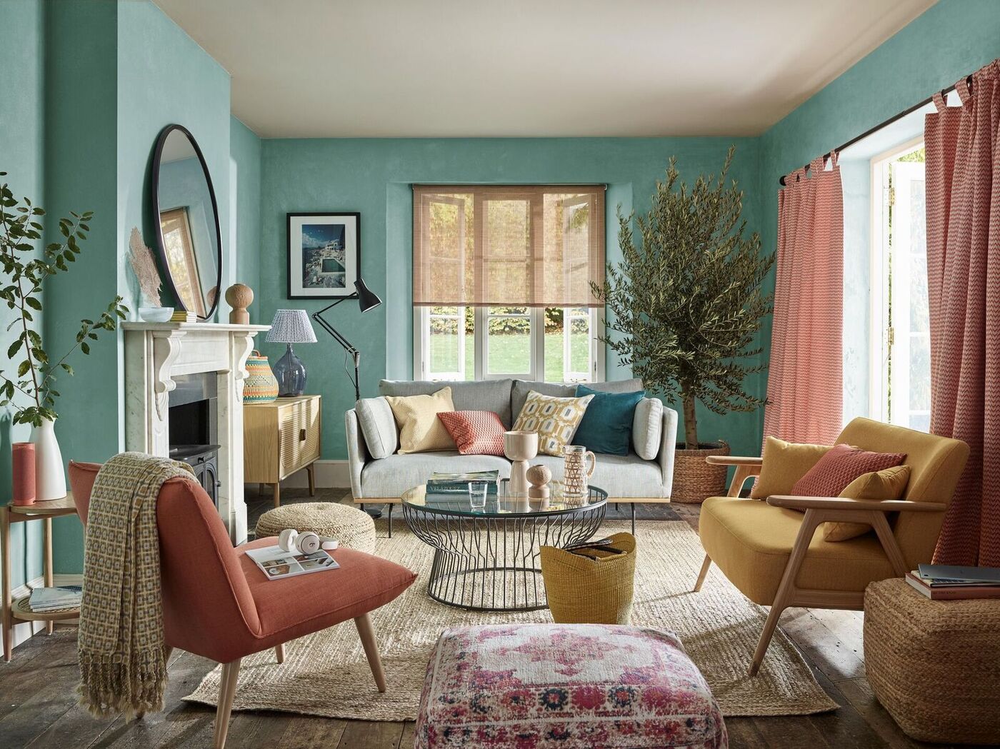
Red: The Power of Passion
Red is a color that demands attention and evokes strong emotions. It symbolizes passion, love, and energy. In color therapy, red is believed to stimulate both the body and mind, increasing heart rate, blood pressure, and boosting circulation.
When used in interior design, red can create a dynamic and stimulating environment. It grabs attention, making it an excellent choice for accent walls or furniture pieces. However, it’s important to use red in moderation, as excessive amounts can create an overwhelming or agitating effect.
In spaces where you want to promote passion and excitement, such as dining areas or home offices, red can be a great choice. It can also be used in rooms where physical activity is encouraged, like a home gym. Just a touch of red can bring life and energy into any space.
But red is not just about stimulating energy; it also ignites appetite and promotes conversation. That’s why it’s often used in restaurants and dining rooms. It can create a warm and inviting atmosphere, encouraging guests to enjoy a delightful meal and engage in lively conversations.
So, whether you want to add a splash of passion to your living room or create an inviting dining area, the color red can be a powerful tool in interior design. Just remember to use it strategically and in moderation to get the desired effect.
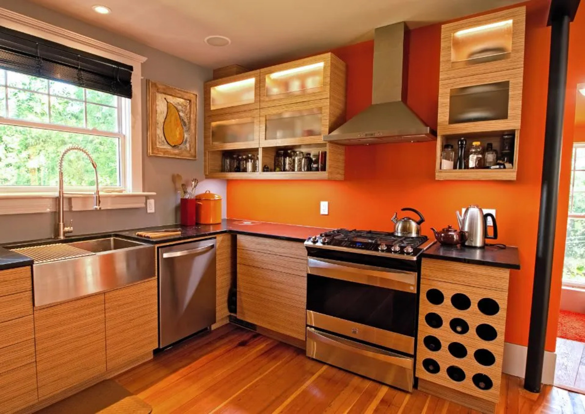
Orange: Energy and Enthusiasm
Orange is a vibrant and energetic color that radiates warmth and enthusiasm. It combines the passion and intensity of red with the cheerfulness and optimism of yellow. In color therapy, orange is associated with joy, creativity, and vitality.
When used in interior design, orange can create a lively and invigorating space. It’s perfect for rooms where energy and enthusiasm are desired, such as a playroom or home gym. The color orange stimulates the mind and encourages creative thinking, making it an excellent choice for a home office or study area.
Orange can also bring a sense of warmth and coziness to a room. It’s a great choice for living rooms or dining areas where you want to create a welcoming and sociable atmosphere. The color orange is known to promote social interaction, making it perfect for spaces where you entertain guests.
When incorporating orange into your interior design, it’s important to find the right balance. Too much orange can be overwhelming, so using it as an accent color or in combination with neutral tones is often the best approach. Just a pop of orange can bring energy and excitement to a space without overpowering it.
Remember, orange is a color that promotes joy and creativity. By using it strategically in your interior design, you can create spaces that are full of life and enthusiasm, energizing both you and your guests.
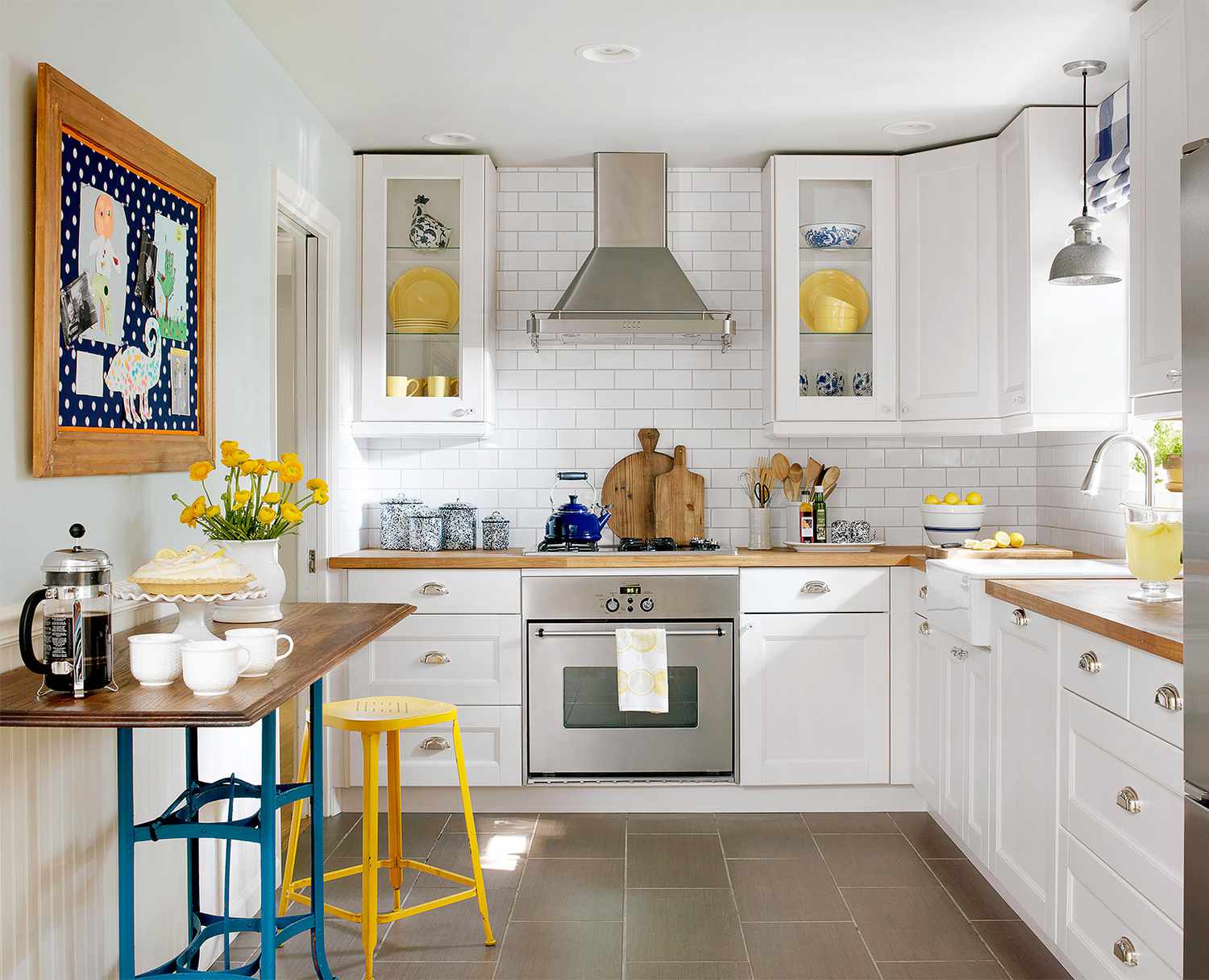
Yellow: Sunshine and Happiness
Yellow is the color of sunshine, warmth, and happiness. It is often associated with feelings of joy, optimism, and positivity. In color therapy, yellow is believed to stimulate the nervous system, improve focus, and uplift the spirits.
When used in interior design, yellow can brighten and energize a space. It’s an excellent choice for rooms that lack natural light or feel dreary. Yellow walls or accents can create a sunny and cheerful atmosphere, making any room feel more inviting.
Yellow is also known to stimulate creativity and enhance mental clarity. It’s a perfect color for home offices, study areas, or creative spaces like art studios. The warm and vibrant nature of yellow can inspire fresh ideas and promote a positive mindset.
In addition to its energizing qualities, yellow is a color that encourages socialization and communication. It’s an ideal choice for gathering spaces like kitchens, dining rooms, or living rooms. The vibrant and welcoming nature of yellow can create an atmosphere that promotes lively conversations and connection.
While yellow is a delightful and uplifting color, it’s essential to use it with caution. Too much yellow can be overwhelming and create a sense of anxiety or unease. Using yellow as an accent color or in combination with neutral tones is a great way to add a touch of sunshine without overpowering the space.
Incorporating yellow into your interior design can bring a sense of sunshine and happiness to your living space. Just a splash of this vibrant color can transform a room and create a positive and inviting atmosphere.
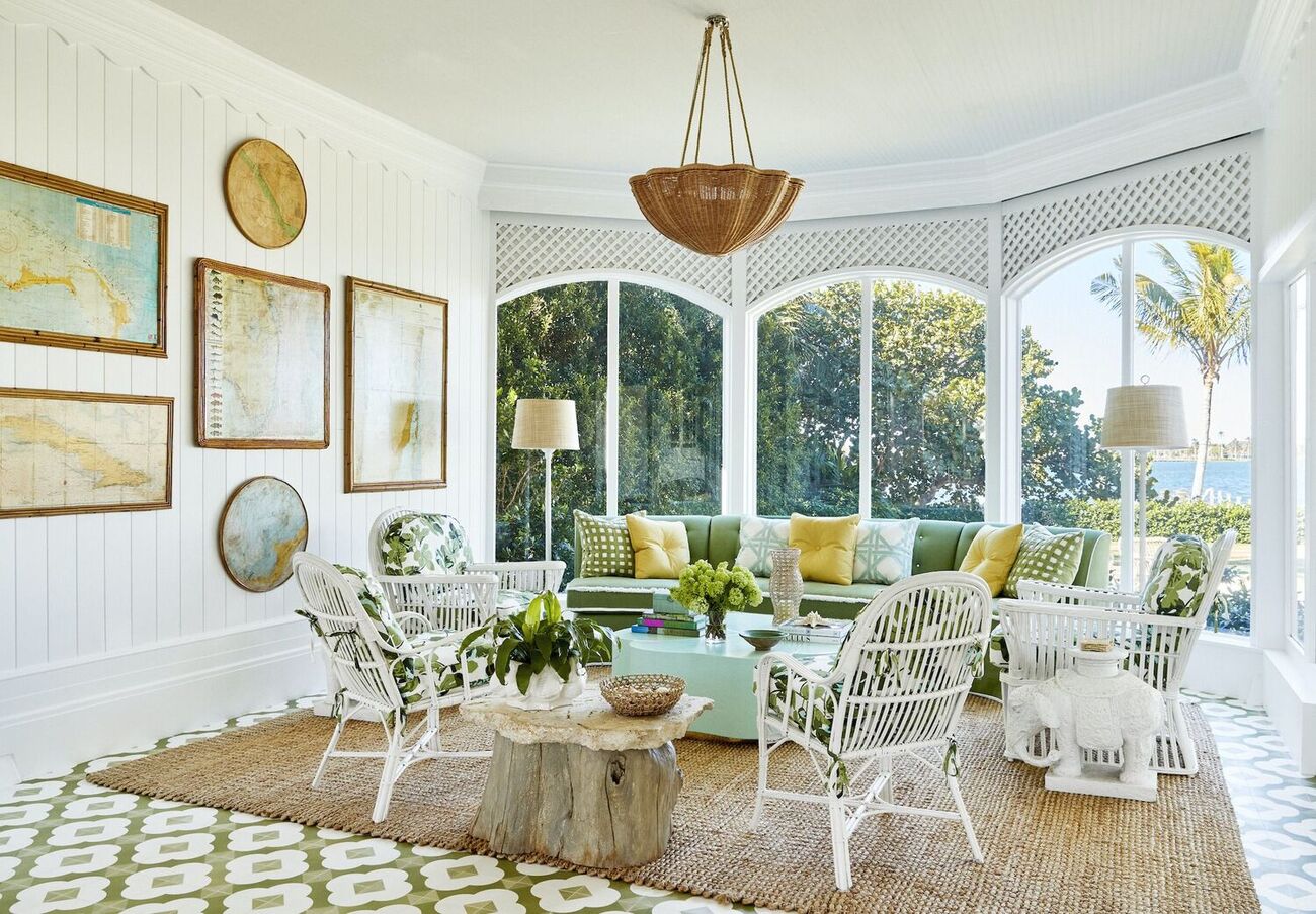
Green: Harmony and Balance
Green is a color that represents nature, growth, and harmony. It is also associated with feelings of balance, calmness, and rejuvenation. In color therapy, green is believed to have a soothing and healing effect on both the mind and body.
When used in interior design, green can create a sense of serenity and relaxation. It is a versatile color that can be used in various shades, from soft and muted tones to vibrant and deep hues. Green is often considered a neutral color in interior design, as it complements a wide range of other colors.
By incorporating green into your living space, you can bring the calming and refreshing qualities of nature indoors. It’s an excellent choice for bedrooms, bathrooms, or any area where you want to create a peaceful retreat. The color green promotes tranquility and can help alleviate stress and anxiety.
In addition to its soothing qualities, green is also known to enhance focus and concentration. It’s a perfect color for home offices or study areas, where productivity and mental clarity are essential. The calming effect of green can create a harmonious and conducive environment for work or study.
Green is often associated with growth and vitality, making it a great choice for spaces where you want to promote a sense of well-being. It can be used in areas where you practice yoga or meditation, creating a serene and nurturing atmosphere.
Whether you incorporate green through plants, wall paint, or furniture, it can bring a sense of balance and harmony to your living space. The color green has a natural ability to connect us with the soothing elements of nature and create a peaceful atmosphere that promotes relaxation and well-being.
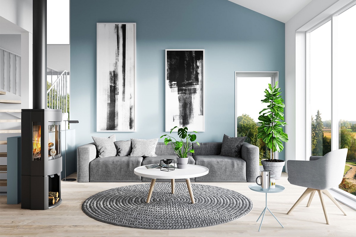
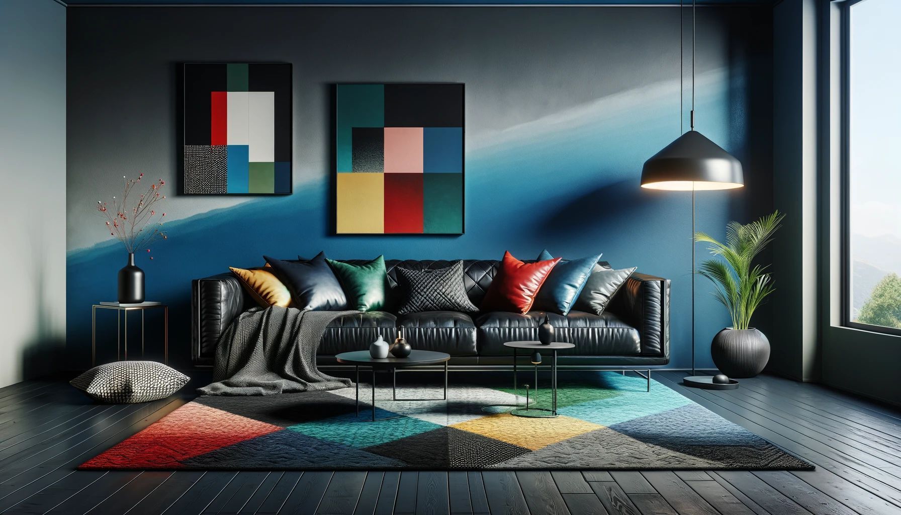
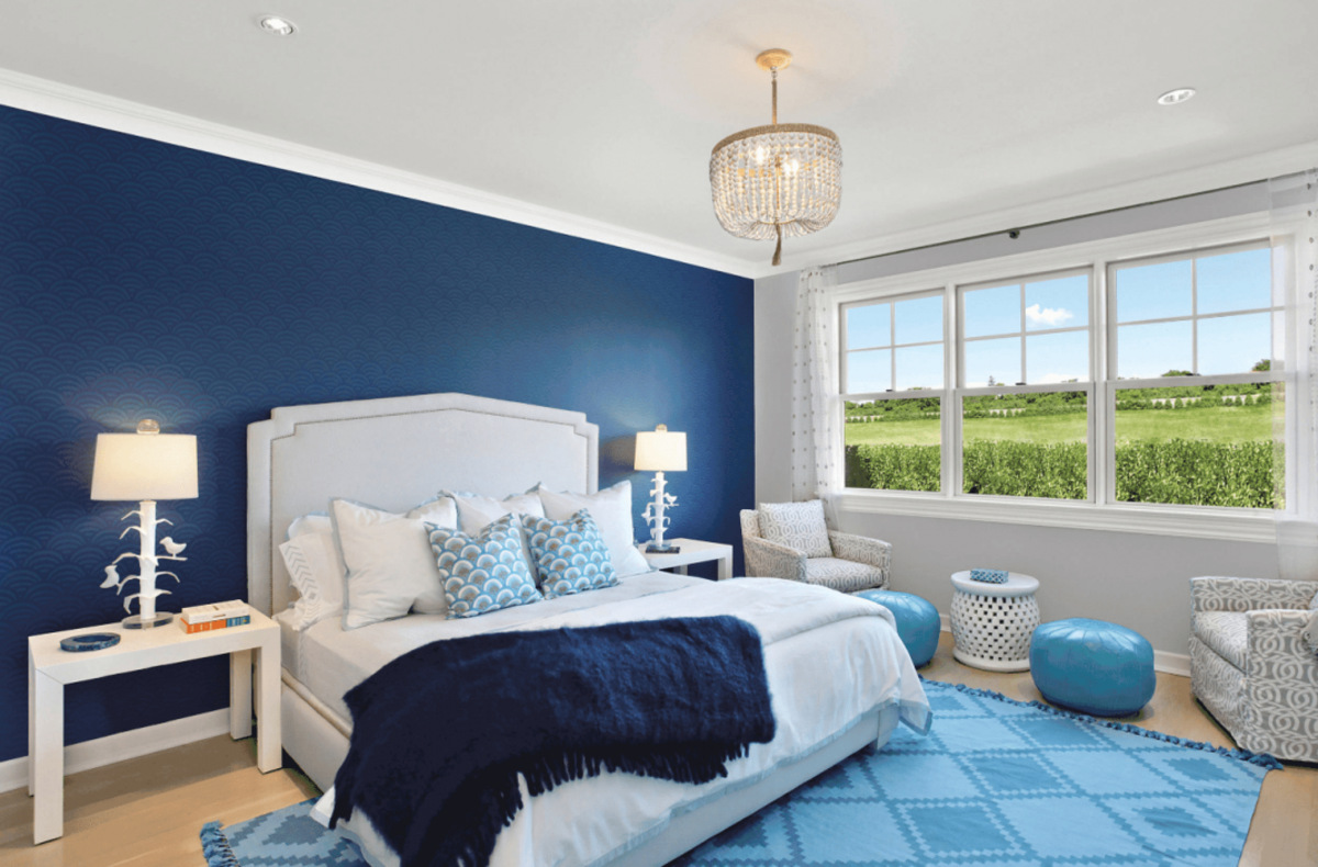
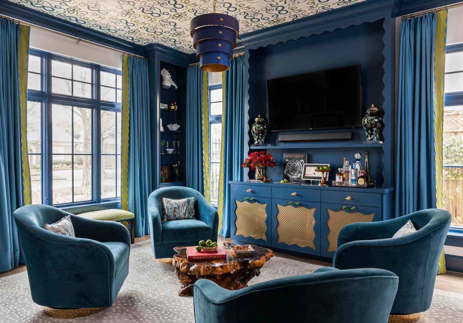
Blue: Calmness and Serenity
Blue is a color that is often associated with calmness, serenity, and tranquility. It evokes feelings of peace, stability, and relaxation. In color therapy, blue is believed to have a soothing effect on the mind and body, reducing stress and promoting a sense of calm.
When used in interior design, blue can create a peaceful and harmonious atmosphere. It is a versatile color that can range from soft and light shades to deep and rich tones. Light blues can create a sense of openness and expansiveness, while darker blues can add depth and create a more intimate feel.
Blue is commonly used in bedrooms and bathrooms, spaces where relaxation and tranquility are sought after. It can help create a serene environment that promotes a restful sleep and a peaceful start to the day. Blue is also an excellent choice for living rooms or areas where you want to unwind and de-stress.
In addition to its calming qualities, blue is also associated with trust and communication. It can create a sense of reliability and dependability, making it suitable for office spaces or meeting rooms. The color blue can promote clear and effective communication, fostering a sense of trust and understanding.
When incorporating blue into your interior design, it’s important to consider the overall mood you want to create. Light blues can make a space feel airy and refreshing, while deep blues can create a more introspective and serene environment. Pairing blue with other calming colors like white or gray can enhance the overall sense of tranquility.
By incorporating shades of blue into your living space, you can create an atmosphere of calmness and serenity. Whether you choose a soft and soothing blue or a deeper and more introspective shade, this color has the power to create a sense of peace and relaxation throughout your home.
Tip: Surround yourself with blue to promote relaxation and calmness, yellow for energy and positivity, and green for balance and harmony. Incorporating these colors into your environment can help improve your mood.
Purple: Creativity and Spirituality
Purple is a color that is often associated with creativity, spirituality, and luxury. It combines the stability of blue with the energy of red, resulting in a color that inspires imagination and introspection. In color therapy, purple is believed to stimulate the mind, enhance intuition, and promote a sense of spiritual connection.
When used in interior design, purple can evoke a sense of opulence and elegance. It is a color that adds a touch of luxury to a space. Deep shades of purple, such as royal purple or eggplant, can create a regal and sophisticated ambiance, while lighter shades, like lavender or lilac, can bring a sense of tranquility and serenity.
Purple is often associated with creativity and artistic expression. It is a perfect color for art studios, craft rooms, or any space where you want to unleash your creative potential. Purple stimulates the imagination and encourages out-of-the-box thinking.
In addition to its creative qualities, purple is also linked to spirituality and introspection. It is a color that invites contemplation and encourages inner reflection. Purple can be used in meditation spaces or quiet corners of a room to create a serene environment for spiritual practices.
When using purple in interior design, it’s important to find the right balance. Too much purple can be overwhelming and create a sense of heaviness. Using purple as an accent color or in combination with neutral tones can provide a harmonious and well-balanced look.
Incorporating shades of purple into your living space can ignite your creativity and enhance your spiritual well-being. Whether you choose deep, rich purples or soft, soothing lavenders, this color has the power to inspire and uplift, creating an environment that is both aesthetically pleasing and spiritually enriching.
Pink: Love and Compassion
Pink is a color that is often associated with love, compassion, and tenderness. It is a gentle and soothing color that evokes feelings of warmth and affection. In color therapy, pink is believed to promote feelings of love, nurturance, and emotional healing.
When used in interior design, pink can create a soft and romantic atmosphere. It is a versatile color that ranges from delicate pastel shades to vibrant and bold hues. Light pinks can create a sense of serenity and sweetness, while deeper pinks can add a touch of drama and sophistication.
Pink is often associated with femininity, making it a popular choice for bedrooms or spaces dedicated to self-care. It can create a cozy and nurturing environment that promotes relaxation and restful sleep. Pink can also be used in living rooms or dining areas to create an intimate and inviting setting.
In addition to its associations with love and romance, pink is also a color that promotes compassion and emotional healing. It can create a sense of comfort and safety, making it ideal for spaces where self-reflection and emotional well-being are important, such as meditation rooms or reading nooks.
When incorporating pink into your interior design, it’s important to consider the overall mood you want to create. Lighter shades of pink can create a soft and serene ambiance, while bolder pinks can add a vibrant and energetic touch. Pairing pink with neutral tones like white or gray can create a harmonious and balanced look.
By using shades of pink in your living space, you can create an atmosphere of love, compassion, and emotional well-being. Whether you choose a delicate pastel pink or a bold fuchsia, this color has the power to bring warmth and tenderness to your home.
White: Purity and Clarity
White is a color that symbolizes purity, simplicity, and clarity. It is a timeless and versatile color that has long been associated with cleanliness and a sense of serenity. In color therapy, white is believed to promote mental clarity, fresh beginnings, and a sense of spaciousness.
When used in interior design, white can create a bright and airy atmosphere. It reflects light, making a space appear more open and expansive. White walls, furniture, and décor can create a minimalist and clean look, providing a blank canvas for other elements to shine.
White is often chosen for kitchens and bathrooms, as it conveys a sense of cleanliness and hygiene. It creates a fresh and inviting environment, making it easy to spot dirt or stains. White can also be used in bedrooms or living rooms to create a peaceful and calming retreat.
In addition to its associations with purity and simplicity, white is known to enhance mental clarity and focus. It can create a sense of balance and tranquility, making it a great choice for home offices or study areas. White promotes a clear and uncluttered mindset, allowing for improved concentration and productivity.
Using white in interior design allows for versatility and the ability to easily change the look and feel of a space by incorporating different colors and textures. It serves as a neutral backdrop that can highlight other elements and create a fresh and contemporary aesthetic.
It’s important to note that while white is often associated with cleanliness, it can also be perceived as cold or sterile if used excessively. Adding touches of different colors, textures, or natural elements can bring warmth and visual interest to a white-dominated space.
By incorporating white into your living space, you can create an atmosphere of purity, simplicity, and clarity. The color white has the power to open up a room, promote mental focus, and provide a timeless and versatile backdrop for your interior design vision.
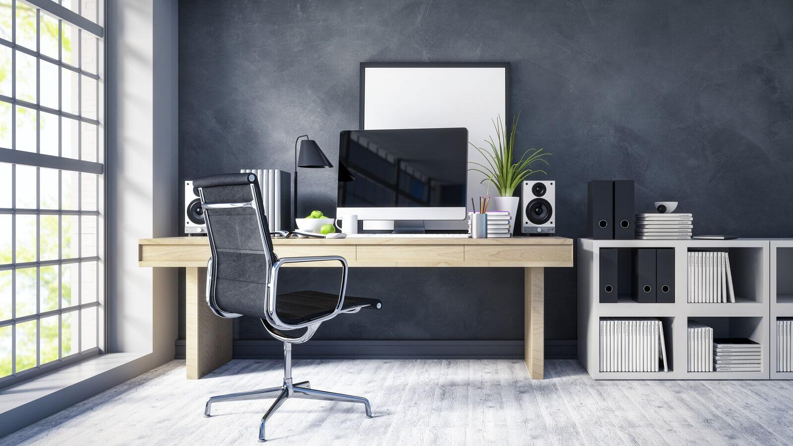
Black: Strength and Protection
Black is a color that exudes strength, elegance, and sophistication. It is often associated with power, authority, and protection. In color therapy, black is believed to provide a sense of grounding, shielding from negative energies, and promoting a feeling of safety and security.
When used in interior design, black can create a dramatic and bold statement. It adds a sense of depth and mystery to a space. Black walls or furniture pieces can become focal points, creating a sense of sophistication and luxury.
Black is often used in spaces where strong and decisive presence is desired, such as formal dining rooms or executive offices. It can create an environment that commands attention and reflects a sense of power and authority.
In addition to its associations with strength and power, black is also a color that provides a grounding effect. It can help create a sense of stability and protection. Incorporating black accents or elements, such as black picture frames or decorative objects, can add a touch of sophistication and elegance to any room.
It’s important to note that while black can create a striking and powerful look, using it in excess can make a space feel dark and heavy. Balancing black with lighter or brighter colors, as well as incorporating reflective surfaces or natural light, can help create a harmonious and well-balanced interior.
By incorporating black into your living space, you can create an atmosphere of strength, elegance, and protection. Whether you choose to embrace black as the main color or incorporate it as accents, this color has the power to add a touch of sophistication and grounded energy to your home.
Conclusion
Color plays a significant role in interior design, not just for aesthetic purposes, but also for its ability to influence our emotions and well-being. Understanding the psychological effects of different colors can help us create spaces that promote the desired ambiance and mood.
Red, with its passionate and energizing nature, can add a dynamic touch to any room, while orange brings enthusiasm and creativity. Yellow evokes sunshine and happiness, while green creates harmony and balance. Blue brings a sense of calmness and serenity, and purple stimulates creativity and spirituality. Pink represents love and compassion, white signifies purity and clarity, and black exudes strength and protection.
By carefully selecting and incorporating colors into our living spaces, we can create environments that align with our desires and enhance our well-being. Whether we choose to create a vibrant and energetic space or a serene and tranquil retreat, color therapy allows us to harness the power of hues to make our homes more inviting, comfortable, and meaningful.
It’s important to note that personal preferences and individual responses to colors may vary. What evokes positive emotions for one person may have a different effect on another. Experimenting with different colors and observing their impact on your mood and well-being is a great way to find the perfect color palette for your home.
Remember, interior design is not just about aesthetics but also about creating spaces that nurture our well-being and reflect our unique personalities. So, embrace the power of colors and let them transform your living space into a haven that truly speaks to you.
Frequently Asked Questions about Color Therapy: Therapists Swear These Hues Boost Your Mood
Was this page helpful?
At Storables.com, we guarantee accurate and reliable information. Our content, validated by Expert Board Contributors, is crafted following stringent Editorial Policies. We're committed to providing you with well-researched, expert-backed insights for all your informational needs.
0 thoughts on “Color Therapy: Therapists Swear These Hues Boost Your Mood”