Home>Interior Design>5 Bedroom Curtain Colors To Avoid: They May Be Ruining Sleep
Interior Design
5 Bedroom Curtain Colors To Avoid: They May Be Ruining Sleep
Modified: January 5, 2024
Discover the top 5 bedroom curtain colors to avoid for a peaceful night's sleep. These interior design choices could be ruining your rest.
(Many of the links in this article redirect to a specific reviewed product. Your purchase of these products through affiliate links helps to generate commission for Storables.com, at no extra cost. Learn more)
Introduction
Choosing the right colors for your bedroom curtains is not just about aesthetics; it can also impact the quality of your sleep. The colors we surround ourselves with have a psychological and physiological effect on our minds and bodies. When it comes to creating a calming and restful sleep environment, certain colors are more conducive than others.
In this article, we will explore five bedroom curtain colors to avoid if you want to ensure a good night’s sleep. These colors, while visually appealing, may unknowingly be disrupting your sleep patterns and preventing you from getting the restorative rest you need. We will also suggest alternative curtain colors that promote relaxation and create a serene atmosphere in your bedroom.
The bedroom is a sanctuary, a place where we seek solace and rejuvenation. It is essential to create an environment that promotes tranquility and allows us to unwind after a long day. Let’s dive into the curtain colors that may be sabotaging your sleep and discover the alternatives that can help you achieve a peaceful night’s rest.
Key Takeaways:
- Avoid dark shades of blue, purple, vibrant red, bright orange, neon colors, bold patterns, and metallic curtains for better sleep. Opt for lighter, soothing colors, gentle patterns, and matte fabrics to create a serene sleep environment.
- Carefully select bedroom curtain colors to promote relaxation and enhance sleep quality. Choose calming hues, subtle patterns, and light-absorbing fabrics to transform your bedroom into a peaceful sanctuary for rest and rejuvenation.
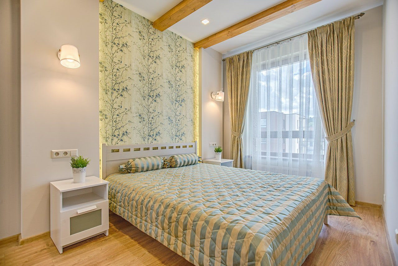
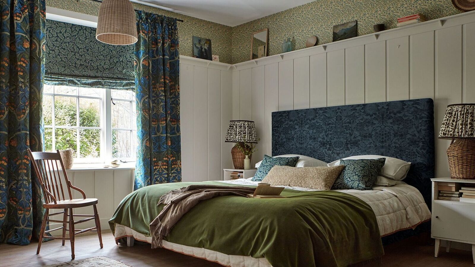
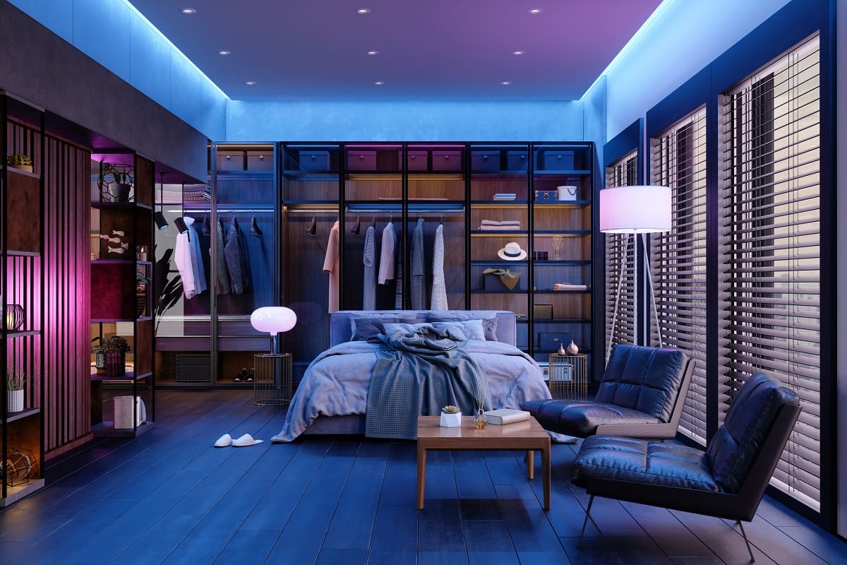
Dark shades of blue and purple
Dark shades of blue and purple may seem like elegant and soothing choices for bedroom curtains, but they can actually have a negative impact on sleep quality. These deep, saturated colors have a stimulating effect on the brain, making it harder to relax and fall asleep.
Research has shown that exposure to blue light, especially in the evening or at night, can interfere with the body’s production of melatonin, a hormone that regulates sleep and wakefulness. This disruption in melatonin production can lead to difficulty falling asleep and disrupted sleep patterns.
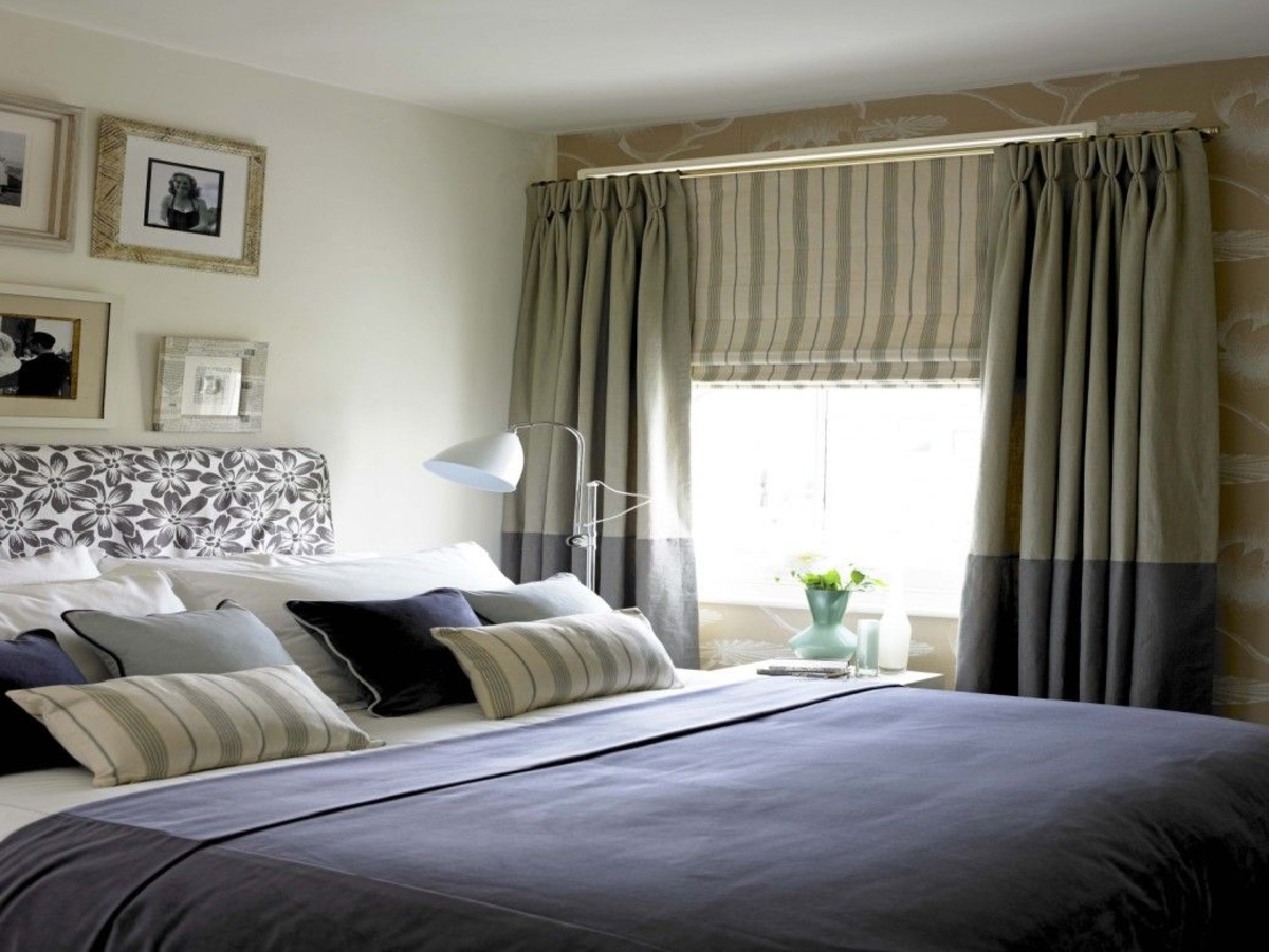
If you want to create a sleep-friendly atmosphere in your bedroom, consider opting for lighter shades of blue and purple. Soft pastel blues and lavenders have a calming effect on the mind and promote relaxation. These lighter tones can still add a touch of tranquility to your space without hindering your sleep.
Alternatively, earthy tones like sage green or warm neutrals such as beige or light gray can provide a soothing backdrop for your bedroom curtains. These colors evoke a sense of serenity and can help create a peaceful sleep environment.
Remember, when choosing curtain colors, it’s not just about the color itself but also the intensity and saturation. Opting for softer, muted shades of blue and purple can make a significant difference in promoting a restful night’s sleep.
Creating a harmonious and calming sleep environment involves taking into consideration every aspect of your bedroom, including your choice of curtain colors. Experiment with different hues and shades to find the perfect balance between aesthetics and sleep-promoting qualities.
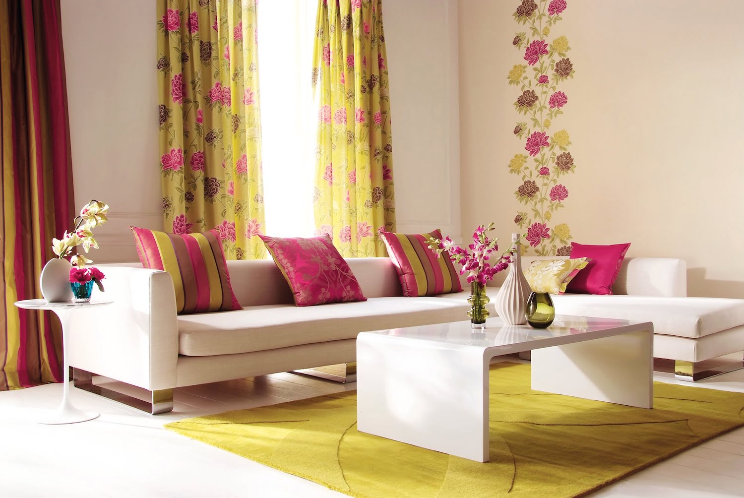
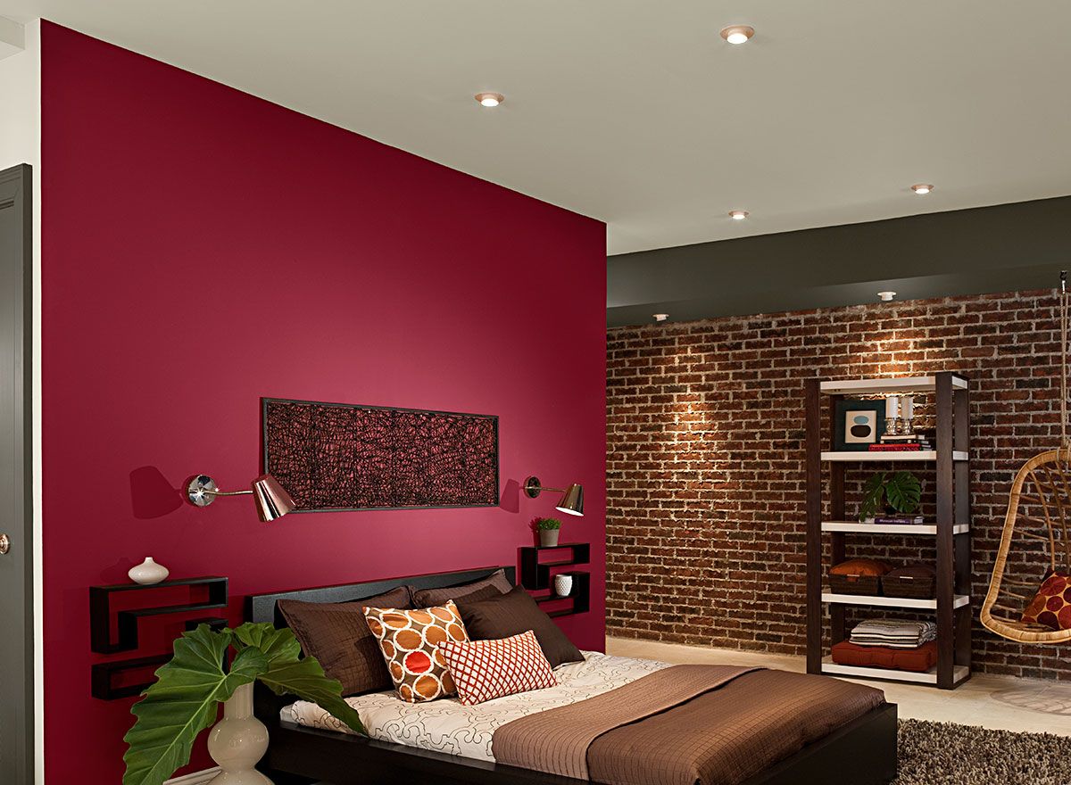
Vibrant red and bright orange
Vibrant red and bright orange may be attention-grabbing and energetic colors, but they can have a stimulating effect on the brain, making it difficult to unwind and fall asleep. These intense hues can increase heart rate and blood pressure, promoting a sense of restlessness rather than relaxation.
The psychological association of red and orange with energy and excitement can keep your mind active and alert, making it harder to transition into a state of calmness conducive to sleep. To promote a better night’s sleep, it is advisable to avoid using these colors for your bedroom curtains.
Instead, opt for cooler and more soothing tones. Shades of green, such as mint or seafoam, can evoke a sense of tranquility and promote a peaceful sleep environment. Green is often associated with nature and has a calming effect on the mind.
If you prefer warmer tones, consider muted shades of pink or peach. These softer hues can create a gentle ambiance in the bedroom, instilling a feeling of relaxation and serenity.
When selecting curtain colors for your bedroom, it’s important to create a visual environment that encourages rest and relaxation. By choosing more subdued and peaceful colors over vibrant red and bright orange, you can create a soothing atmosphere that promotes a deep and restorative sleep.
Neon or fluorescent colors
Neon or fluorescent colors may be trendy and eye-catching, but they can have disruptive effects on sleep patterns. These intense and vibrant colors can overstimulate the brain, making it challenging to wind down and achieve a restful state.
The bright and glaring nature of neon and fluorescent colors can interfere with the body’s natural circadian rhythm, which regulates sleep-wake cycles. Exposure to these colors, particularly in the evening or at night, can confuse the brain and hinder the secretion of melatonin, the hormone responsible for promoting sleep.
To create a sleep-inducing atmosphere in your bedroom, it is best to steer clear of neon and fluorescent curtain colors. Instead, opt for subtle and calming alternatives that promote relaxation.
Soft, pastel hues like lavender or baby blue can create a soothing and tranquil environment. These gentle colors have a calming effect on the mind and can help prepare your body for a night of uninterrupted sleep.
Earth tones such as warm browns or muted greens can also contribute to a serene bedroom setting. These colors evoke a sense of groundedness and harmony, providing a peaceful backdrop for a restful sleep.
When choosing curtain colors, prioritize softer and more subtle shades over the bold and intense neon or fluorescent colors. By creating a soothing visual environment, you can promote healthy sleep patterns and improve the overall quality of your rest.
Avoid bright and bold colors like red, orange, and yellow for bedroom curtains as they can be too stimulating and disrupt sleep. Opt for calming and soothing colors like blue, green, or lavender instead.
Bold and overpowering patterns
While bold and eye-catching patterns can add visual interest to your bedroom curtains, they can also become visual distractions during sleep. Intricate and overpowering patterns can create a sense of busyness and restlessness, making it challenging to relax and drift off into a peaceful slumber.
When your eyes are exposed to busy patterns, it can be difficult for your mind to settle down and enter a state of tranquility. This can result in fragmented and disrupted sleep, impacting the overall quality of your rest.
To create a sleep-friendly environment, consider opting for serene and peaceful pattern options. Simple geometric designs, such as subtle stripes or gentle waves, can add a touch of visual interest without overwhelming the senses. These patterns have a calming effect on the mind and can help create a more serene atmosphere in your bedroom.
If you prefer a more organic and nature-inspired look, botanical or floral patterns can be a great choice. Opt for softer and more muted versions of these patterns to promote relaxation and create a soothing sleep environment.
Remember, the key is to create a harmonious and balanced visual atmosphere in your bedroom. Choose patterns that contribute to a sense of calmness and allow your mind to unwind. By avoiding bold and overpowering patterns, you can minimize visual distractions and enhance the quality of your sleep.
Metallic or shiny curtains
While metallic or shiny curtains may add a touch of glamour and elegance to your bedroom, they can have reflective properties that can negatively impact your sleep environment. The reflective surfaces of these curtains can bounce light around the room, creating disturbances and hindering the ability to achieve a restful sleep.
When light reflects off metallic or shiny curtains, it can create glare and disrupt the darkness needed for optimal sleep. This can interfere with the body’s natural production of melatonin and disrupt the sleep-wake cycle.
To create a more sleep-friendly atmosphere, opt for softer and matte alternatives for your curtains. Fabrics with a matte finish absorb light rather than reflecting it, providing a darker and more serene environment for sleep.
Consider choosing curtains made from natural materials like cotton or linen. These fabrics have a more subdued sheen, creating a calming ambiance in the bedroom. They also offer excellent light-blocking properties, helping to maintain a darker sleep environment.
Another option is to choose curtains with a blackout lining. The blackout lining acts as a barrier to prevent light from filtering through the fabric, offering maximum darkness for a better night’s sleep. This is especially beneficial for those who are sensitive to light or live in areas with bright streetlights.
By avoiding metallic or shiny curtains and opting for softer and matte alternatives, you can create a sleep environment that is conducive to rest. The use of light-absorbing fabrics or blackout linings can help create a darker and more peaceful atmosphere, allowing for a more rejuvenating and uninterrupted sleep.
Conclusion
When it comes to selecting curtain colors for your bedroom, it’s important to consider their impact on your sleep quality. Certain colors, such as dark shades of blue and purple, vibrant red and bright orange, neon or fluorescent colors, bold and overpowering patterns, and metallic or shiny curtains, can have detrimental effects on your sleep environment.
These colors and patterns can stimulate the brain, disrupt sleep patterns, create visual distractions, and reflect light, all of which can hinder the ability to relax and achieve a restful sleep. However, there are alternative curtain colors and styles that can promote relaxation, create a serene atmosphere, and enhance the quality of your sleep.
Lighter shades of blue and purple, softer pastels, earthy tones, and gentle greens can provide a calming and soothing backdrop for your bedroom curtains. Subtle and calming patterns such as simple geometric designs or nature-inspired motifs can contribute to a sense of tranquility. Opting for fabrics with a matte finish or blackout linings can prevent light from disrupting your sleep environment.
Creating a sleep-friendly atmosphere in your bedroom is essential for optimal rest and rejuvenation. By carefully selecting the colors and patterns for your curtains, you can transform your sleep environment into a peaceful sanctuary that promotes relaxation and enhances sleep quality.
Remember, it’s not just about the aesthetic appeal of your curtains, but also their impact on your sleep. Take the time to explore different options, experiment with colors and patterns, and choose curtains that create a soothing and restful ambiance. Your bedroom should be a haven of tranquility, and by making the right choices for your curtains, you can ensure that it becomes a place of peaceful slumber.
Investing in the right curtain colors and configurations can go a long way in creating a sleep environment that promotes relaxation and rejuvenation. So, take a step back, evaluate your current bedroom curtains, and make the necessary changes to guarantee a restful and restorative night’s sleep.
Frequently Asked Questions about 5 Bedroom Curtain Colors To Avoid: They May Be Ruining Sleep
Was this page helpful?
At Storables.com, we guarantee accurate and reliable information. Our content, validated by Expert Board Contributors, is crafted following stringent Editorial Policies. We're committed to providing you with well-researched, expert-backed insights for all your informational needs.


0 thoughts on “5 Bedroom Curtain Colors To Avoid: They May Be Ruining Sleep”