Home>Interior Design>Carpet Colors To Avoid: Steer Clear Of These 5 Shades
Interior Design
Carpet Colors To Avoid: Steer Clear Of These 5 Shades
Modified: August 28, 2024
Discover the interior design tips you need to know! Avoid these 5 carpet colors at all costs to create a stylish and timeless space.
(Many of the links in this article redirect to a specific reviewed product. Your purchase of these products through affiliate links helps to generate commission for Storables.com, at no extra cost. Learn more)
Introduction
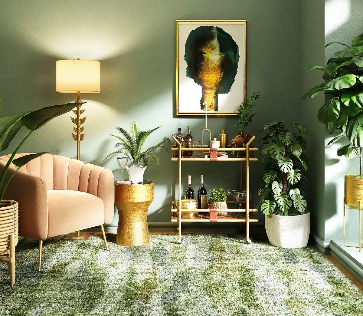
When it comes to interior design, choosing the right carpet color can greatly impact the overall look and feel of a space. The color of the carpet sets the tone for the room and can either enhance or detract from the style and ambiance you are trying to achieve. While there is an endless array of color options available, it’s important to be aware of certain shades that may not be the best choice for your carpets. In this article, we will explore five carpet colors that you may want to avoid to ensure a harmonious and visually appealing space.
While personal preferences play a significant role in selecting carpet colors, it’s essential to consider how those colors can influence the atmosphere of a room. Keep in mind that colors can evoke different emotions and create various visual effects. Additionally, certain carpet shades may become outdated over time, limiting your ability to update your décor without replacing the entire carpet. By avoiding these five carpet colors, you can ensure a timeless and versatile design scheme that will withstand the test of time.
Key Takeaways:
- Choose timeless and versatile carpet colors like neutral tones or muted shades to ensure a visually appealing and harmonious space that withstands changing design trends and complements various design elements.
- Avoid overwhelming and high-maintenance carpet colors like red, neon, dark brown/black, bright yellow, and stark white to create a balanced, inviting, and visually stunning interior design scheme that reflects your personal style.
Read more: 5 Colors To Avoid In A Bathroom
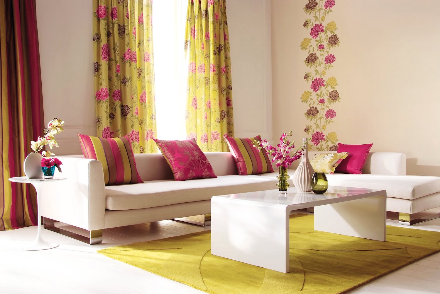
Red
Red is a bold and vibrant color that can add a dramatic touch to any room. However, when it comes to carpets, red can be a tricky color to work with. One of the main reasons to avoid red carpets is that they tend to dominate the space and become the focal point of the room. This can make it difficult to coordinate other elements in the room, such as furniture and accessories, without overwhelming the space.
Another consideration to keep in mind when it comes to red carpets is their ability to affect the atmosphere of a room. Red is known to evoke strong emotions and can create a sense of intensity and energy. While this may be desirable in certain spaces, such as a home gym or an entertainment room, it may not be the best choice for areas where you want to create a calming and relaxing environment, such as bedrooms or living rooms.
Furthermore, red carpets can be challenging to maintain and keep clean. Red is a color that easily shows dirt, stains, and wear and tear. This means that you may find yourself constantly battling to keep your red carpet looking fresh and in good condition. Additionally, red carpets can make it difficult to decorate according to changing trends and styles, as they can limit your options for color palettes and furniture choices.
Ultimately, if you are considering a red carpet, it’s essential to carefully evaluate whether it aligns with your overall design goals and the function of the space. While it can make a bold statement, it’s important to consider the potential limitations and challenges that come with this vibrant carpet color.
Neon Colors
Neon colors may be eye-catching and trendy, but they are not the most suitable choice for carpets. Neon colors, such as neon green, hot pink, and electric blue, are highly vibrant and can be overwhelming in large quantities. While they may work well as accent colors or in small doses, using neon colors for the entire carpet can create a visually chaotic and distracting space.
One of the main reasons to avoid neon-colored carpets is their lack of versatility. Neon colors are known for being trendy and temporary, and they can quickly go out of style. Investing in a neon carpet may restrict your ability to update your décor in the future without replacing the entire carpet. It’s best to opt for more timeless and classic carpet colors that can withstand changing design trends.
Additionally, neon colors can also have a negative impact on the overall ambiance of a room. These bright and intense colors can be visually overwhelming and make it challenging to create a balanced and harmonious space. They can also clash with other elements in the room, such as furniture, wall colors, and accessories, making it difficult to achieve a cohesive and aesthetically pleasing design.
Moreover, neon-colored carpets may not be the most practical choice for high-traffic areas or spaces frequented by children or pets. Stains and spills can be more noticeable on neon carpets, and it may require more effort and maintenance to keep them looking clean and presentable.
Overall, while neon colors may be trendy and exciting, it’s best to use them sparingly as accents or in small doses rather than as the main color for your carpet. Opting for more timeless and versatile colors will ensure a longer-lasting and visually appealing design.
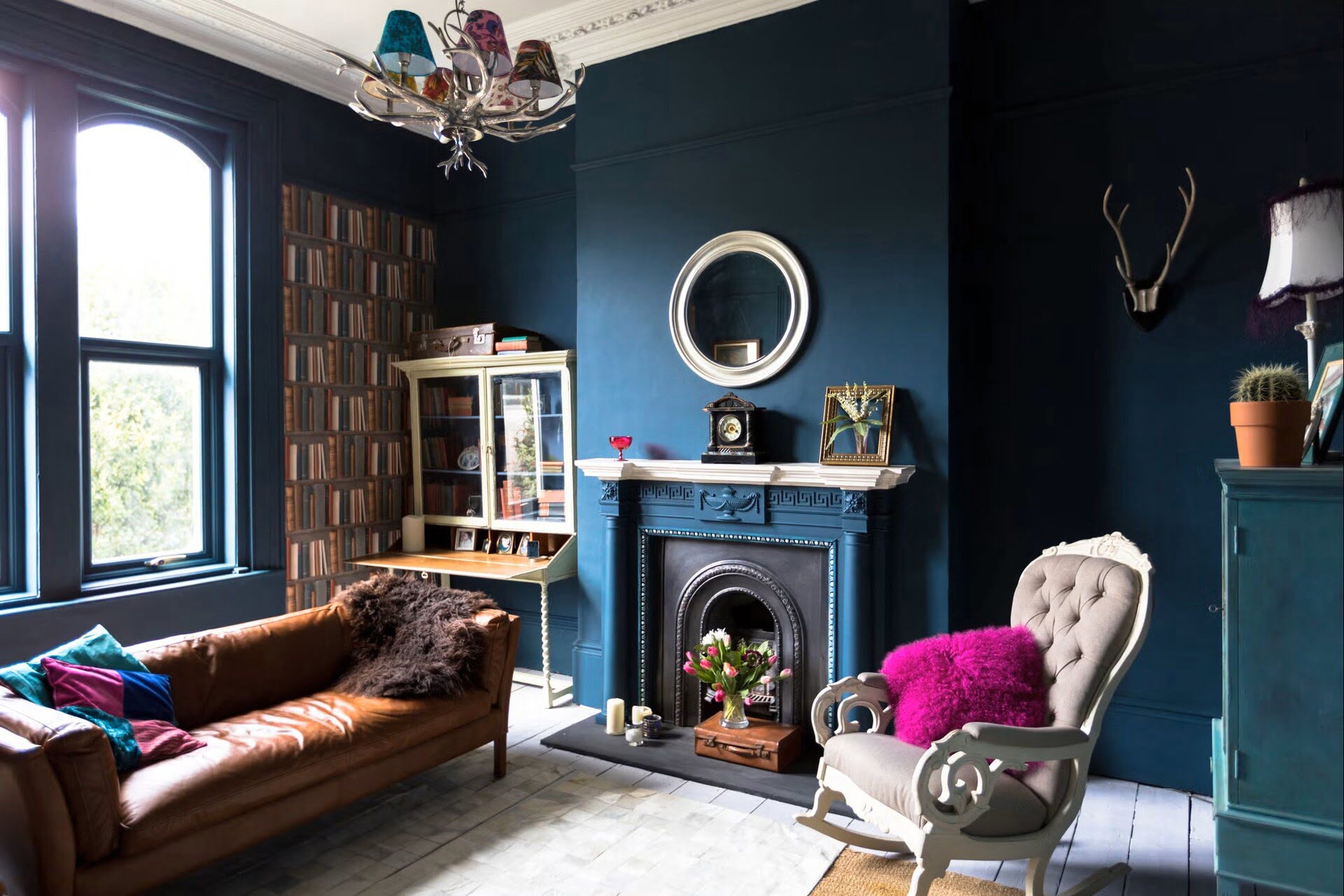
Dark Brown/Black
Dark brown and black carpets may seem like a sophisticated and elegant choice at first glance, but there are a few reasons why you may want to avoid these colors when it comes to your flooring. While they can create a sense of richness and depth, dark brown and black carpets can also make a room feel smaller and more closed-in. This is especially true in rooms with limited natural light or smaller square footage.
Another drawback of dark brown and black carpets is their ability to show dust, lint, and pet hair more easily. This means that you may find yourself constantly vacuuming and cleaning to keep your carpet looking pristine. Additionally, dark-colored carpets tend to show footprints and stains more noticeably, which can be a concern in high-traffic areas or spaces frequented by children and pets.
Dark carpets can also be challenging to coordinate with other elements in the room. Unless you have a specific design style in mind, such as a contemporary or minimalist aesthetic, dark carpets can limit your color and pattern choices for furniture and accessories. Lighter, neutral-colored carpets, on the other hand, provide more flexibility and allow you to experiment with different design elements.
Furthermore, dark-colored carpets can absorb more heat from sunlight or artificial lighting, which can make the room feel warmer and less comfortable, particularly in warmer climates. This can also impact the overall energy efficiency of the space, as dark carpets can contribute to a higher cooling load in the summer months.
Considering these factors, it’s essential to carefully assess the lighting, size, and overall style of your room before opting for a dark brown or black carpet. While they can create a sense of elegance, it’s important to weigh the potential drawbacks and limitations to ensure a well-balanced and visually appealing space.
When choosing a carpet color, avoid shades of bright red, deep purple, neon green, bright orange, and dark brown. These colors can be difficult to coordinate with other decor and may quickly go out of style.
Bright Yellow
Bright yellow carpets may seem like a cheerful and vibrant choice, but they can pose several challenges when it comes to interior design. While yellow can evoke feelings of happiness and positivity, using it as the main color for your carpet can create a visually overwhelming and potentially distracting space.
One of the main reasons to avoid using bright yellow carpets is their impact on the overall ambiance of a room. Yellow is a highly stimulating color and can elicit a sense of energy and excitement. However, in large quantities, it can become overpowering and make it difficult to create a calm and relaxing environment. Bright yellow carpets can also clash with other colors and create a discordant and chaotic look.
Additionally, bright yellow carpets can be challenging to coordinate with other elements in the room. Yellow is a color that can quickly dominate the space and limit your options for furniture and accessory choices. It may be difficult to find complementary colors that work well with a bright yellow carpet without overwhelming the room or creating a clash of hues.
Furthermore, bright yellow carpets can also show dirt, stains, and wear more easily, requiring frequent cleaning and maintenance. This can be especially problematic in high-traffic areas or spaces frequented by children and pets. Considering the practicality and longevity of your carpet is crucial when making design choices.
If you are drawn to the vibrancy of yellow, consider using it as an accent color or in smaller doses rather than as the main color for your carpet. Using yellow in decorative pillows, artwork, or accessories can add pops of color and create a visually pleasing contrast without overwhelming the space.
Ultimately, while bright yellow carpets can add a bold statement to your room, it’s important to consider the potential challenges they can present in terms of overall design and maintenance. Carefully weigh the pros and cons before committing to a bright yellow carpet to ensure a well-balanced and visually appealing space.
Stark White
While white may often be associated with cleanliness and purity, using stark white carpets can come with its own set of challenges. While it may seem like a classic and timeless choice, white carpets can be difficult to maintain and keep looking pristine.
One of the main concerns with white carpets is their susceptibility to stains and discoloration. Even small spills or dirt can be incredibly noticeable on a white carpet, requiring constant cleaning and maintenance. This can be particularly challenging in high-traffic areas or homes with young children or pets. Keeping a white carpet in impeccable condition may necessitate frequent professional cleaning or constant vigilance to prevent stains from setting in.
Additionally, white carpets can easily show signs of wear and tear. Footprints, scuffs, and general traffic patterns can become more visibly apparent on a white surface, detracting from the overall appearance of the room. This may require more frequent replacements or a more rigorous cleaning routine to keep the white carpet looking its best.
Another consideration is that white carpets can make a room feel stark and sterile if not balanced properly. They can create a cold and impersonal atmosphere, lacking the warmth and coziness often associated with carpeted spaces. To mitigate this, it is important to introduce other colors and textures through furniture, accessories, and wall colors to create a more inviting and balanced environment.
Furthermore, white carpets can be challenging to coordinate with other design elements in the room. Unless you have a minimalist or monochromatic aesthetic in mind, pairing white carpets with furniture and accessories can be limiting. White carpets can easily clash with certain colors or patterns, making it more difficult to achieve a cohesive and harmonious design.
When considering a white carpet, it is crucial to weigh the maintenance and design challenges it may present. If you are willing to put in the effort to keep it clean and are able to strike the right balance with other design elements, a white carpet can create a crisp and modern look. However, it is worth considering alternative options that offer a similar aesthetic with less upkeep and potential limitations.
Conclusion
When it comes to carpet colors, it’s important to choose wisely to create a visually appealing and harmonious space. While personal preferences certainly play a role in selecting the right color, there are certain shades that may be best avoided to ensure a timeless and versatile design.
Red carpets can be overwhelming and dominate the space, making it challenging to coordinate with other elements in the room. Neon colors may be trendy but can quickly become outdated, limiting your ability to update your décor in the future. Dark brown and black carpets can make a room feel smaller and can be more challenging to maintain and coordinate. Bright yellow carpets can be visually overwhelming and clash with other design elements. Stark white carpets require constant maintenance and may create a sterile and impersonal atmosphere if not balanced properly.
It’s essential to carefully evaluate the lighting, size, and overall style of your room when selecting a carpet color. Consider the mood and atmosphere you want to create, as well as the practicality and longevity of your choice. Opting for more versatile and timeless colors, such as neutral tones or muted shades, can provide a solid foundation to build upon with furniture, accessories, and wall colors.
Remember, while carpet colors can significantly impact the overall look and feel of a space, they are not the sole determining factor. It’s crucial to incorporate other design elements and create a cohesive and balanced environment. By avoiding these five carpet colors and making thoughtful choices, you can ensure a visually stunning and inviting space that reflects your personal style and stands the test of time.
Frequently Asked Questions about Carpet Colors To Avoid: Steer Clear Of These 5 Shades
Was this page helpful?
At Storables.com, we guarantee accurate and reliable information. Our content, validated by Expert Board Contributors, is crafted following stringent Editorial Policies. We're committed to providing you with well-researched, expert-backed insights for all your informational needs.

0 thoughts on “Carpet Colors To Avoid: Steer Clear Of These 5 Shades”