Home>Interior Design>20 Gorgeous Pastel Colors To Enliven Any Space
Interior Design
20 Gorgeous Pastel Colors To Enliven Any Space
Modified: December 6, 2023
Fill your home with these stunning pastel colors that are guaranteed to uplift your senses and upgrade your interior design game.
(Many of the links in this article redirect to a specific reviewed product. Your purchase of these products through affiliate links helps to generate commission for Storables.com, at no extra cost. Learn more)
Any space that you have on your hands can be considered as a blank canvas that’s just waiting for you to inject your own unique brand of beauty and personality into. From your choice of wall paint to the furniture that you decide to bring in, every little detail can be taken as an extension of who you are as a person. You can tell a lot about someone from just a single home visit.
However, today is going to be all about a special set of colors that have the power to transform a space despite their calm demeanor: pastel colors. These colors have earned a respectable following from the general public over the years. Although many colors can considered as part of a trend or a passing fad, the same can definitely not be said for pastel colors. The best way to define these shades is to refer to them as the muted versions of colors that we’re all very familiar with: red, blue, yellow, and more. However, primary colors aren’t exactly the most soothing of colors – when used incorrectly, they can be quite an eyesore.
In rooms such as the bedroom, a burning red or a polarizing shade of cyan might prevent you from relaxing and getting quality rest. You need something that’s calmer on the eyes and less stimulating to the brain, while still being able to give color and life to your space. This is where pastel colors come into play. They often evoke feelings and memories that are reminiscent of ’70s to ’80s fashion, as muted colors were all the rage in fashion houses (such as Chanel) at the time.
To this day, such fashion houses still integrate pastel colors into their spring and summer collections, which is why pastels are closely associated with lighter and warmer seasons. In a nutshell, the pastel aesthetic is a great and easy way to make your home feel more uplifting and improve your mood. Here are 20 shades you can use to master the tricky art of a flawless pastel room.
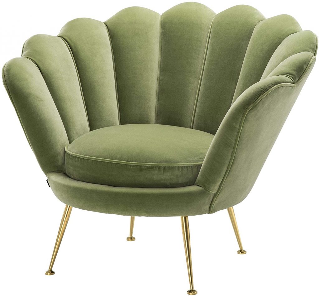
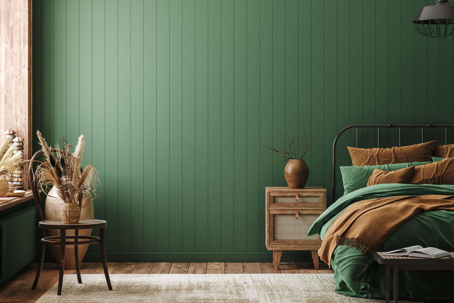
When it comes to interiors, shades of pastel green are making a massive comeback right now. Not only is this color known to be beneficial to the eyes, its origins are also very much rooted in nature. More and more people are introducing greenery into their homes. If you’ve noticed, the act of gardening has become more prevalent amid the Covid-19 pandemic, where more people are stuck at home. You can slowly begin adding pastel green pieces into your space, such as the gorgeous velvet option above: they’ll look amazing, even as standalones. You can also improve the appearance and texture of the pieces by playing around with lighting.
Pastel Green Olive Color Codes:
HEX
RGB
HSL
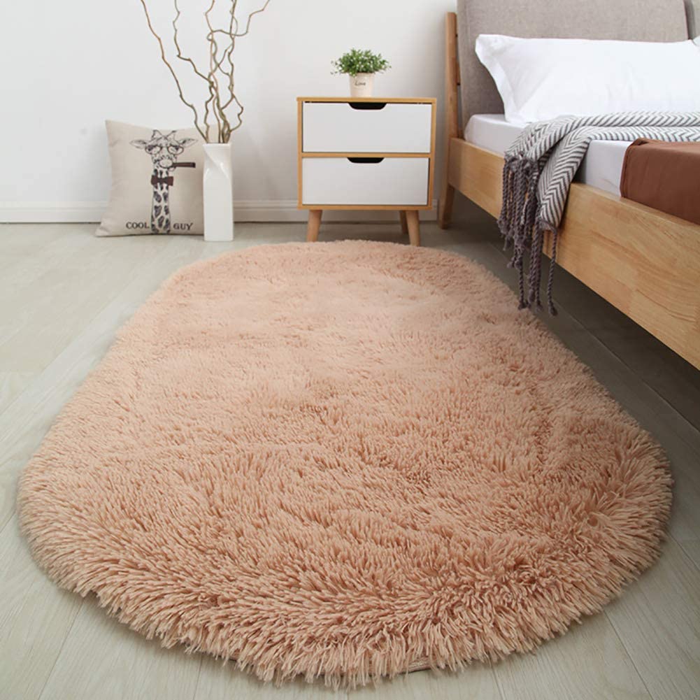
Whether it comes to fashion, makeup, or even interior design, peach and beige are some of the most popular colors. The two colors have their own unique neutralities that go with just about any pastel palette that you can think of. When you combine peach and beige together, you’ll achieve a pretty and slightly warm color that is just the right amount of feminine. This is not to say that peach beige can’t look great in a more “masculine” or male-oriented setting. In fact, it would work wonders as a balancing force with plenty of dark tones and can provide that elusive softness that many spaces often lack.
Peach Beige Color Codes:
HEX
RGB
HSL
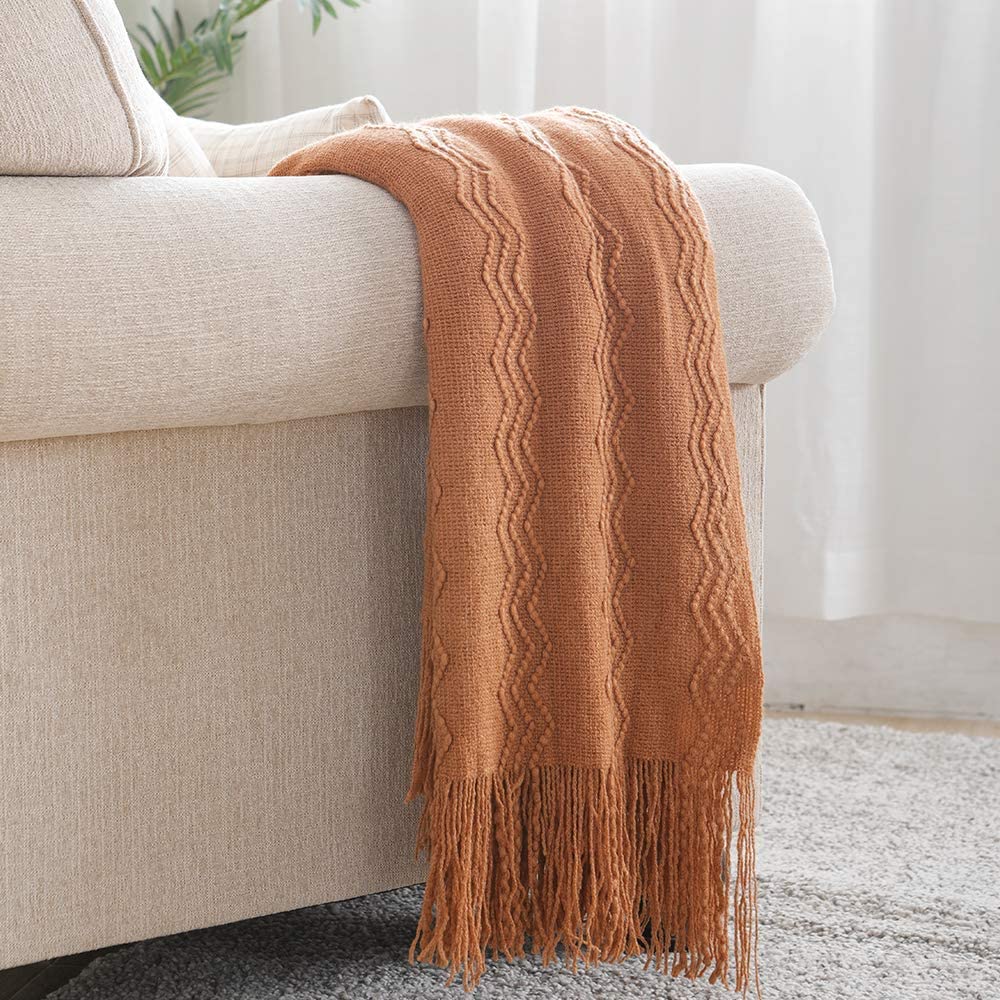
When you’re looking to create a calming environment, orange is probably not the first color that comes to mind. However, the color is actually used heavily in modern interiors and retail store designs as a color accent, because it’s bold but not too overpowering (unlike a laser red shade).
With pastel orange, your perception of the color will shift dramatically and it’s like to become a color you won’t be able to get enough of. It just pumps in so much warmth and coziness unlike any other. It takes the things we find comfortable with neutrals and takes it in a warmer direction and results in one of the prettiest shades you can have anywhere.
Pastel Orange Color Codes:
HEX
RGB
HSL
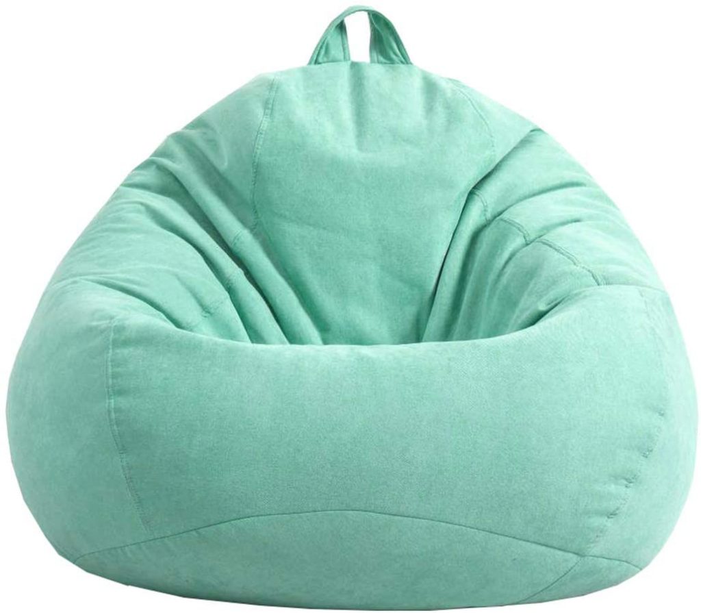
Mint green was one of the hottest colors in the early 2010s. It was believed to signify the future and advancement of technology. This is why several technology websites make use of this shade. It’s also one of the few shades that strike that unique balance between pastel and neon: while it’s bright and vibrant, it doesn’t hurt your eyes from staring at it. If you’re looking to have a room with plenty of light and a fair amount of happy energy, mint green is a fantastic choice as a piece of furniture or even as a pastel paint selection to fill your walls. If you plan to use it as an accent, soft bean bags are the perfect option.
Mint Green Color Codes:
HEX
RGB
HSL
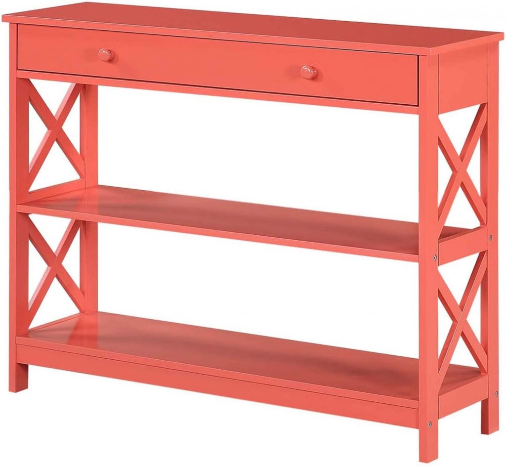
In the same year that mint was crowned as the color of the year, coral ran right beside it. There’s a lot of energy that goes into this shade but it can still have a place to go in just about any room in your house. It’s a unique shade that a lot of people have fallen in love with because it isn’t washed out like most pastel colors, however it doesn’t really assault your eyes like a plain red or plain green color would. Coral is definitely a pastel background you would want in a place where you move around a lot like a living room or maybe even the kitchen or dining room. If you’re planning to use it in the bedroom, place it on a wall that gets the most amount of light.
Coral Color Codes:
HEX
RGB
HSL
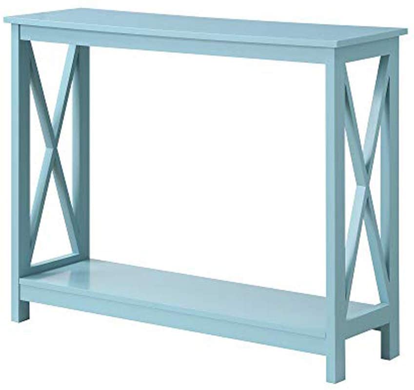
When it comes to pastel colors, sea foam is a pastel blue shade we just can’t pass up on. It’s such a safe and versatile option that you needn’t even ponder for long: it can complement virtually any piece. In terms of versatility, sea foam cannot be defeated as it tiptoes gracefully along the lines of being a neutral color, a cool color, and a reliable pastel color that a lot of people rely on.
Sea Foam Color Codes:
HEX
RGB
HSL
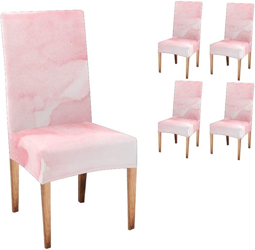
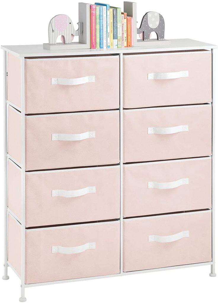
Possibly the epitome of feminine colors, Pastel Pink is a color that will be heavily used until the end of time. When coloring the walls of a nursery for a baby girl, this exact shade is the number one most purchased option. Pastel Pink is probably one of the most irreplaceable shades in the pastel palette – and for good reason. It bears a certain uniqueness that can’t be replicated and it’s such a forgiving shade that it would just look wonderful no matter where you decide to apply it. For a more unique touch, you can get your pastel furniture with a watercolor effect to give the shades more depth and dimension, such as these dining chair covers.
Pastel Pink Color Codes:
HEX
RGB
HSL
If you’re new to adding color to your interiors but would like to add something that isn’t the typical black, white, or gray, go for a pastel blue shade like Muted Blue. It isn’t exactly desaturated like most pastel blues; unlike its calmer variations, it has a certain depth and vibrance that makes its presence felt instantly. There’s also a sense of coziness and familiarity with this shade of blue because we’ve probably all seen it in one form or another. Overall, it’s an excellent color to consider for any pastel room.
Muted Blue Color Codes:
HEX
RGB
HSL
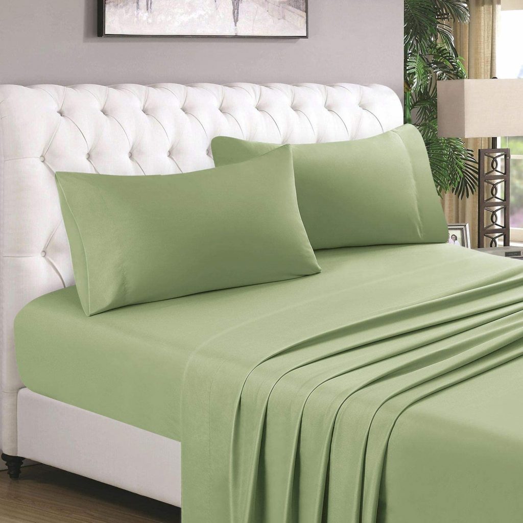
A tricky shade of pastel green to work with, avocado nevertheless has a place in the hall of fame of fashionable pastel colors. For a long time in the early 2010s, this color was used extensively in a lot of modern interiors. It veered away from the norm which used to comprise warmer tones like orange and yellow. The easiest way to incorporate avocado into your interiors like a professional is to use it as accents on soft elements such as bed sheets, pillowcases, and the upholstery for your couch and lounge chairs.
Avocado Color Codes:
HEX
RGB
HSL
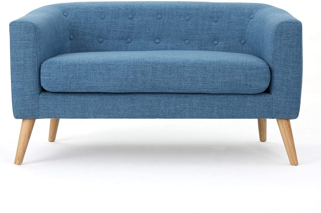
Light denim is another color that rates high on familiarity in most people’s lists. At one point or another in our lives, we’ve probably worn jeans in this color. It can also be said that certain pieces of clothing can transport us to a specific time in our lives. This shade of blue can trigger a wave of nostalgia and is something you’d want in your space. That sense of the past that you enjoyed and cherished can be a part of your daily life by incorporating this color into your space. Try going for a pastel paint or a piece of furniture, like the comfortable sofa shown above.
Light Denim Color Codes:
HEX
RGB
HSL
Pink is probably one of the most misunderstood colors in interior design. It’s largely the fault of our patriarchal society that somehow dictated and imprinted in our minds that pink is only for females, more specifically little girls. However, any designer worth their salt can tell you that Powder Pink can also be sophisticated yet feminine, and its usage most definitely doesn’t have to be restricted to a child’s bedroom. Powder Pink is a uniquely crafted shade that is so close to white that it can totally stand in its stead in a lot of settings. The highly washed-out color also means it complements other colors very well. It also gives you plenty of of opportunities to experiment and may even give birth to a color motif that’s never been done before.
Powder Pink Color Codes:
HEX
RGB
HSL
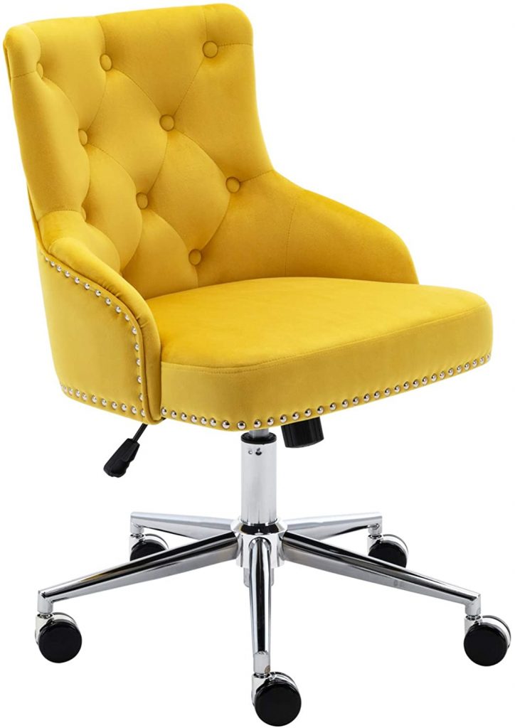
Although it barely qualifies as a pastel, mustard is still most definitely a shade of pastel yellow that you should consider for your interiors. Yellow is closely associated with the sun and happiness, so it’s no surprise that mustard too can give your space life unlike any other shade in existence. However, the noteworthy thing about mustard is that it also contains brown undertones that give it a sense of neutrality. This makes it a little easier on the eyes despite its brightness and vibrance. To this day, a lot of talented designers make use of mustard in their furniture. Especially with tight spaces, this shade can completely transform the look of a room and give the illusion of added natural light because of just how bright it is.
Mustard Color Codes:
HEX
RGB
HSL
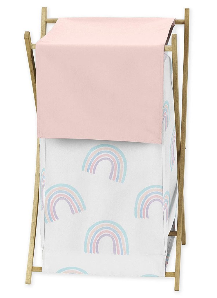
The most traditional pink pastel color has got to be Blush Pink. It’s the shade that immediately comes to mind whenever the term light pink is mentioned. It’s hard to pin down which part of pop culture has instilled this image into our minds, but perhaps the immense popularity of the Barbie franchise had something to do with it. In any case, Blush Pink is a wonderful color to use almost anywhere and if you feel a little uncertain about adding color it can be just as much as this accent panel on the hamper above.
Blush Pink Color Codes:
HEX
RGB
HSL
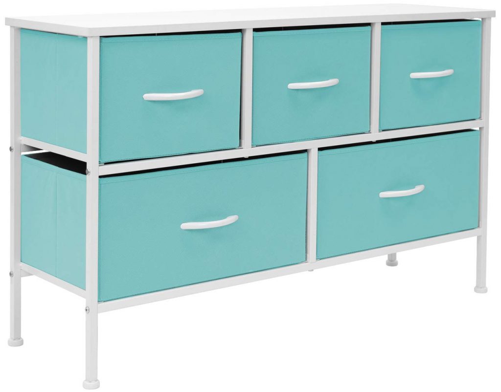
Going back into a little bit of a neon territory, Aqua is a unique marriage of green and blue to form this super vibrant color that’s a popular pick for visual presentations. There’s an undeniable freshness to it that makes it such an attractive tone to use as a pastel wallpaper or even as an accent piece. In the example above, the pastel aqua was used on a simple design for a cabinet but it certainly makes it about ten times more attention-grabbing than, say, its gray counterpart. There are colors in the spectrum that are naturally geared to shine, and pastel aqua is no doubt one of them.
Pastel Aqua Color Codes:
HEX
RGB
HSL
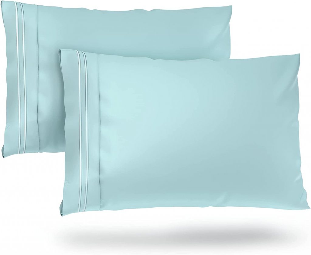
If you feel that Pastel Aqua might be a bit too much for your pastel background, here’s a much calmer alternative. Pastel sky blue takes all the best parts of the typical sky blue shade and makes it better by leaps and bounds. I think we can all agree that the generic sky blue color doesn’t really do the sky much justice. It can sometimes come off as way too neon or just too vibrant. The pastel color of this is more accurate and so much easier on the eyes. Who wouldn’t love to sleep on a pillow that reminds them of clear skies?
Pastel Sky Blue Color Codes:
HEX
RGB
HSL
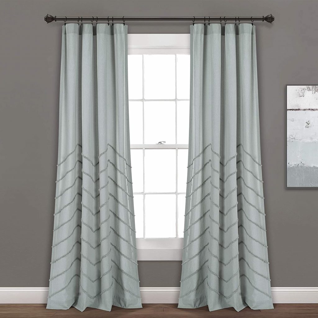
This is a color that causes a lot of arguments between people who love gray and blue. To the eyes of some, it’s a cool gray tone, while to others, it may come off as a very neutralized blue. Either way, it’s definitely a color that you’ll want to have in almost any room. Because of its ambiguous undertones, faded blue gray is a perfect gateway to color for people who feel they’re still too afraid to risk introducing too many colors. It’s also an incredibly elegant color whether you use it for pastel wallpaper or a background. However, you should totally consider using it as drapes such as in the photo above.
Faded Blue Gray Color Codes:
HEX
RGB
HSL
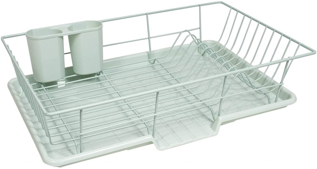
This shade of mint has become a favorite in the world of technology. Smartphones are now slowly creeping into colorful territory to appear more appealing to different markets. Although a lot of us can’t get enough of the classic beauty of black, white, and gray, these neutral shades of mint are more than welcome to join the fray. This specific pastel color is stunning all on its own as it looks incredibly immaculate when glossy while moody but light when used as pastel paint to fill a room. It’s hard not to fall head over heels for a color like this and it’s even harder to find someone who would hate such a universal color.
Grey Mint Color Codes:
HEX
RGB
HSL
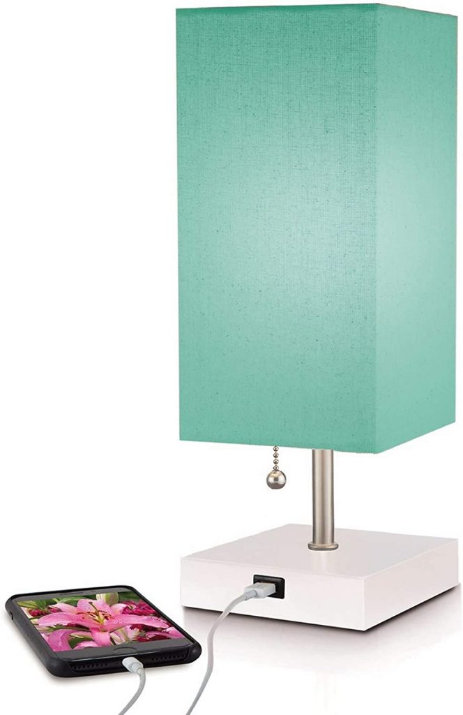
We all know that there are thousands of variations to popular pastel shades so here’s another variation of Aqua that more people can probably get on board with. Teal is another shade that’s heavily used in contemporary design because it isn’t as frequently used as your standard blues, but it still bears all the good things that people love about the pastel blue family. It’s still really calming and it’s just so refreshing to the eyes. So now that it’s combined with a greenish Aqua tone, it becomes even cooler and more refreshing – kind of like a mojito on a scorching day in the sun. When coupled with lighting, it results in a very unique lampshade that will elevate your room like no other.
Teal Aqua Color Codes:
HEX
RGB
HSL
Believe it or not, gray also has its own pastel hue. In terms of a standard gray, it can usually be compared to that of asphalt so once you take it up a few notches lighter, it becomes a very calm and subtle color that’s perfect to replace the color white. It also has the very enviable quality of looking great with just about any other pastel palette you want to include it with. When looking at gray, you should consider it as a bridge that can link neutrals with true vibrant colors. Despite its mundane looks, gray is actually one of the most powerful colors you can make use of in almost any setting. It’s perfect for serious business settings like an office, but it can also make a stunning neutral bedroom. If you’re struggling with what to put in contemporary interiors such as that cottagecore aesthetic, gray might be a viable candidate.
Pastel Gray Color Codes:
HEX
RGB
HSL
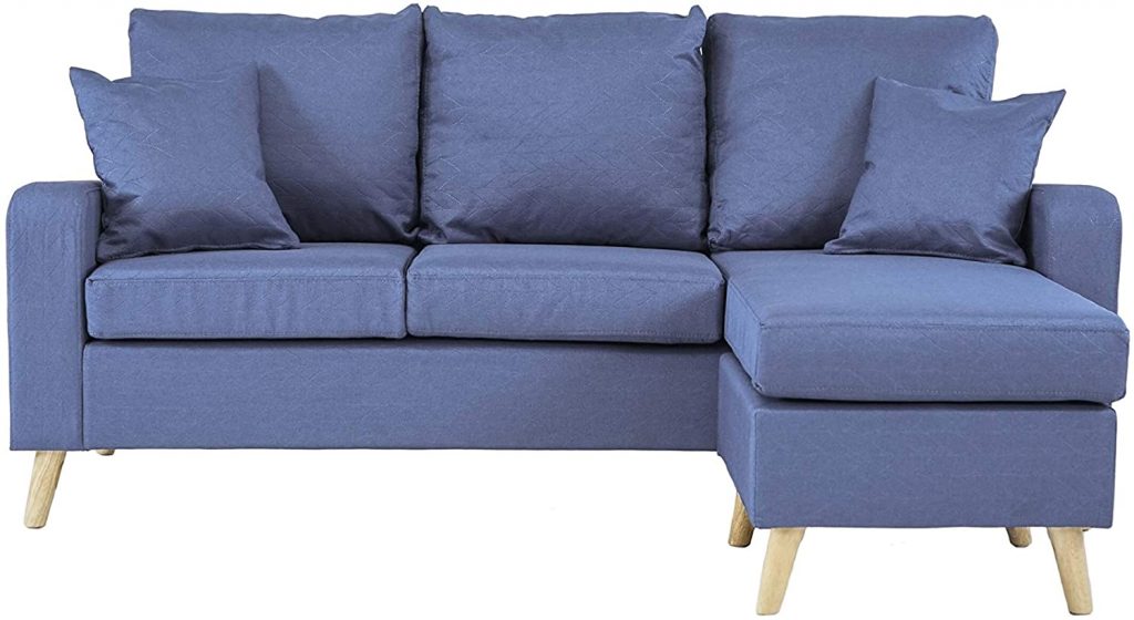
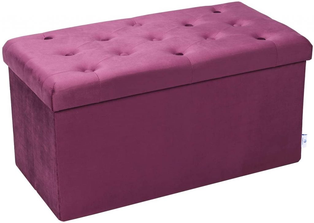
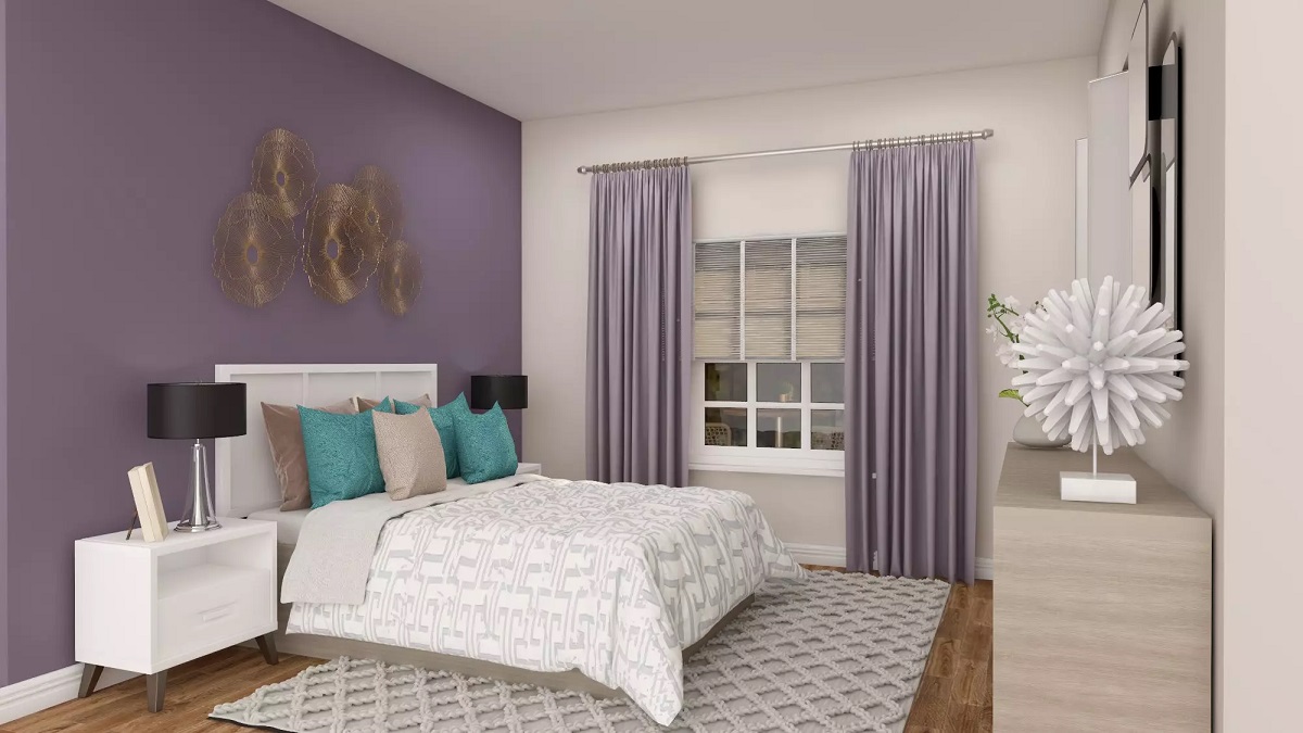
Last but certainly not the least, purple is a shade that we could never forget to include. This used to be a color that represented royalty and opulence in the early ages, but today it’s a well-loved color for various reasons. It used to be that only Roman royalty could don this tone but it is thankfully no longer the case. Pastel purple mutes the tone of this iconic color ever so slightly and makes it just vibrant enough to be used as a focal point in a space which is why it’s recommended to get it as upholstery for your couches and lounges. You can make it even more dramatic and pronounced by selecting a fabric like suede or velvet to include the element of light and touch and you would be designing your interiors like a complete pro.
Pastel Purple Color Codes:
HEX
RGB
HSL
Like a lot of things when it comes to interior design, your pastel palette can be used as heavily or as lightly as you want. There aren’t really any rules on how to use them, but rather, just some guidelines to consider so you don’t accidentally make any questionable decisions.
That being said, pastel colors are probably some of the easiest shades that you can play with as they are considered to be quite forgiving. If you’re ever in doubt that you might be going a little bit overboard, then you can simply do something as simple as putting it next to a piece of furniture or design that’s mostly neutral. Do this before adding anything new like another pastel color or maybe more of the same thing.
When you’ve selected the shades that you do want to play with, you can create infinite variations of your room. You’re the one who gets to decide how little or how much of one element you would like to see. Every color you choose doesn’t have to have the same amount of screen time, after all. Just like your favorite TV shows, your pastel aesthetic can have a lead actor and a whole bunch of diverse supporting actors that will only help elevate your space into something that you can confidently and irrevocably say is you.
Was this page helpful?
At Storables.com, we guarantee accurate and reliable information. Our content, validated by Expert Board Contributors, is crafted following stringent Editorial Policies. We're committed to providing you with well-researched, expert-backed insights for all your informational needs.


0 thoughts on “20 Gorgeous Pastel Colors To Enliven Any Space”